Bootstrap Part 1
Bootstrap CSS Framework
A CSS framework is a set of pre-prepared styles that you can use to quickly get a website up and running. Most websites employ some universal design aesthetics. It’s pointless to reinvent the wheel every time you build a website. Using a framework will cover most of the work in building a website.
It’s important to remember that a framework is just a starting point. It’s not the finished site. Instead, you should design your website on top of the framework, just as you would build a house on the frame.
History of Bootstrap
Bootstrap started as a framework from a couple of Twitter developers who were interested in encouraging consistency among tools used within the Twitter company. They released the code to the public, and Bootstrap quickly became one of the most popular CSS frameworks in use.
Bootstrap supports accessibility features, a mobile-first paradigm, and leverages some of the latest technologies like flexbox.
Downloading Bootstrap
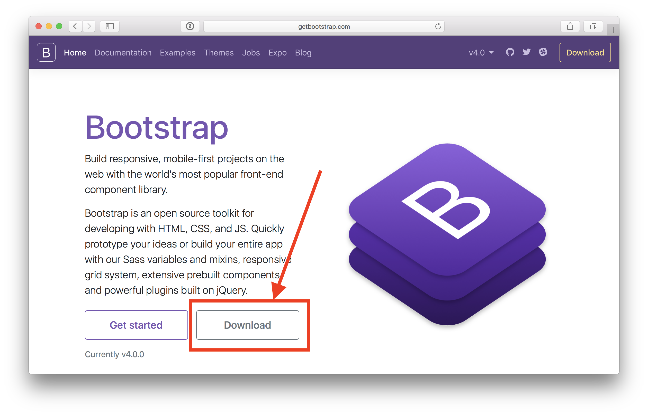
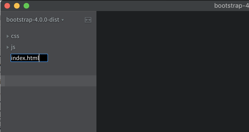
You should download bootstrap from the main Bootstrap Website so that you capture the latest version.
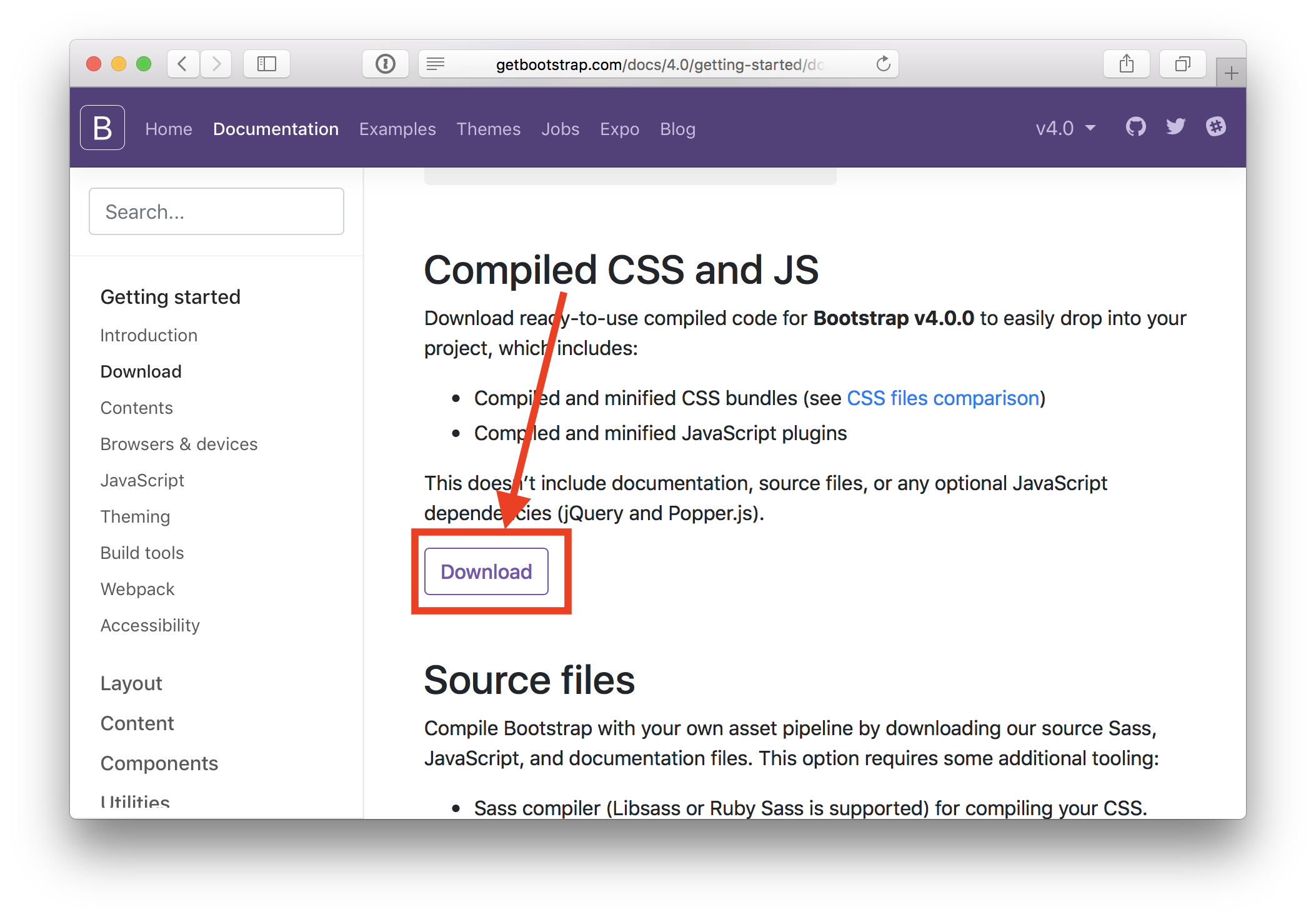
The version this tutorial will use is 4.0, (latest as of spring 2018). To follow along exactly, you should download this version here:
https://github.com/twbs/bootstrap/releases/download/v4.0.0/bootstrap-4.0.0-dist.zip
What do the different files mean?
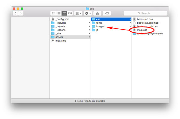
When you download the pre-compiled version of Bootstrap, you’ll get two folders: a css folder and a js folder. The CSS folder has six files in it:
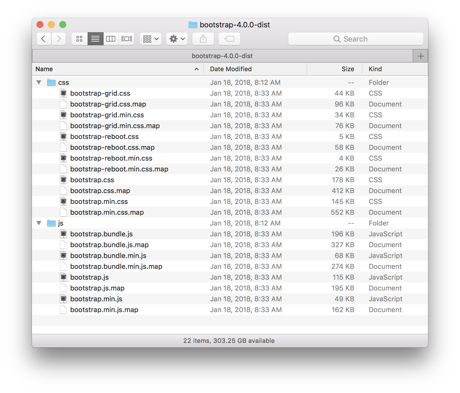
The files that end with min.css are “minified” version of the file, which are not human-readable. They remove the extra whitespace to make a smaller, faster-loading file. Functionally, they are idential to the .css versions of the file.
The files that end with .map are special debug files that will utilize special features in Chrome web developer tools. They are optional, and including them won’t affect the end-user. They can only help you debug issues with your page.
bootstrap-grid.css— A light version of Bootstrap with only the grid system, and none of the other components.bootstrap-reboot.css— A light version of Bootstrap with only the components, and no grid system.bootstrap.css— The full version of Bootstrap, with all components and grid system.
Similarly, the JavaScript folder has two versions of the bootstrap components:
bootstrap.bundle.js— All JavaScript components, including Popper.js, which is a JavaScript plugin for displaying tooltips. Since this plugin is relatively large, it’s setup as an optional addition.bootstrap.js— Only the Bootstrap components without Popper.js.
Setting up Your First Bootstrap Webpage
There are two ways to setup your webpage with Bootstrap. The first method is to download the Bootstrap files, and put them into a project folder. Then create your own index.html file for your website in that folder. This is ideal when making websites for production use.
Content Delivery Network (CDN)
The second method, is to use the CSS and JS files hosted externally from a Content Delivery Network, or CDN.
- CDNs usually use faster servers than your own server (unless you’re using Amazon CloudFront or some other fast edge service).
- Some browsers throttle the number of concurrent connections to a webpage, so hosting some files on a CDN, which is on a different domain, can sometimes be faster. When you connect to a webpage, all of the photos, and linked files have to be downloaded simultaneously.
- Web browsers also cache code it has downloaded from a particular domain, so many users don’t need to download Bootstrap again because their browser may have already downloaded the file from from that CDN while visiting another website.
These efficiencies are on the order of milliseconds, and most users may not even notice when running a smaller website. But they will add up. Shaving off a few milliseconds multiple times throughout your website mean the difference between a quickly loading website and a slowly loading website.
The big disadvantage to a CDN is that if the CDN ever goes down or is discontinued, you’re out of luck. This is why it’s often best to host your own JavaScript in production environments, so you’re always in control of your own code.
Starter Template using CDN
The Bootstrap website offers a nice boilerplate starter template, which outlines all of the basic links for the CDN versions of CSS and JavaScript files. Using this boilerplate code does not require downloading Bootstrap. Simply copy the below code into your editor and run it.
<!DOCTYPE html>
<html lang="en">
  <head>
    <!-- Required meta tags -->
    <meta charset="utf-8">
    <meta name="viewport" content="width=device-width, initial-scale=1, shrink-to-fit=no">

    <!-- Bootstrap CSS -->
    <link rel="stylesheet" href="https://maxcdn.bootstrapcdn.com/bootstrap/4.0.0/css/bootstrap.min.css" integrity="sha384-Gn5384xqQ1aoWXA+058RXPxPg6fy4IWvTNh0E263XmFcJlSAwiGgFAW/dAiS6JXm" crossorigin="anonymous">

    <title>Hello, world!</title>
  </head>
  <body>
    <h1>Hello, world!</h1>

    <!-- Optional JavaScript -->
    <!-- jQuery first, then Popper.js, then Bootstrap JS -->
    <script src="https://code.jquery.com/jquery-3.2.1.slim.min.js" integrity="sha384-KJ3o2DKtIkvYIK3UENzmM7KCkRr/rE9/Qpg6aAZGJwFDMVNA/GpGFF93hXpG5KkN" crossorigin="anonymous"></script>
    <script src="https://cdnjs.cloudflare.com/ajax/libs/popper.js/1.12.9/umd/popper.min.js" integrity="sha384-ApNbgh9B+Y1QKtv3Rn7W3mgPxhU9K/ScQsAP7hUibX39j7fakFPskvXusvfa0b4Q" crossorigin="anonymous"></script>
    <script src="https://maxcdn.bootstrapcdn.com/bootstrap/4.0.0/js/bootstrap.min.js" integrity="sha384-JZR6Spejh4U02d8jOt6vLEHfe/JQGiRRSQQxSfFWpi1MquVdAyjUar5+76PVCmYl" crossorigin="anonymous"></script>
  </body>
</html>
Hosting Bootstrap Yourself
If you’re downloading the Bootstrap CSS and JS files to your computer in order to host them yourself (meaning, you’re not using a CDN), then use the adapted code below which will link to the files in those respective folders. Make sure you also download jQuery separately. You can download the jQuery 3.2.1 slim version from here and save it to your JS folder. Popper.js can be downloaded from here and should also saved to the JS folder.
<!DOCTYPE html>
<html lang="en">
  <head>
    <!-- Required meta tags -->
    <meta charset="utf-8">
    <meta name="viewport" content="width=device-width, initial-scale=1, shrink-to-fit=no">

    <!-- Bootstrap CSS -->
    <link rel="stylesheet" href="css/bootstrap.min.css">

    <title>Hello, world!</title>
  </head>
  <body>
    <h1>Hello, world!</h1>

    <script src="js/jquery-3.2.1.slim.min.js""></script>
    <script src="js/popper.min.js"></script>
    <script src="js/bootstrap.min.js"></script>
  </body>
</html>
Multiple Attribute Values for Classes
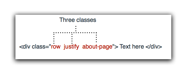
A single HTML tag can have have multiple distinct classes, but you must put them in the same class attribute. You just space separate them.
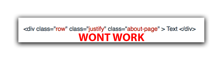
Attempting to have multiple class attributes in the same tag won’t work.
Bootstrap Layout — Containers
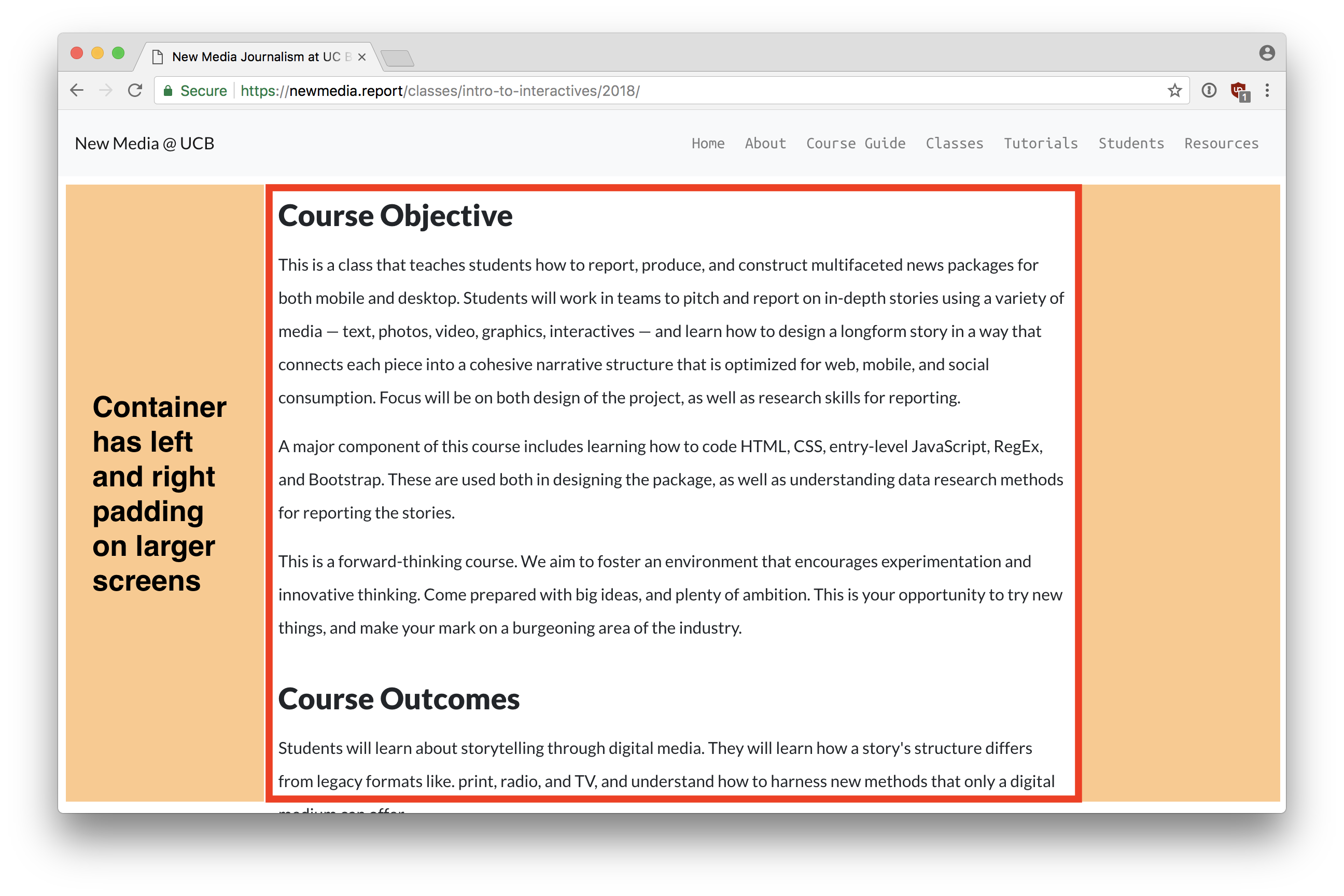
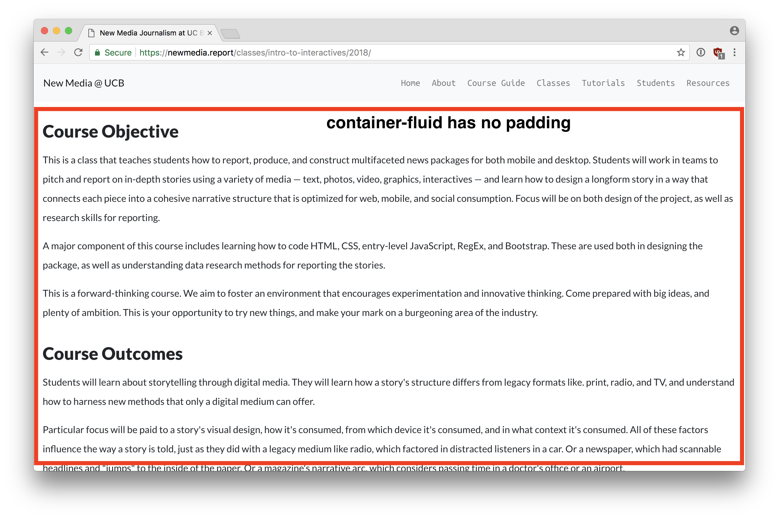
In order to use the grid system, you must have a tag with class="container" or class="container-fluid" to start. The difference is that containers will restrict the webpage’s width to the center, giving some space on each side of the content on larger screens. On mobile, the content will display edge-to-edge. Container fluid layouts will always be edge to edge.
Compared to container-fluid:
Here is what it would look like in the code:
<div class="container">
	<!-- content centered on page on large screens -->
</div>

<div class="container-fluid">
	<!-- content edge-to-edge -->
</div>
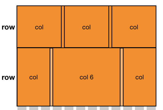
Bootstrap Layout — Grid System
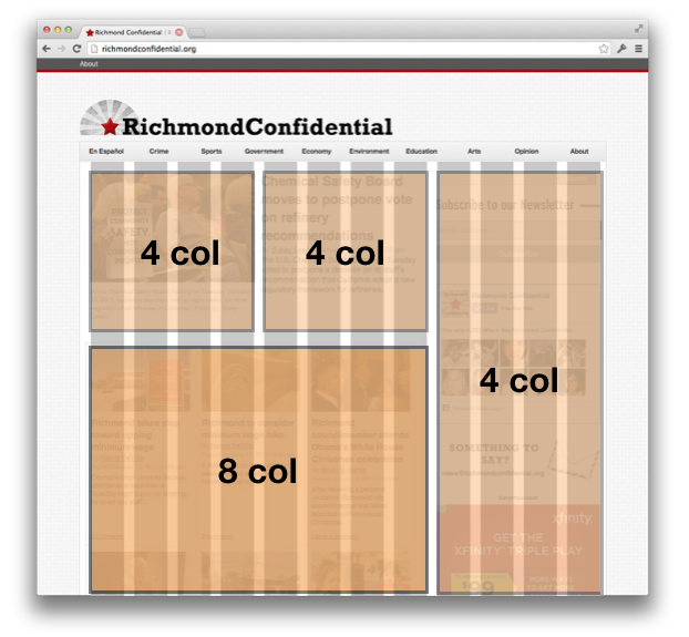
The grid system is a method of separating your webpage layout into a series of boxes that are aligned to an invisible grid. You specify the size of each box by how many columns of the grid it would take up.
By default, Bootstrap is based on a 12 column grid.
Imagine an invisible 12 column grid over your website:

You can create boxes which will be placed in various positions over the grid by specifying how many columns wide you wish them to be.
Bootstrap Layout - Column rules
There are some simple rules to follow when using the grid system:
- All column boxes must be inside a row.
- Each row can have no more than 12 columns. If it does, then the next columns will go down to the next line.
- Columns can be offset to create space around the column if needed.
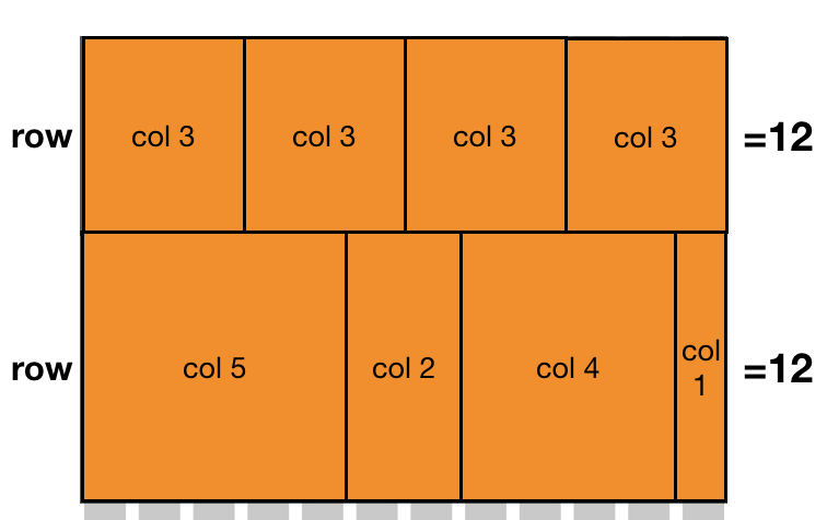
Here is how the above image would look like in code:
<div class="container">

  <div class="row">
    <div class="col-3"></div>
    <div class="col-3"></div>
    <div class="col-3"></div>
    <div class="col-3"></div>
  </div>

  <div class="row">
    <div class="col-5"></div>
    <div class="col-2"></div>
    <div class="col-4"></div>
    <div class="col-1"></div>
  </div>

</div>
Bootstrap Layout - Offsets
Columns can be offset to create space to the left of the column. You can only create space on the left side of each column. To create space on the right, you either put an offset before the next adjacent column, or you let the number of columns in a given row add up to less than 12.
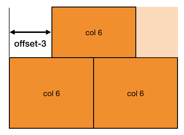
The above images would look like this in code:
<div class="container">

  <div class="row">
    <div class="col-6 offset-3"></div>
  </div>

  <div class="row">
    <div class="col-6"></div>
    <div class="col-6"></div>
  </div>

</div>
Bootstrap Layout - Nesting
It is possible to nest the grids in order to create more sophisticated layout where the numbers aren’t divisible by 12. You do this by simply creating a new row within a column designation. When you make a new row element, it resets the grid system to 12, and you can add up to 12 columns within that space.
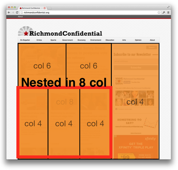
The code to create the above image would look like this:
<div class="container">

  <div class="row">
    <div class="col-8">

      <div class="row"><!-- note this inner row -->
        <div class="col-6"></div>
        <div class="col-6"></div>
      </div>
      <div class="row"><!-- note this inner row -->
        <div class="col-4"></div>
        <div class="col-4"></div>
        <div class="col-4"></div>
      </div>

    </div>
    <div class="col-4"></div>
  </div>

</div>
Bootstrap Layout - Flexbox Grids
The latest version of Bootstrap employs a new feature called flexbox. One nice addition is that you can create columns without any numbers and they will automatically space evenly as needed based on the number of column boxes in the row.
You can also mix with boxes that do specify column numbers. The boxes with column numbers will be fixed to a certain size, and all of the other boxes will automatically adjust as needed to accommodate the space.
The above layout would look like this in code:
<div class="container">

  <div class="row">
    <div class="col"></div>
    <div class="col"></div>
    <div class="col"></div>
  </div>

  <div class="row">
    <div class="col"></div>
    <div class="col-6"></div>
    <div class="col"></div>
  </div>

</div>
Bootstrap Layout - Row Justification
In order to justify the boxes within a row to the center, left, or right, you can optionally include a justification class within the row tag. This allows you to create boxes that add up less than 12 to automatically be centered if needed, or spaced to the right.
The justification classes are:
justify-content-centerjustify-content-startjustify-content-end
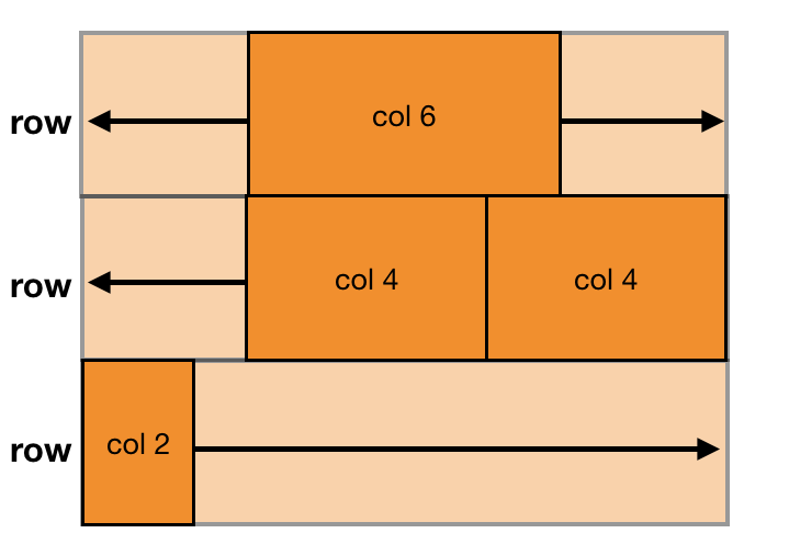
The above image would look like the following in code:
<div class="container">

  <div class="row justify-content-center">
    <div class="col-6"></div>
  </div>

  <div class="row justify-content-end">
    <div class="col-4"></div>
    <div class="col-4"></div>
  </div>

  <div class="row justify-content-start">
    <div class="col-2"></div>
    <div class="col-2"></div>
  </div>

</div>
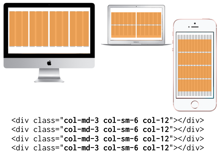
Bootstrap Layout - Responsiveness
Responsiveness in Bootstrap is a specification you add to the columns about when they should break into a stacked layout. You have four options:
- col-{Number} — Never break to stacked layout.
- col-sm-{Number} — Break to stacked layout when viewport is less than 540px.
- col-md-{Number} — Break to stacked layout when viewport is less than 720px.
- col-lg-{Number} — Break to stacked layout when viewport is less than 960px.
- col-xl-{Number} — Break to stacked layout when viewport is less than 1140px.
You can also combine the breakpoints in the same HTML tag, so that you can get different column layouts depending on the screen size.
Relative vs Absolute Paths
A path is the location of files that pertain to your web page. We often list paths in attributes like href="" or src="". How you write your path, particularly the characters you use to start the path, determine where the browser will look for the files.
Paths take the following forms:
- URL paths — These are paths that use a protocol to retrieve content out on the web, perhaps another server.
- Relative paths — These are paths that start from the current file’s location, and you either work your way up or down the document tree.
- Absolute paths — These are paths that always start from the root folder of a website, regardless of where your file is.
URL Paths
These start with a protocol, like http: or https:. These will go out onto the web and fetch a web page somewhere based on the URL given. Everything after that is an absolute path.
In-Class Exercise
The instructor will take you through the following exercise. You can follow along, and use this guide to make sure you’re performing each step correctly.
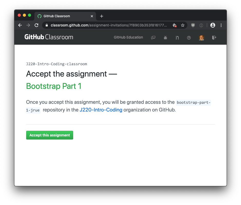
Step 1) Clone assignment from Github and launch Grunt
The first step is to setup your repository by clicking the following URL:
https://classroom.github.com/a/SL9H2KN6
You’ll need to be logged into your Github account to accept the assignment.
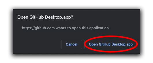
Next, click the green Clone or Download button, and open the repository in your Github Desktop Application.
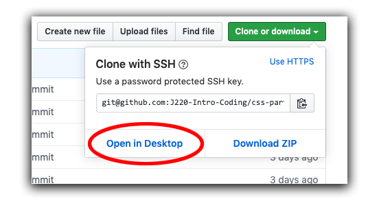
Your browser will issue a message asking whether you want the link to launch Github Desktop software. Open in Github Desktop. (Note: On a few computers, this button doesn’t seem to properly launch Github Desktop. So you should manually launch it yourself.)
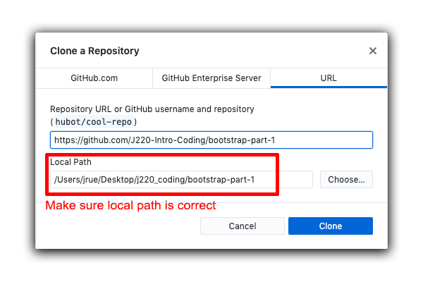
In the Github Desktop program, it will ask you to save (clone) your repository to somewhere on your computer. Make sure your local path is set correctly to save the project in the location you want it to go.
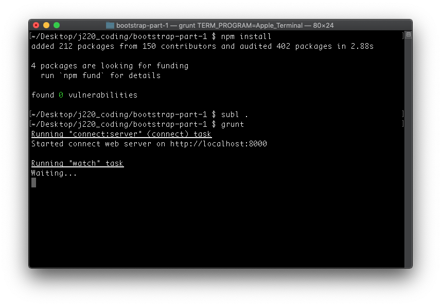
Go into your Finder and find the location your saved this folder. It should be in your J220_coding folder. Right-click the bootstrap-part-1 folder you downloaded and select New Terminal at Folder. (The name of the folder may vary slightly, and include your username.)
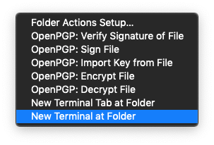
Now your Terminal program should be open at the folder we downloaded with the assignment.
Next, run the following command:
npm install
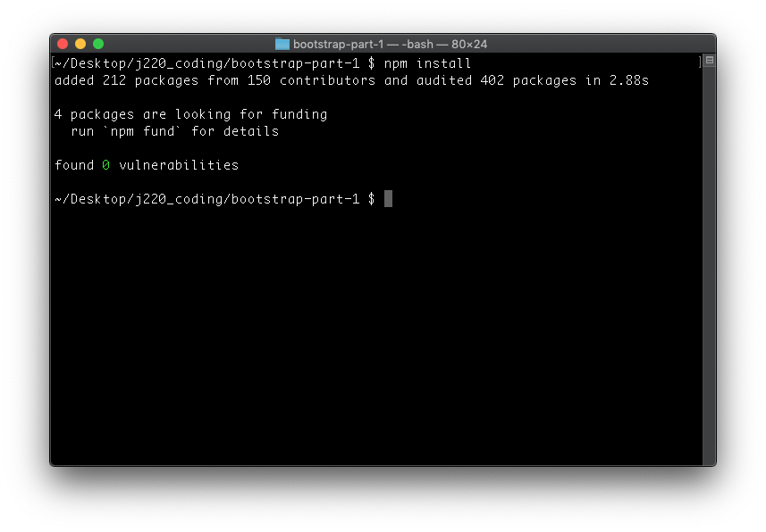
If you get something else other than the image above, then stop and try to figure out what went wrong. Most likely the issue is you’re in the wrong folder. Make sure you right-clicked the correct folder before running the command.
Next, run the following command:
subl .
Which will launch Sublime Text 3 in the folder we’re working from.
Lastly, run the grunt command:
grunt
Open your browser by visiting the following url: http://localhost:8000/. This url will only work while Grunt task is running.
You should see this:
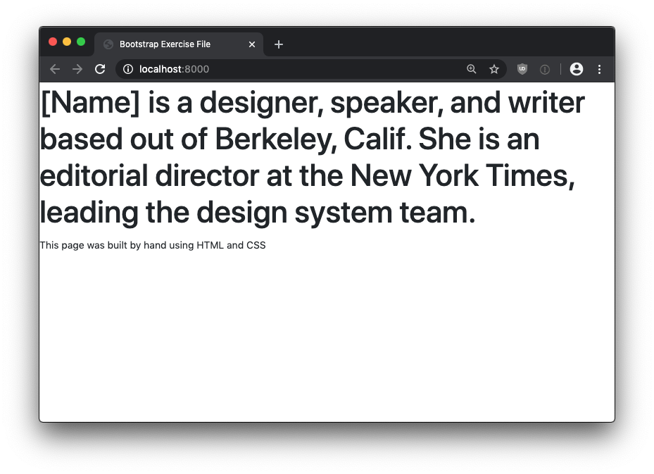
Hooray! You setup your local development environment. Onward to the next step.
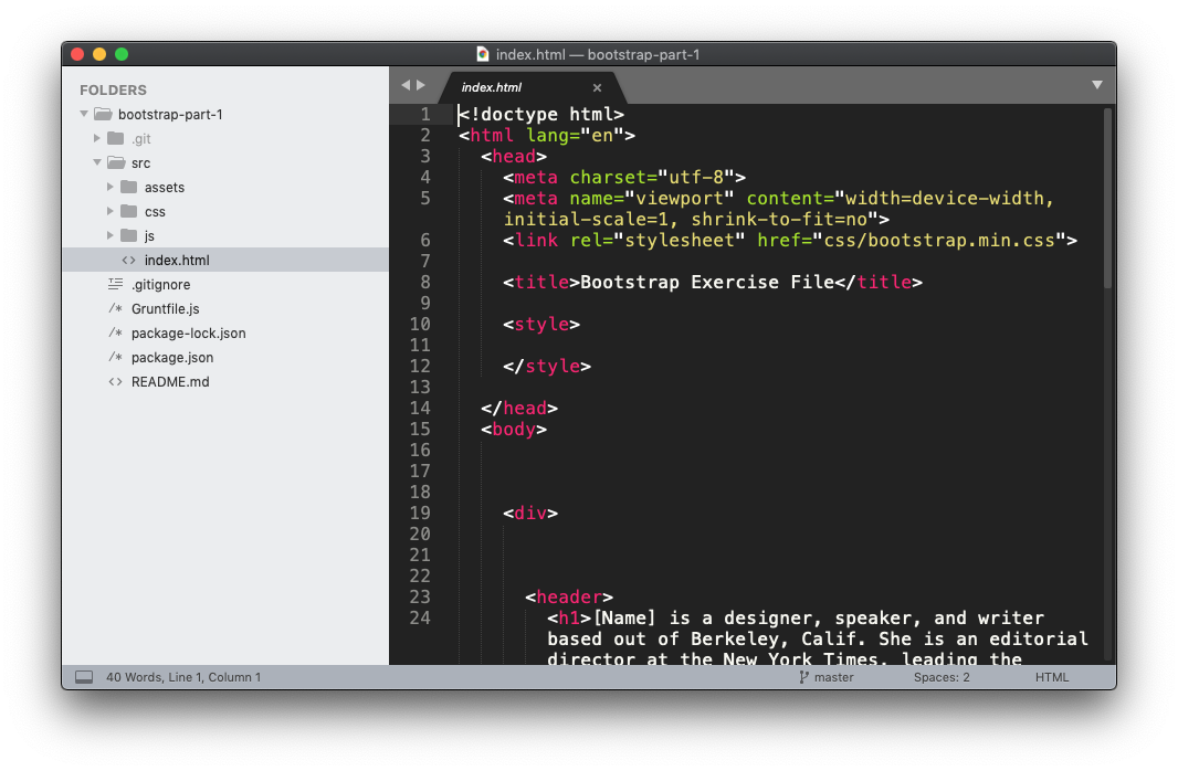
Step 2) Visit the Bootstrap Page and Add Nav Bar.
By now, you should have your preview window open, and your Sublime Text 3 window open showing your code. Your code will be in the src folder.
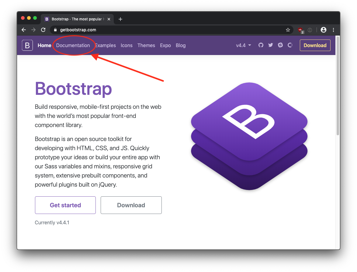
Let’s open the GetBoostrap.com web page open in another tab. We’ll be referencing it a lot during this exercise. Click on the Documentation link at the top of the screen.
Let’s search for Navbar and scroll down to the section on NAV. You can also click this link to go there immediately.
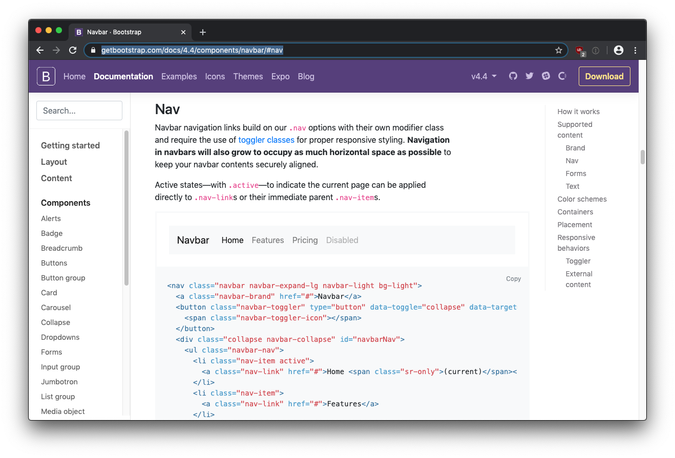
Let’s copy the code in this section, and paste in below the opening <body> tag in our own code.
Next, we’ll remove the line of code that lists the branding for the Website. We don’t really need it in our example. Normally this would have a logo or something.
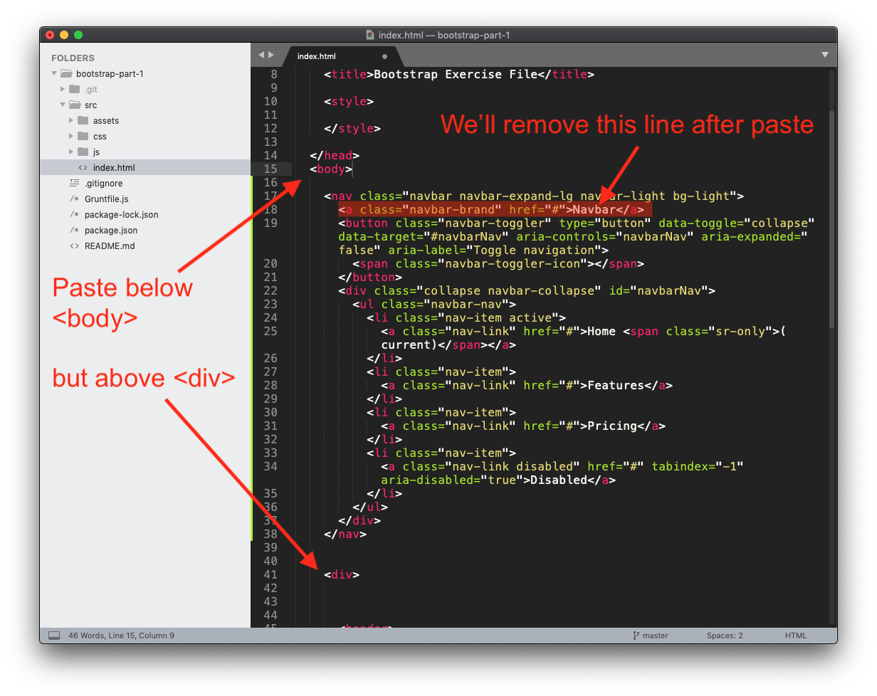
Remove this line:
<a class="navbar-brand" href="#">Navbar</a>
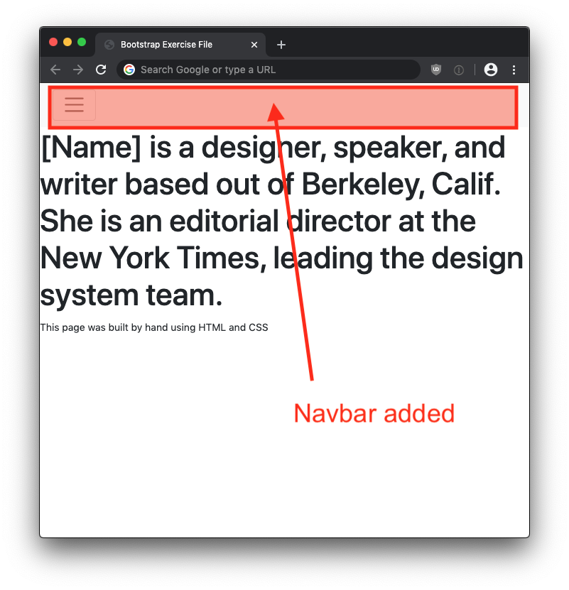
Save and see how it affects your webpage.
Step 3) Adding Bootstrap Cards
Visit the Bootstrap website again, and search for “Cards”
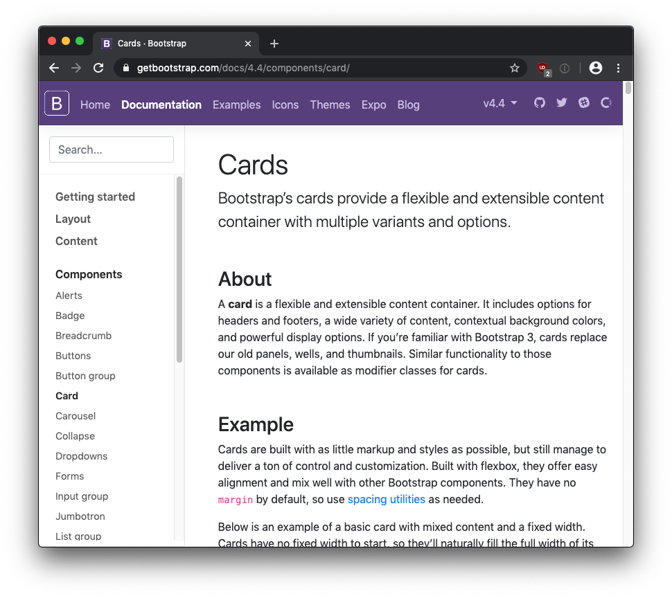
Scroll down to the section on Card Grids, which is directly linked here.
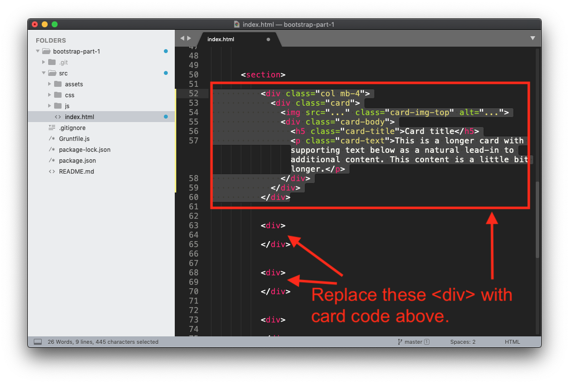
We’re going to copy the code for a single card. Make sure not to include the .row <div> tag, and that the indentation matches the image below exactly.
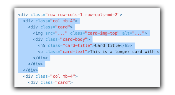
What you’re going to do is replace the empty <div> tags with the code you copied from the Bootstrap website. We’ll do one to start, make sure it’s working, then do the rest.
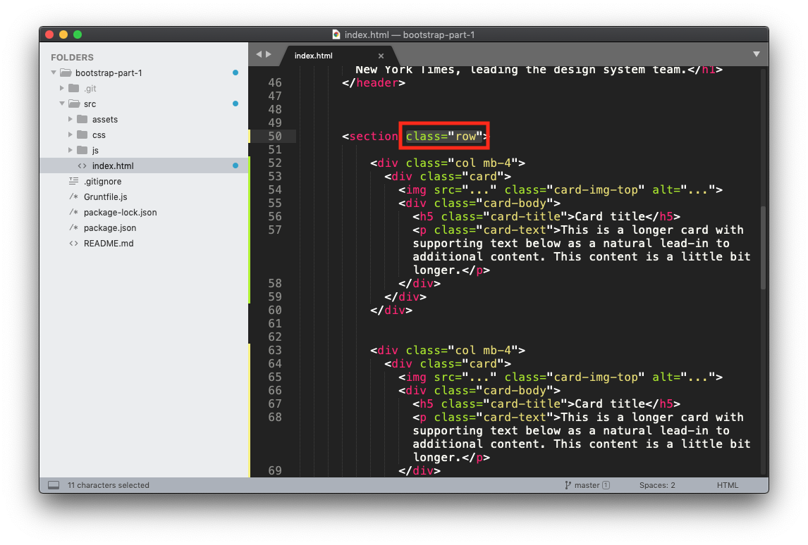
Next, add class="row" to the parent <section> tag.
Your webpage will display the cards, but with missing images. It may looked messed up, but we’ll fix that. We need to ad a few more things:
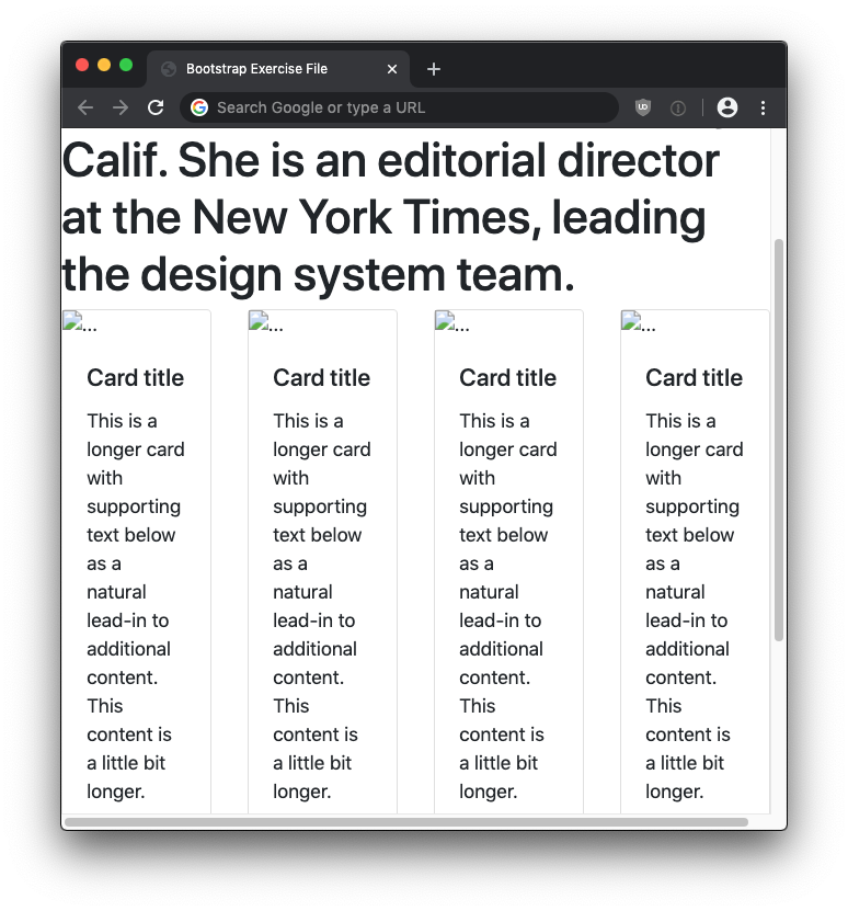
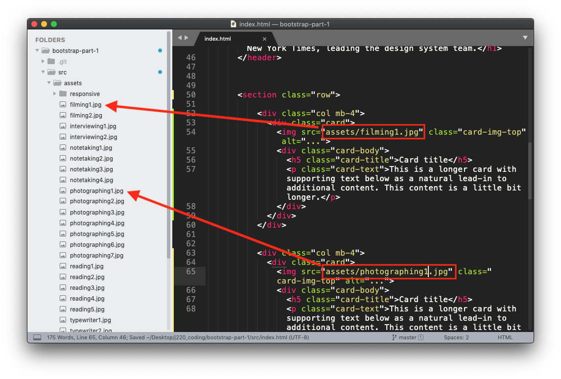
Next, let’s add images to your cards. The images are located in the assets folder. Feel free to use any of the images you want. You should also modify the alt="" attribute to describe what’s in the image.
Step 4) Using Bootstrap Grid System to Make Our Page Responsive
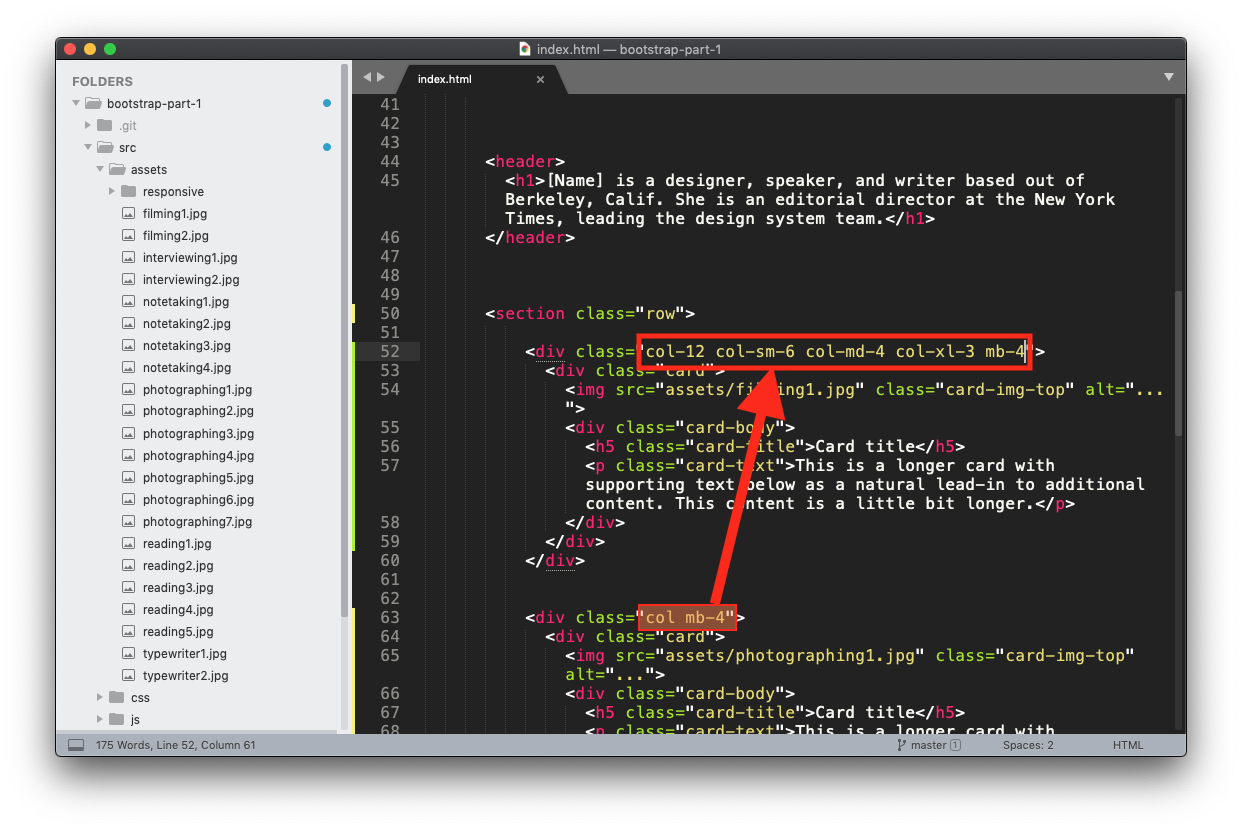
Next, we will add some CSS classes to our cards to make them responsive. Right now, we see too many cards next to each other when viewing on a mobile viewport. We can control how many columns appear at each breakpoint.
We will combine the various columns sizes like so:
- col-12 This will be for mobile view. Each card will take up the full 12 columns.
- col-sm-6 On smaller screens, like small tablets (e-reader) in portrait mode, show two cards side-by-side, six columns each.
- col-md-4 On mid-size screens, maybe tablets in landscape mode and some desktops like laptops, show three cards side-by-side (each card will be four columns wide)
- col-xl-3 On extra large screens, show four cards side-by-side. Each card will be three columns wide.
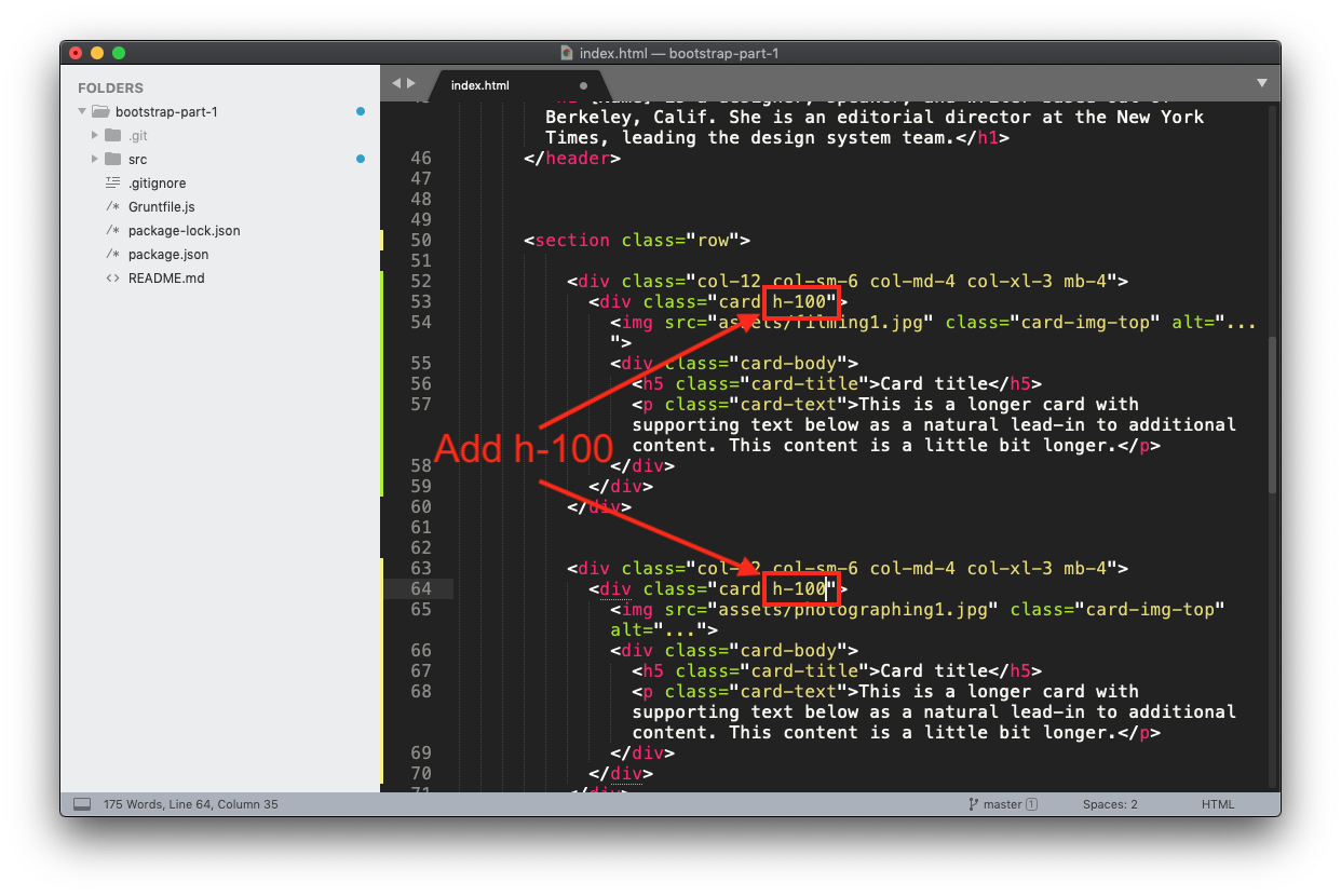
We will also keep the mb-4 helper class, and add one new one, h-100 which will make sure each column is even.
- mb-4 This class will make sure there is vertical space between the cards.
To make this happen, replace col mb-4 of each card with the following CSS classes:
col-12 col-sm-6 col-md-4 col-xl-3 mb-4
Next, let’s add h-100 class to each card itself (not the same div as the column grids) The h-100 class will even the height of the cards on each row so they’re the same height, even if the text is different lengths.
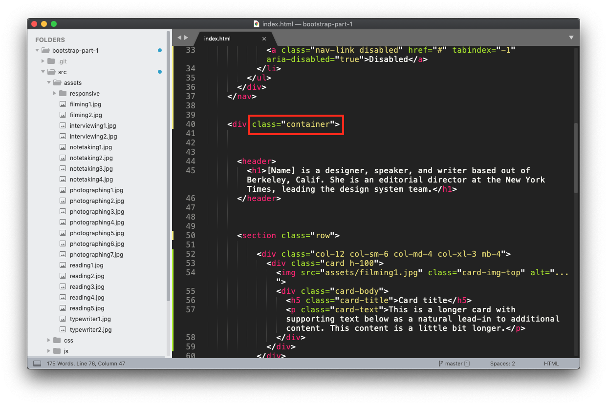
Step 5) Adding a Container Class
Lastly, we add a container or container-fluid surrounding all of the content on our page (except the nav). This will keep the content from touching the sides of our webpage.