Making Charts in D3
In this tutorial, we will build a simple bar chart in d3. There are numerous tutorials on how to do this. The lesson below will be brief, as its designed to be complementary to the lesson given in class.
Chart Samples In D3
This section has some quick links to some basic chart type templates. It’s recommended to use these only after you’ve completed the general lesson on creating a chart further below.
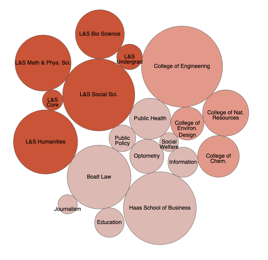
Bubble Chart
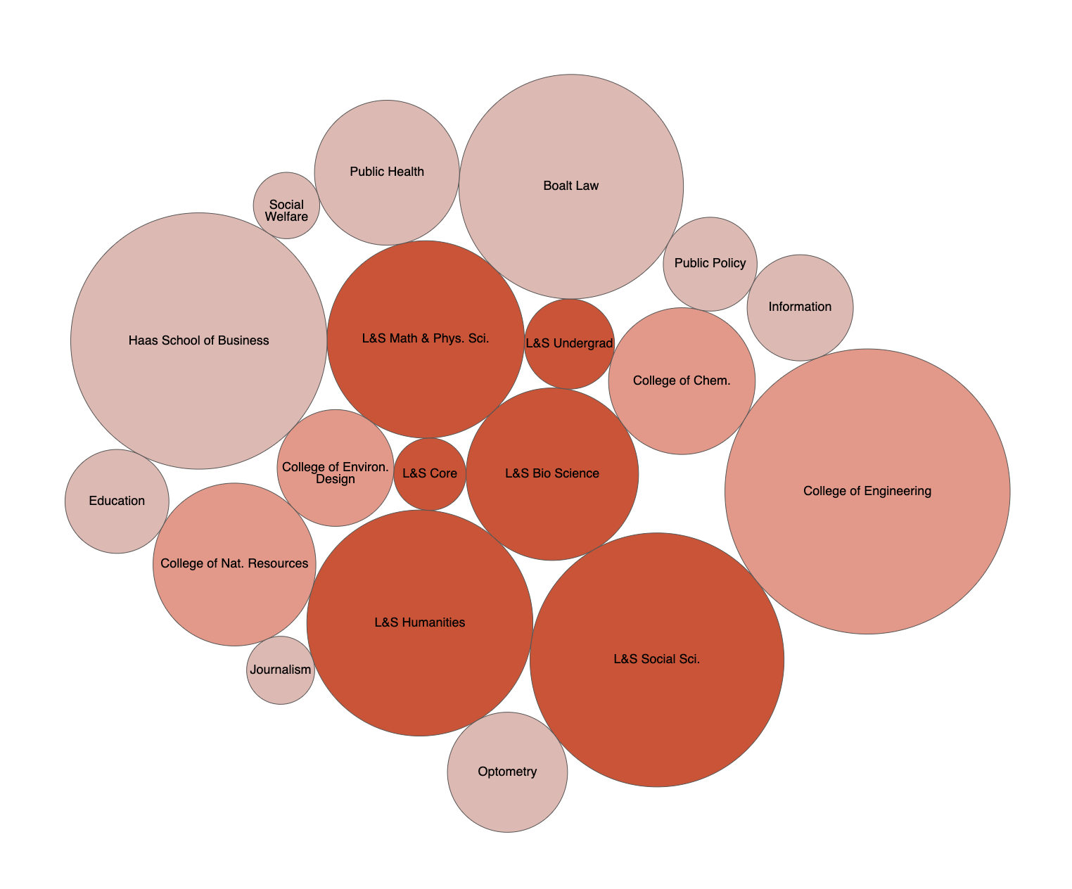
Bubble charts are a creative way of comparing quantities in an imprecise way. It’s difficult to make exact comparisons, and the area of each circle can’t be reliably interpreted by the human eye. But the magnitude of differences is emphasized, and while not perfect can still be useful in communicating the essence of the data. If you need exact comparisons, default to a bar or column chart.
Chord Chart
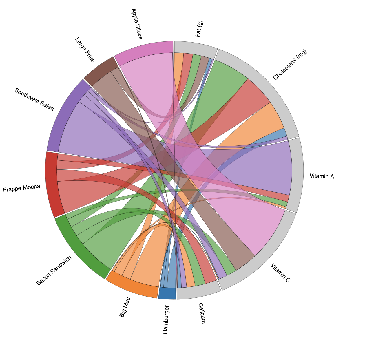
Chord charts are also a creative way of seeing connections between different sets of quantities, and proportions between those quantities. For more detailed information about preparing your data for a chord diagram, see this tutorial.
Choropleth Map
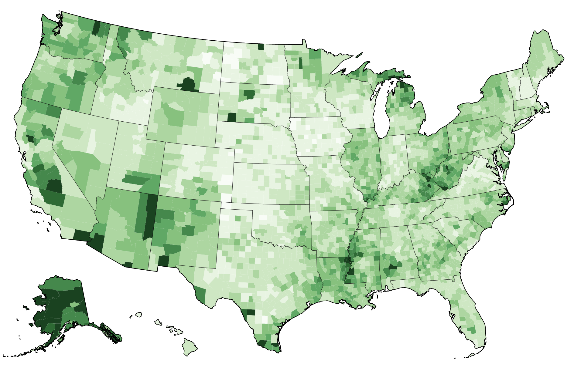
Choropleth maps are useful ways to see geographically how different areas compare. This example is specific to the United States, and has a county-level map. To use this out-of-the-box, you’ll need data that has county FIPS codes. The map file also contains state-level data, but it will require some modification.
Force Chart
Force charts are a lot of fun, but difficult to templatize. Lots of variables will need to be adjusted depending on your data, how many bubbles there are, and what categories you choose. This template is an attempt to recreate the spirit of the famous Obama budget chart by the New York Times. But how the chart reacts really depends on the situation and data format you have.
Globe Map
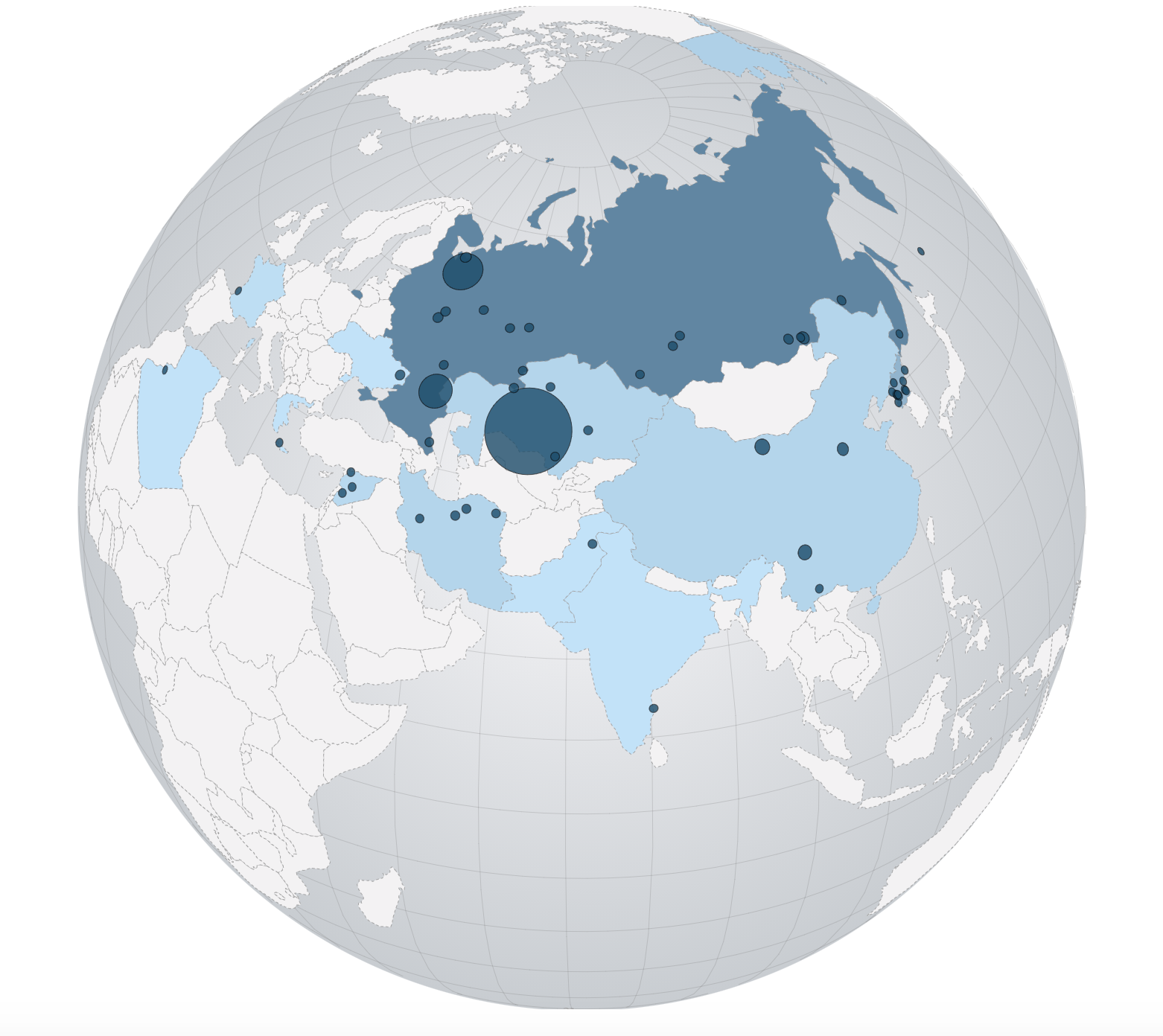
Globe projections are really creative way to show data across the world. This template includes both a choropleth data, and bubble area data, as an example.
Leaflet Map
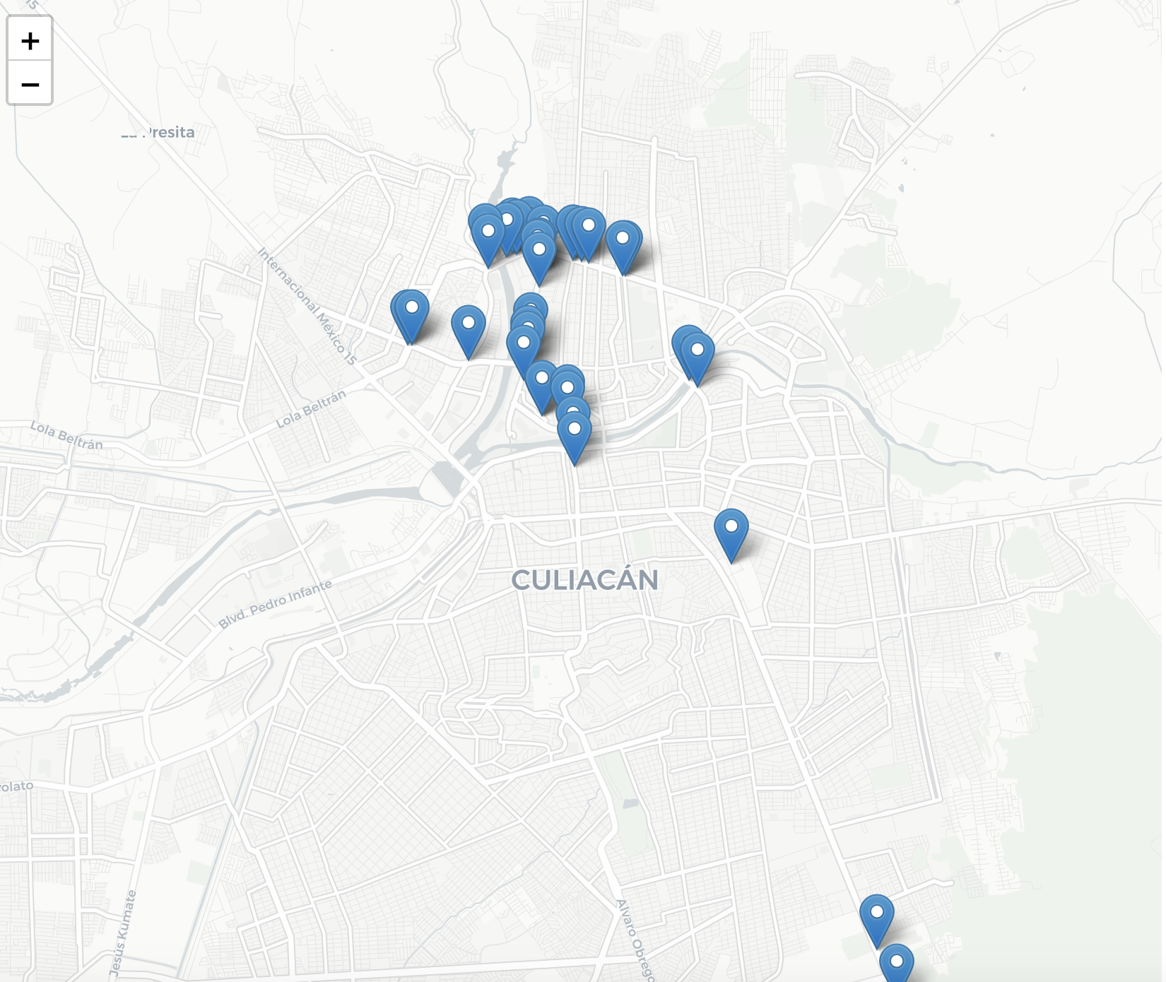
Because so many students request it, this is a basic Leaflet starter map. You can swap out other basemap providers at this link.
Line Chart
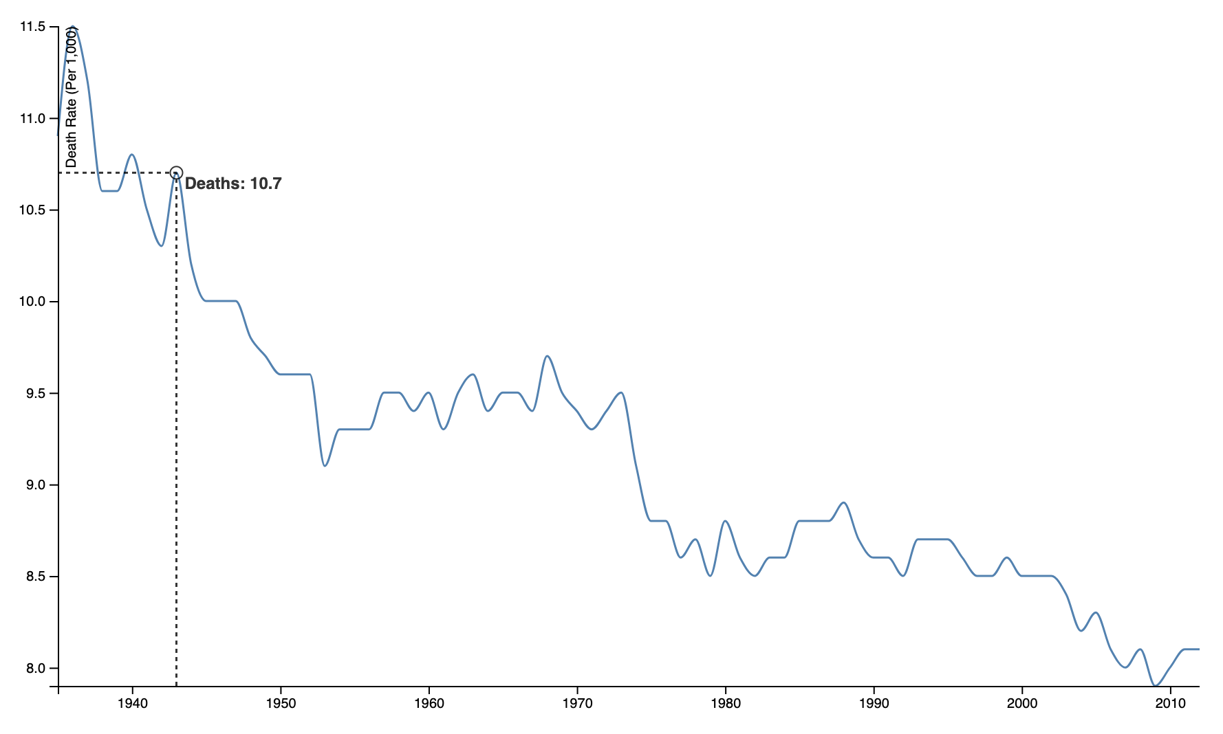
Line charts show continuous data. This line chart template has a hover effect that will show you data based on where your mouse arrow is compared to the line.
Stacked Area
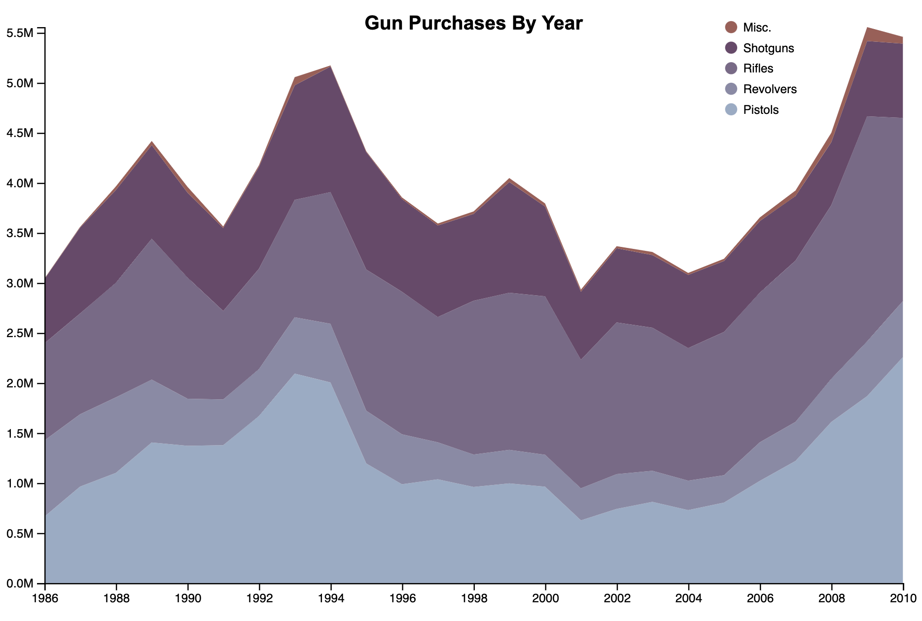
Stacked area charts are a great way to show data comparisons in proportion to each other. There are some areas to watch out for, particularly how each quantity compares at each point in the X axis. If there are steep rises, it may give a false impression of some quantities.
Stacked Area Fill
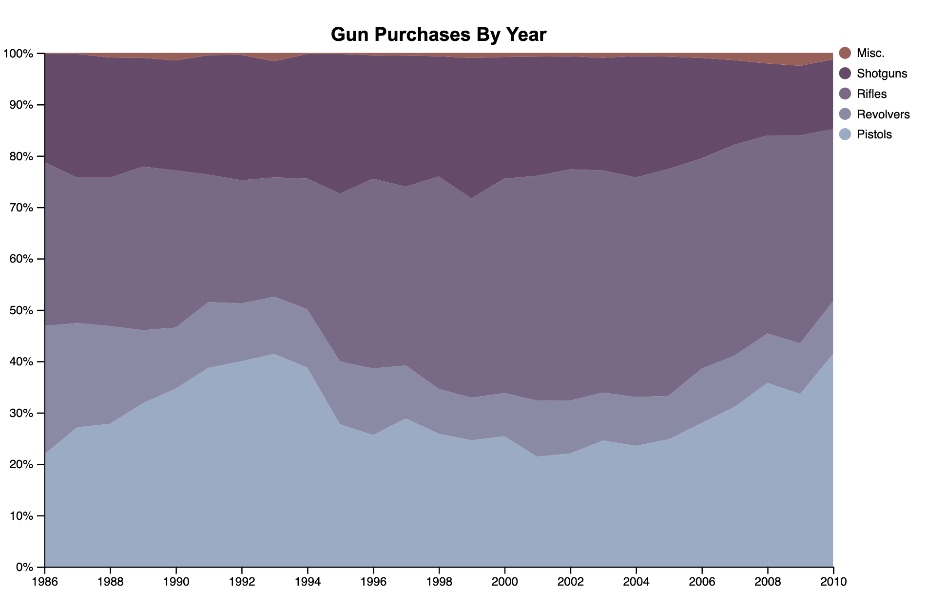
Stacked area fill charts are similar to its cousin stacked area, but with an important difference. They show how the quantities compare as a percentage of 100. This can show incorrect information if there are unknown quantities that are in addition to the provided data (meaning the combined values of your data can’t to be considered 100 percent).
Stacked Bar
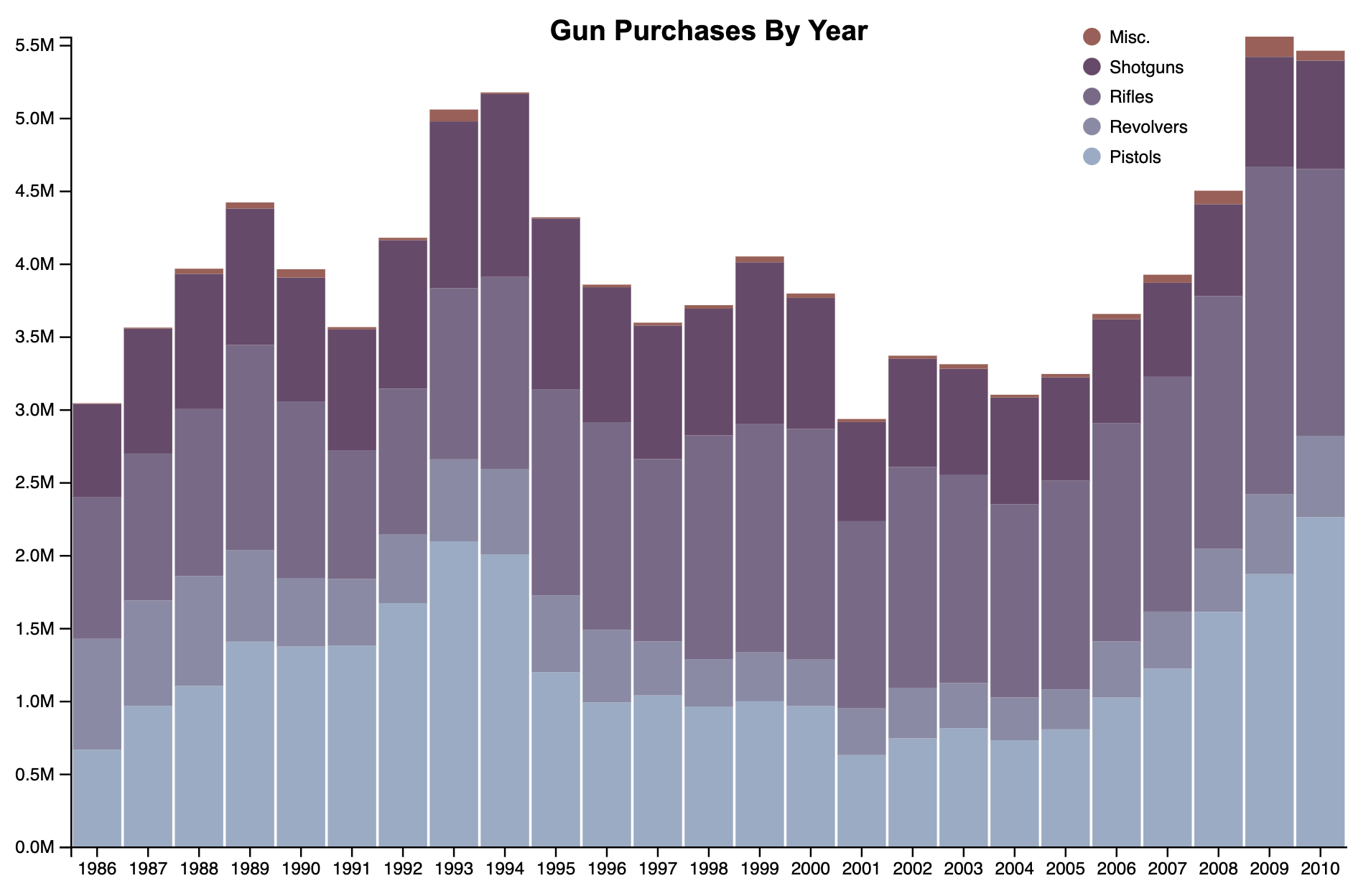
Stacked bar charts are a great way to avoid the pitfalls of the previous two charts.
Stream Graph
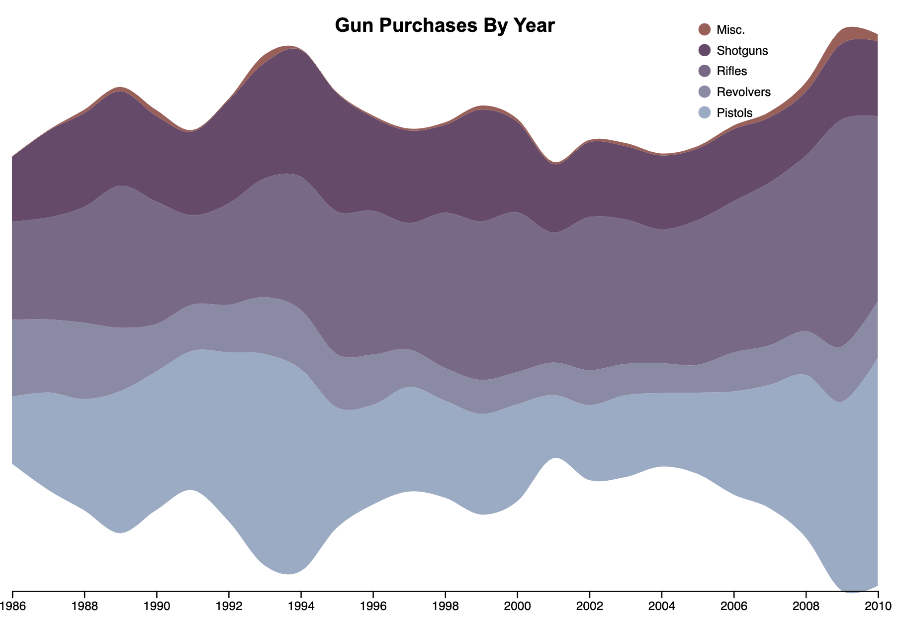
Stream graphs are fun to look at, but they are often confusing for viewers. It’s important to annotate the portions and make sure the chart is explained well in the caption text. Stream graphs can be an effective way to show how the combined values change over the continuous X axis. Sometimes it’s more form than function.
Waffle Chart
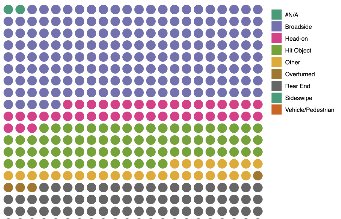
Waffle charts are an easy way to show proportions and are sometimes more effective than pie charts. The quantities are easily broken down into discrete values, which makes comparisons easy. Waffle charts also can show lots of data in a small area.
Making a Bar Chart — Sample data
In this tutorial, we will first use some random sample data. Then, pull in data from a csv file, which is a more realistic example of how we would create a chart.
var data = [
    { name:"Apples",  value: 12 },
    { name:"Pears" ,  value: 15 },
    { name:"Oranges", value: 21 },
    { name:"Bananas", value: 19 }
];
Specifying width, height and margins
When making a charts in d3, it’s often useful to set some variables at the beginning of your code for dimensions for use throughout your chart. This will make it really easy to resize your chart later if you need to.
Because the actual chart only takes up a limited amount of space, we also set some margins in a variable. These margins will be used to display our axes. For this reason, we really only need margins on the bottom and left side. But later we might want to add a legend, so we’ll specify all four sides.
Notice we also subtract the margins from the width and height immediately. This is for convenience only so that our width and height will now specify the main chart area, which we will reference numerous times when creating our chart.
var margin = {top:0, right:0, bottom:75, left:20},
    width  = 900 - margin.left - margin.right,
    height = 800 - margin.top  - margin.bottom;
Create our SVG and store it in a variable
Next, let’s create the actual svg, append it to our document body, and store it in a variable so that we can append multiple elements to this later.
Notice we add back the margins. This might seem counter-intuitive, but only our main svg needs to be the full width. Everything else will be inside the margins.
var svg = d3.select("body")
      .append("svg")
      .attr("width", width + margin.right + margin.left)
      .attr("height", height + margin.top + margin.bottom);
Create the grouping element to hold our chart
We will append a grouping element “g” to hold the main chart. We will use the transform attribute in order to move the whole grouping down and to the right to account for the margins.
var chart = svg.append("g")
      .attr("transform", "translate(" + margin.left + ", " + margin.top + ")");

//when rendered, this will look like <g transform="translate(20, 0)">
Mapping data
Most of the time, our data will be in a format that is an array of objects. This is convenient because it allows us to easily iterate over each item of data.
However, sometimes we will want extract specific values in our dataset — particularly in situations when we want to find the highest or lowest value, or sort the data in order. In these cases, we want to make a new array with only the information extracted from each object. This is when we use the Array.map() function. Array.map takes a function as the argument, then it calls this function for each element in the array. You then return whatever you want, and that becomes a new element in an array.
/* Example data
[
    {name:"Apples",  value: 12},
    {name:"Pears" ,  value: 15},
    {name:"Oranges", value: 21},
    {name:"Bananas", value: 19}
]
*/

var values = data.map(function(d){ return d.value; });
var names  = data.map(function(d){ return d.name; });

//newly created "values" variable is now an array with [12, 15, 21, 19];
//newly created "names" variable is now ["Apples", "Pears", "Oranges", "Bananas"];
In this example above, the function inside data.map() is called for every element in the data array. The first time it’s called, the function receives {name:"Apples", value: 12}. The second time, the function receives {name:"Pears" , value: 15}, and these are assigned to the internal variable d. We then return d.value.
In the end, we have a new variable values which is an array of numbers.
Understanding scales
This is where a big part of the magic of d3 takes place. Scales allows us to stuff a dataset into a specified range of our chart. Since we’re making a bar chart, we have to figure out how large do we make each bar? Well, that really depends on maximum value of our data, then stuffing that into the space (or range) available in our chart. This is done with two values:
range — The distance (in our case the height) available for stuffing our data into.
domain — Our data, from zero to maximum or in some cases from the minimum value to maximum value.
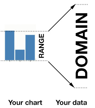
Read more about scales on Scott Murray’s tutorial’s page
We will call a special scale function in d3, and save it into a variable. We’ll name this variable simply y. Later, we can call this variable and as an argument, we’ll specify an element of our data. The function will return the corresponding pixel location on our chart.
In a linear scale, both the range and domain functions require an array of two elements. In our range, we start with height, because we want the smallest values to be at the bottom of our chart. There is also a convenience function d3 provides d3.max() or d3.min(). When you give these functions an array as an argument, it will return either the maximum or minimum value in the array.
//Note: updated for version 4
var y = d3.scaleLinear()
        .range([height, 0]) //the space available in our chart
        .domain([0, d3.max(values)]); //the span of our data that will fit into the range
Band scales
Band scales, (also formerly referred to as ordinal scales) work very similar to the above linear scales. The only difference is that each item in the domain to be unique, and preferably a string. Then it will assign those to a numerical range, and spread them out evenly.
We will use a build-in function for our range when doing column bar charts.
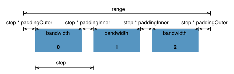
Don’t worry about all of the specific dimensions. We will use the defaults. The scaleBand() function works just like the linear scale but you can provided a padding() function to specify the space between each bar.
var x = d3.scaleBand()
        .range([0, width]) //the range (chart area) we want to place each bar
        .domain(names) //names variable from array mapping above
        .padding(0.1); //space between bars as a percentage
Alternatively, you can also use rangeRound([0, width]) instead of just range, which will round the numbers and give you crisper edges.
Making the chart
We can now make the chart with d3. The data() function will receive our data, and the enter() will cause it to iterate through each element in our data array.
chart.selectAll(".bars")
     .data(data)
     .enter()
     .append("rect")
     .attr("x", function(d){ return x(d.name); })
     .attr("y", function(d){ return y(d.value); })
     .attr("width", function(d){ return x.bandwidth(); }) //bandwidth() returns width of bars
     .attr("height", function(d){ return height - y(d.value); })
     .attr("class", "bar");
You won’t see the chart just yet. We have to add a bit of CSS to create a fill for the chart. In the top of your document, add the following CSS:
.bar{
    stroke: none;
    fill: steelblue;
}
Preparing the axes
D3 provides some axes functions which will automatically draw an axis line. The only thing you need to do is to give it the scale function you created, so that it knows where to put the tick marks.
Some of the options available for customizing the axes can be found the on the d3 site
svg.append("g")
   .attr("transform", "translate(" + margin.left + "," + margin.top + ")")
   .call(d3.axisLeft(y));

svg.append("g")
   .attr("transform", "translate(" + margin.left + "," + (height + margin.top) + ")")
   .call(d3.axisBottom(x));
There are some options you can do for customizing the axes. There is a ticks(11) function where you can pass in a number (like 11) and it will specify the number of ticks to create. There is also a tickValues([1,2,3]) where you pass in an array of values for each tick.
Running a webserver on a Mac
When loading an external file from your computer into a website — like a csv file — there are browser safety measures called Cross-origin resource sharing (CORS) which prevent a webpage from loading an external resource onto the page. These are important security measures. Without them, a local webpage could take any file from your computer!
But, they are also annoying when trying to load separate files like a CSV file for your d3 chart. Fortunately, there is a solution. Macs come with Python pre-installed, and there is a Simple Webserver utility that is baked in. (PC users will need to install a webserver like WAMP).
- Step 1: Open your terminal program. You can find it using spotlight in the upper-right hand corner.
- Step 2: You need to navigate to the folder you’re working on. Use the
cdcommand to change the directory. You should be starting from your home folder when you launch Terminal. For example, if you wanted to change the directory to your Desktop, you could typecd Desktop. If there is another folder on your Desktop, let’s pretend it’s called “d3 tutorials”, then you could typecd "d3 tutorials". You can also typelsto list the current directory and see the folders there. - Step 3: Once you’ve navigated to the correct folder, runt he following command:
python -m SimpleHTTPServer 8000
This will launch a temporary web server. In your browser type: http://127.0.0.1:8000 (or the address it gives you, if different) and you should see the contents of that folder. This will mimic a real website, and allow the browser to think this is a live webpage (it’s not really).
Using a CSV file
Using a Comma Separated Values (CSV) file is a little different. It requires us to use the d3.csv() function. The function works like so:
d3.csv("path_to_csv_file.csv", row, function(error, data){});
The d3.csv function takes three arguments: path to file, an row function, and a function callback that will be called once the csv is loaded.
Path to file — The url to a csv file, or path to a local file (Need to be running a local server for this to work on your own computer.)
row — An optional function that will be called for every element (row) in the data, where you can convert the data (for example converting strings into numbers), if you wish.
Callback Function — This is the function that will call after everything is done and the data is loaded in.
The row function is usually a standalone function which will be called for every element. Typically, you would use this to covert the data to a specific format for d3. It’s also commonly use to convert strings into numbers. Whenever d3 loads data, it always brings in values as strings for better dependability. Strings can be easily converted to numbers by placing the plus symbol (+) in front of them, i.e. +"578" will become 578.
//accessor function
function convertToNumber(d){

    d.murders = +d.murders; //takes d.murders string, converts to number

    return d;
}
In order to convert the code above into one that uses a CSV, we need to move our x and y domain() functions to inside the callback function, because it requires the data to have been loaded.
Below is the complete finished product using sample_gun_data.csv for the data.
<html>
<head>
    <meta charset="utf-8">
    <title>Example chart</title>
    <script src="https://d3js.org/d3.v4.min.js"></script>
</head>
<body>

<script>

    var margin = {top:0, right:0, bottom:70, left:30},
        width  = 900 - margin.left - margin.right,
        height = 700 - margin.top  - margin.bottom;

    var svg = d3.select("body")
        .append("svg")
        .attr("width", width + margin.left + margin.right)
        .attr("height", height + margin.top + margin.bottom);

    var chart = svg.append("g")
        .attr("transform", "translate(" + margin.left + ", " + margin.top + ")");

    var x = d3.scaleBand()
        .rangeRound([0, width])//leave off domain
        .padding(0.1);

    var y = d3.scaleLinear()
        .range([height, 0]);//leave off domain

    d3.csv("sample_gun_data.csv", convertToNumber, function(error, data){
        if (error) throw error; //catch the error

        //optionally sort data
        data.sort(function(a,b){ return b.murders - a.murders; });

        //set the domains for x and y functions here
        x.domain(data.map(function(d){ return d.state; }));
        y.domain([0, d3.max( data.map(function(d){ return d.murders; }) )]);

        chart.selectAll(".bar")
            .data(data)
            .enter()
            .append("rect")
            .attr("x", function(d){ return x(d.state); })
            .attr("y", function(d){ return y(d.murders); })
            .attr("width", function(d){ return x.bandwidth(); })
            .attr("height", function(d){ return height - y(d.murders); })
            .attr("class", "bar");

        //setting the axes
        svg.append("g")
            .attr("transform", "translate(" + margin.left + "," + margin.top + ")")
            .call(d3.axisLeft(y));

        svg.append("g")
            .attr("transform", "translate(" + margin.left + "," + (height + margin.top) + ")")
            .call(d3.axisBottom(x))
            .selectAll("text")
            .attr("transform", "translate(-10,0)rotate(-65)")
            .style("text-anchor", "end");

    });

    function convertToNumber(d){
        d.murders = +d.murders;
        return d;
    }

</script>
</body>
</html>
Swoopy Arrows
A couple of libraries have examples of using “swoopy” arrows for annotation purposes.