A d3 Basic Chord Diagram Template
Prepare your data as a CSV file
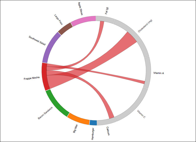
A chord diagram represents a relationship between two datasets. The way this template is designed, we established a format that works with data in the exactly following format:
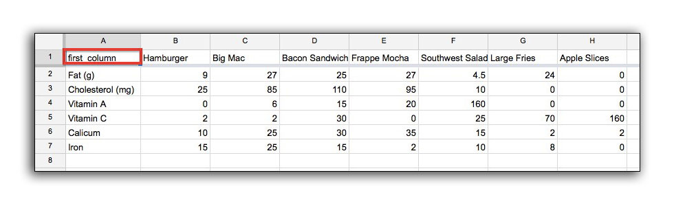
The headers across the top of the spreadsheet will be the source data in the diagram, and will be displayed along the left side of the circle. The data in the first column of the spreadsheet will be the target data in the digram, and will be listed at the right side of the circle.
Because D3 brings in data as rows and doesn’t discern any column from another, it’s important to tell D3 the name of the first column in the code below. See the comments in the code.
NOTE: This example uses nutritiondata.csv, which needs to be in the same folder as your .html file. This project will only work when launched from a web server.
<!DOCTYPE html>
<html>
<head>
    <meta charset="utf-8">
    <title>Chord Diagram</title>
    <style type="text/css">

    path{
        stroke: black;
        stroke-width: .25px;
    }
    path.fade{
        display: none;
    }
    </style>
</head>
<body>

<script src="http://d3js.org/d3.v5.min.js"></script>
<script>

var margin      = {top: 10, right: 10, bottom: 10, left: 10},
    width       = 600 - margin.left - margin.right,
    height      = 600 - margin.top  - margin.bottom,
    innerRadius = Math.min(width, height) * .35, //35% of smallest measurement
    outerRadius = innerRadius * 1.1; //110% of innerradius

var svg = d3.select("body").append("svg")
    .attr("width",  width  + margin.left + margin.right)
    .attr("height", height + margin.top  + margin.bottom)
    .append("g")
    .attr("transform", "translate(" + margin.left + "," + margin.top + ")")
    .append("g")
    .attr("class", "chordgraph")
    .attr("transform", "translate(" + width/2 + "," + height/2 + ")");

d3.csv("nutritiondata.csv").then(function(d){

    /*
     * IMPORTANT! Specify your first column of data here (see example data)
     *
     */
    var firstColumn = "first_column";

    //store column names
    var fc = d.map(function(d){ return d[firstColumn]; }),
        fo = fc.slice(0),
        maxtrix_size = (Object.keys(d[0]).length - 1) + fc.length,
        matrix  = [];

    //Create an empty square matrix of zero placeholders, the size of the data
    for(var i=0; i < maxtrix_size; i++){
        matrix.push(new Array(maxtrix_size+1).join('0').split('').map(parseFloat));
    }

    //go through the data and convert all to numbers except "first_column"
    for(var i=0; i < d.length; i++){

        var j = d.length;//counter

        for(var prop in d[i]){
            if(prop != firstColumn){
                fc.push(prop);
                matrix[i][j] = +d[i][prop];
                matrix[j][i] = +d[i][prop];
                j++;
            }
        }
    }

    //set color scale. More color options: https://github.com/d3/d3-scale-chromatic
    var color = d3.scaleOrdinal(d3.schemeCategory10)

    //d3 chord generator
    var chord = d3.chord()
        .padAngle(0.01)
        .sortSubgroups(d3.descending);

    //apply the matrix
    var chords = chord(matrix);

    //each ribbon generator
    var ribbon = d3.ribbon()
        .radius(innerRadius);

    //outer rim arc
    var arc = d3.arc()
        .innerRadius(innerRadius)
        .outerRadius(innerRadius + 20);

    //add each of the groupings for outer rim arcs
    var group = svg.append("g")
        .selectAll("g")
        .data(chords.groups)
        .enter()
        .append("g");

    //add each outer rim arc path
    group.append("path")
        .attr("fill", function(d){ return (d.index+1) > fo.length ? color(d.index): "#ccc"; })
        .attr("stroke", function(d){ return color(d.index); })
        .attr("d", arc)
        .style("cursor", "pointer")
        .on("mouseover", function(d, i){
            ribbons.classed("fade", function(d){
                return d.source.index != i && d.target.index != i;
            });
        });

    //add each ribbon
    var ribbons = svg.append("g")
      .attr("fill-opacity", 0.67)
      .selectAll("path")
      .data(chords)
      .enter()
      .append("path")
      .attr("d", ribbon)
      .attr("fill", function(d){ return color(d.target.index); })
      .attr("stroke", function(d){ return d3.rgb(color(d.target.index)).darker(); });

    //add the text labels
    group.append("text")
      .each(function(d){ return d.angle = (d.startAngle + d.endAngle) /2; })
      .attr("dy", ".35em")
      .attr("class", "text")
      .style("pointer-events","none")
      .attr("text-anchor", function(d) { return d.angle > Math.PI ? "end" : "start"; })
      .attr("transform", function(d,i){
          console.log(fc[i], d);
          //rotate each label around the circle
          return "rotate(" + (d.angle * 180 / Math.PI - 90) + ")" +
                 "translate(" + (outerRadius + 10) + ")" +
                 (d.angle > Math.PI ? "rotate(180)" : "");

      })
      .text(function(d,i){
          //set the text content
          return fc[i];
      })
      .style("font-family","sans-serif")
      .style("font-size","10px");
});
</script>
</body>
</html>
Background info on this type of chord diagram
Chord diagrams typically use a square matrix to show relationships between two sets of data. Using a square matrix is technically possible to also specify different quantities depending on the direction of the data in a square matrix. However, square matrices are difficult for many people to understand, and also can be difficult to visually discern in a graph like a chord diagram.
More information about the structure of a Chord Diagram can be found here. This is useful to understanding the nature of how this type of graphic works.
In this template, I decided to create a boilerplate matrix that falls under very specific constraints:
- Each chord has only one quantity associated with it.
- The data isn’t a true many-to-many relationship. Instead, half of the circle is source data, and the other half is target data.
If our data was a 3x3 relationship (ABC -> DEF), the matrix would look like this in chart form:
| A | B | C | D | E | F | |
|---|---|---|---|---|---|---|
| A | 0 | 0 | 0 | 10 | 20 | 30 |
| B | 0 | 0 | 0 | 40 | 50 | 60 |
| C | 0 | 0 | 0 | 70 | 80 | 90 |
| D | 10 | 40 | 70 | 0 | 0 | 0 |
| E | 20 |
50 | 80 | 0 | 0 | 0 |
| F | 30 | 60 | 90 | 0 | 0 | 0 |
For example, notice that the value for an A -> E relationship is the same value as E -> A in the chart above.
This deviation from the norm is intentional, and only specific to the template we setup here. Most typical chord diagrams have varying quantities depending on the direction of the relationship.
As a two-dimensional array, we can represent the above values in the following manner:
var matrix = [
    [0,   0,  0,  10,  20,  30],
    [0,   0,  0,  40,  50,  60],
    [0,   0,  0,  70,  80,  90],
    [10, 40, 70,   0,   0,   0],
    [20, 50, 80,   0,   0,   0],
    [30, 60, 90,   0,   0,   0]
];
It would be possible to modify the code to provide your own matrix instead of using a CSV. However, you would need to remove the for loops which convert the .csv data to this format of matrix.