Introduction
Carto (formerly Carto DB) is a database, spreadsheet, and mapping browser-based software that is easy to use, but flexible enough to be customized with more advanced coding knowledge. At its heart, the software is a database software that you can run SQL queries on. SQL (Structured Query Language) is a way to organize and recall different types of data in a large set based on parameters you specify.
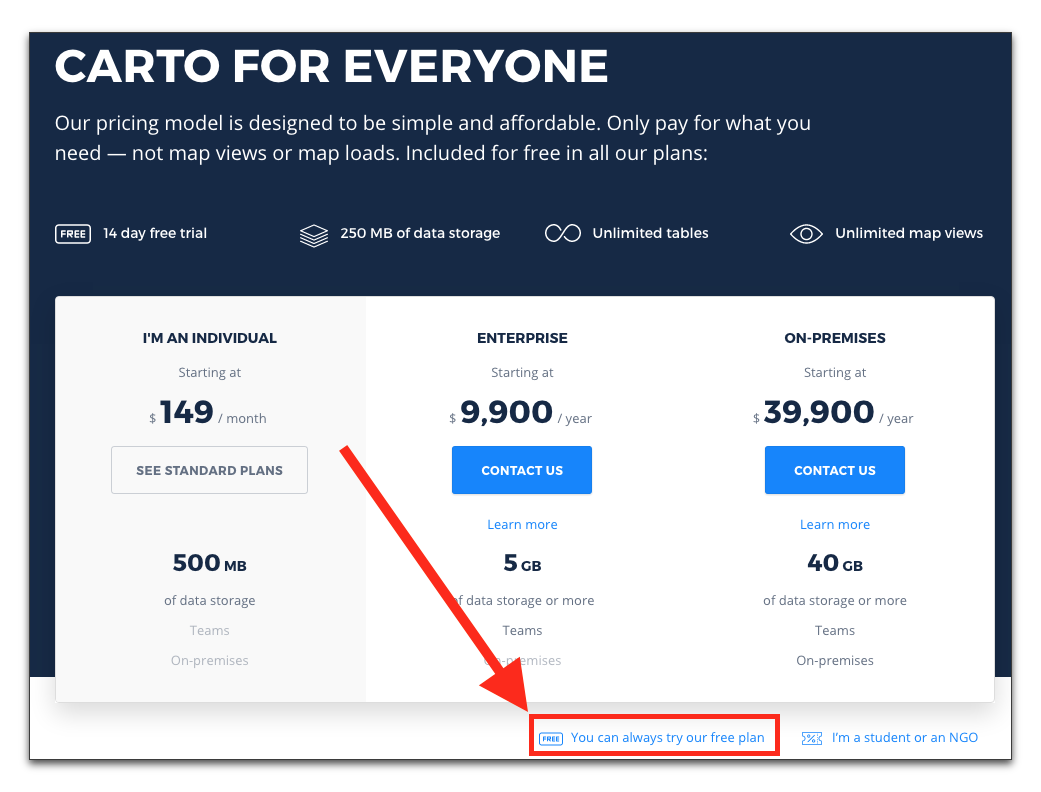
Carto is commercial software that works of a subscription model. As of the writing of this tutorial there is special discount for students and NGOs. There is also a basic free version that limits the amount of data and layers you can put on a map. It’s limitations give people an opportunity to try out the service.
Sign up for the free (or paid) accounts here.
Creating a New Map
After creating an account click to create a new map.

Carto does allow you to create an empty map that you can draw and annotate. But instead, we’ll upload our own dataset. For this tutorial, we’ll use bicycle accident data from San Francisco 2000-2012.
You could download the dataset to your computer and then upload it to Carto, but the interface allows you to link directly to the data from our website, saving you a step. In the box for linking to a .csv file, copy-and-paste the following URL:
https://newmedia.report/images/tutorials/cartodb/bicycle-collision-data.csv

Carto will give you the option to keep this file in sync in case it ever changes. This feature is only available for paid accounts. For the purposes of this tutorial, we will never sync the file. (The file won’t ever change)

Your map should display once the data is fully loaded:

Fixing Column Data Types
Carto will try to identify the type of data in each column. But sometimes it’s unsuccessful. To fix this, you’ll need to go into the data view, which will show you a table of the data.

Find the “data” column and click where it says “string.” This will allow you to change the data format for the column.

Using the appropriate data type will allow you to perform functions and filter the data appropriately.
Filtering the Data
Filtering data is a way to show only a specific part of your dataset based on some parameters you set. Let’s filter our data by date.
Go back to Map View and click the small bar-chart icon to go into filter mode.

Let’s filter by the data column, and then adjust the sliders so we only include one year.

Next, we can add additional filters. Let’s add a new filter by pressing the plus icon (+) and choosing party_at_fault_string column.

The filter will automatically group similar data points in the column and display ‘switches’ that you can turn on or off. As you switch each of them off, you can see the specific data points on the map left over.
Running SQL Queries
SQL stands for “Structured Query Language.” It’s a way to type commands that sort or query data. As you were making filters in the previous example, Carto was creating SQL commands automatically based on the filters you set up. SQL is user-friendly enough to mostly make sense of it once it’s written. Click on the SQL button and you’ll see the two filters you setup:

This is a way where you can make minor adjustments to the filters you setup on a more granular level than the filter tool can. Let’s deconstruct the components of the SQL statement:
The first line means “select ALL from the data_1” table.
SELECT * FROM data_1
The next line specifies the time ranges. In more plain English, it means “where date is more than or equal to 1/1/2000, and less than 10/20/2002”
The >= means “more than or equal to”.
WHERE (date >= ('2000-01-01T15:40:00-08:00') AND date <= ('2002-10-20T20:47:22-07:00'))
The last part is the filter for who is at fault. The last part “IS NOT NULL” means is not blank.
AND party_at_fault_string IN ('Bicyclist') AND party_at_fault_string IS NOT NULL
Map Layer Wizards
Carto comes packaged with some simple to use map layer wizards for displaying your mapping data in a variety of ways. As you switch between the different displays, you can adjust the settings below.

Carto CSS
Carto allows you to customize the appearance of the map using a special type of CSS (Cascading Style Sheet) language.

You can manually type the CSS in, using CartoCSS reference pages, or you can use an external tool for designing a map. The (as of the writing of this tutorial) discontinued Tilemill tool has a gallery of map styles that can be exported for Carto.
Annotating the Map
Carto also has several features for annotating maps in the Map View section. Find the main tool bar where it says “Add Element” and select one of the options for adding text, images, or annotations.

You can then drag the annotations or text boxes around on the map.

Customizing the Info Window
The info window is the bubble that pops up when a user either click or hovers over a data marker. You can customize this under the info window settings pallet.

Check the options that you want to display. There is also a small button for customizing the HTML of the info window. You can also modify the styling of the info window.
