Introduction to CSS
This tutorial is designed to start from where the HTML tutorial left off. If you’re unfamiliar with HTML, it’s a good idea to read that tutorial first
Start with a basic HTML page
Use the index.html page from the HTML tutorial as a starting point. We will make one small change to your file: Just after the opening <body> tag, we will add a <div id="container"> tag, which will wrap your entire page. Just before the closing </body> tag, add a closing </div> tag as well.
If you’re uncertain if your project from the previous lesson is correct and want to start fresh, below is a boilerplate HTML page from last class. You can use this as a starting point instead, if you wish.
<!DOCTYPE html>
<html>
    <head>
        <meta charset="utf-8">
        <meta http-equiv="X-UA-Compatible" content="IE=edge">
        <title>My First Webpage</title>
        <meta name="description" content="An example web page built in Web Skills class">
        <meta name="viewport" content="width=device-width, initial-scale=1">
    </head>
    <body>
        <div id="container">
            <header>
                <h1>Jeremy Rue</h1>
                <h2>My first web page</h2>
            </header>
            <nav>
                <ul>
                    <li>Home</li>
                    <li>Blog</li>
                    <li>Portfolio</li>
                    <li>Contact</li>
                </ul>
            </nav>
            <article>
                <h2>Photos from my last vacation</h2>
                <img src="http://s23.postimg.org/83dry9qhn/flower.jpg" alt="Flower">
                <p>Lorem ipsum dolor sit amet, consectetur adipisicing elit, sed do eiusmod tempor incididunt ut labore et dolore magna aliqua. Ut enim ad minim veniam, quis nostrud exercitation ullamco laboris nisi ut aliquip ex ea commodo consequat. Duis aute irure dolor in reprehenderit in voluptate velit esse cillum dolore eu fugiat nulla pariatur. Excepteur sint occaecat cupidatat non proident, sunt in culpa qui officia deserunt mollit anim id est laborum.</p>
                <p class="quote">Lorem ipsum dolor sit amet, consectetur adipisicing elit, sed do eiusmod tempor incididunt ut labore et dolore magna aliqua. Ut enim ad minim veniam, quis nostrud exercitation ullamco laboris nisi ut aliquip ex ea commodo consequat. Duis aute irure dolor in reprehenderit in voluptate velit esse cillum dolore eu fugiat nulla pariatur. Excepteur sint occaecat cupidatat non proident, sunt in culpa qui officia deserunt mollit anim id est laborum.</p>
                <p>Lorem ipsum dolor sit amet, consectetur adipisicing elit, sed do eiusmod tempor incididunt ut labore et dolore magna aliqua. Ut enim ad minim veniam, quis nostrud exercitation ullamco laboris nisi ut aliquip ex ea commodo consequat. Duis aute irure dolor in reprehenderit in voluptate velit esse cillum dolore eu fugiat nulla pariatur. Excepteur sint occaecat cupidatat non proident, sunt in culpa qui officia deserunt mollit anim id est laborum.</p>
            </article>
            <article>
                <h2>Photos from my last vacation</h2>
                <img id="flower" src="http://s23.postimg.org/83dry9qhn/flower.jpg" alt="Flower">
                <p>Lorem ipsum dolor sit amet, consectetur adipisicing elit, sed do eiusmod tempor incididunt ut labore et dolore magna aliqua. Ut enim ad minim veniam, quis nostrud exercitation ullamco laboris nisi ut aliquip ex ea commodo consequat. Duis aute irure dolor in reprehenderit in voluptate velit esse cillum dolore eu fugiat nulla pariatur. Excepteur sint occaecat cupidatat non proident, sunt in culpa qui officia deserunt mollit anim id est laborum.</p>
                <p class="quote">Lorem ipsum dolor sit amet, consectetur adipisicing elit, sed do eiusmod tempor incididunt ut labore et dolore magna aliqua. Ut enim ad minim veniam, quis nostrud exercitation ullamco laboris nisi ut aliquip ex ea commodo consequat. Duis aute irure dolor in reprehenderit in voluptate velit esse cillum dolore eu fugiat nulla pariatur. Excepteur sint occaecat cupidatat non proident, sunt in culpa qui officia deserunt mollit anim id est laborum.</p>
                <p>Lorem ipsum dolor sit amet, consectetur adipisicing elit, sed do eiusmod tempor incididunt ut labore et dolore magna aliqua. Ut enim ad minim veniam, quis nostrud exercitation ullamco laboris nisi ut aliquip ex ea commodo consequat. Duis aute irure dolor in reprehenderit in voluptate velit esse cillum dolore eu fugiat nulla pariatur. Excepteur sint occaecat cupidatat non proident, sunt in culpa qui officia deserunt mollit anim id est laborum.</p>
            </article>
        </div>
    </body>
</html>
Add <style> tags to the head for including CSS code
CSS code goes between the opening and closing <style> tags in the <head> of the document.
<head>
    <meta charset="utf-8">
    <meta http-equiv="X-UA-Compatible" content="IE=edge">
    <title>My First Webpage</title>
    <meta name="description" content="An example web page built in Web Skills class">
    <meta name="viewport" content="width=device-width, initial-scale=1">

    <style>


    </style>

</head>
Notice the addition of the style tags above. Make sure to add these to your own page in the appropriate place in the <head> of your document.
Adding some body styles
Styles that affect the body tag of your HTML document are considered baseline styles. Since your entire page is within the <body> tag, they will affect everything!
We will first change the font to Garamond, creating a fallback to Georgia, then any serif font. Let’s also set the background color.
body{
    background-color: #4A547F;
    font-family: Garamond, Georgia, serif;
}
The above code goes inside your style tags.
Adding some styles to the container ID
We created a <div id="container"> tag to your page earlier. That ID is accessible in CSS by using the pound symbol #container. This gives us the ability to style this tag specifically, and differentiate it from other div tags.
The styles we will add are background color to a whiter color, adding some padding and setting a defined width. By setting the left and right margins to “auto,” we create an effect of centering this div tag.
#container{
    background-color: #eeeeee;
    padding: 10px;
    width: 500px;
    margin-left: auto;
    margin-right: auto;
    border: 1px dotted black;
}
Add the following CSS rule after the body rule. Careful not to place one inside the other.
Styling the header tags
For the main heading, we will make the font size larger than the default by changing it to 60 pixels. We also want to center the text, and remove the default margins.
h1{
    font-size: 60px;
    text-align: center;
    margin: 0;
}

h2{
    text-align: center;
    margin-top: 0;
}
Styling the unordered list for navigation
We are using an unordered list for our navigation, denoted by a <ul> tag. Let’s center the contents of the tag, add a background color and 10 pixels of padding.
For the <li> tag, we will display in inline which means we want it to run on like text, instead of each element being on its own line. This will cause each list item to appear side-by-side.
ul{
    text-align: center;
    background-color: #939CBF;
    padding: 10px;
}

li{
    display: inline;
    padding: 10px;
}
Another thing we can do is change the background color whenever the user move the mouse over this <li> tag by using the :hover pseudo-selector. The :hover means this style will only be applied when the user moves the mouse over the li tag.
li:hover{
    background-color: white;
    cursor: pointer;
}
Styling the block quote
To make the two block quotes stand out, and indicate visually they are from another source, we will style them using the class selector .quote.
.quote{
    margin: 30px;
    font-style: italic;
    font-family: Helvetica, Arial, serif;
    line-height: 20px;
    color: #999999;
}
Resizing an image
If you want to resize the image, you can do that in CSS as well. We can set width and height properties after referencing the image like so width:300px. But we’ll set the width to 100% so that it consumes the entire space it’s given. This will also make it more responsive. There is a special value of auto that we can set on the height. Auto simply means the height should automatically be set at the appropriate ratio given the width the image has.
img{
    width: 100%;
    height: auto;
}
Centering an image
If you ever want to center an image, you have to change its display property to block first. This means the image won’t be inline like text, and that you can apply both margin-left and margin-right values to the image.
/* center an image */
img{
    display: block;
    margin-left: auto;
    margin-right: auto;
}
Next, add some of your own styles. It’s important to experiment.
Recipe practice Assignment
A practice assignment is to create a recipe for a delicious meal.
The recipe requires the following elements:
- A title or
<header>describing the recipe. This means using both<header>and<h1>tags. - A photograph depicting the finished meal. You can upload them to PostImage hosting service.
- A list of ingredients
- A description of the process on how to make the meal, and optionally any background info about the meal.
CSS Recipe Assignment FAQ
Q. How do I add an image to my recipe website?
A. You should upload your image to PostImage and then copy the Direct Link URL to your clipboard. Then write out an HTML img tag, and paste your PostImage link in the src="" attribute. Don’t forget the alt attribute!
<img src="https://s21.postimg.org/6ryyiwuef/example.png" alt="example">
Q. How do I add a background image?
A. You should either find a background image online, or upload your own to PostImage. You have to set the image to serve as the background of an element. You can do this to the body if you want the image to be the background of the whole page.
body{
    background-image: url(https://example.com/example.png);
}
By default, background images repeat. Sometimes you want this to happen, such as when you use background patterns. But you avoid this, or optionally add some additional CSS properties for controlling the way the background image appears.
body{
    background-image: url(https://example.com/example.png);
    background-repeat: no-repeat;
    background-position: center top; /* horizontal and vertical position */
    background-size: cover; /* also use "contain" to not crop */
}
Q. What’s the difference between a <ul> and <ol>?
A. The <ul> tag stands for “unordered list” and is a list where the order isn’t as important. Think: a bulleted list. The <ol> tag is a numbered list where the order is important, (such as following steps in a recipe). Here are examples of both:
<ul>
    <li>Butter</li>
    <li>Sugar</li>
    <li>Egg</li>
    <li>Flour</li>
</ul>

<ol>
    <li>Mix all together in a bowl.</li>
    <li>Put in oven.</li>
    <li>Eat.</li>
</ol>
Q. How do I include Google Fonts?
A. You can visit the Google Fonts website and pick out the font you want to include. Click on the + button, and then when you’re ready, click on the bottom tab and it will give you a link to some code you can put in the <head> of your document to embed the font. You should put this before your <style> tag for the rest of your CSS.
<head>
    <meta charset="utf-8">
    <title>My Recipe</title>


    <link href="https://fonts.googleapis.com/css?family=Roboto" rel="stylesheet">
    <style>
        body{
            font-family: 'Roboto', sans-serif;
        }
    </style>

</head>
You will need to add the font-family property to any areas you want to use that font. It’s not advised to use a display font on body text.
Q. What are some other cool CSS tricks I can do?
A. Check out CoDrops for some ideas and tutorials. There is also CodePen which is much more technical, but sometimes students find interesting things they can incorporate into their site. Lastly, Google is your friend.
There is no extra credit for whiz-bang features… but they look fun.
Review of CSS Selectors
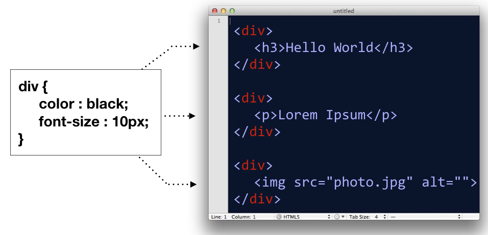
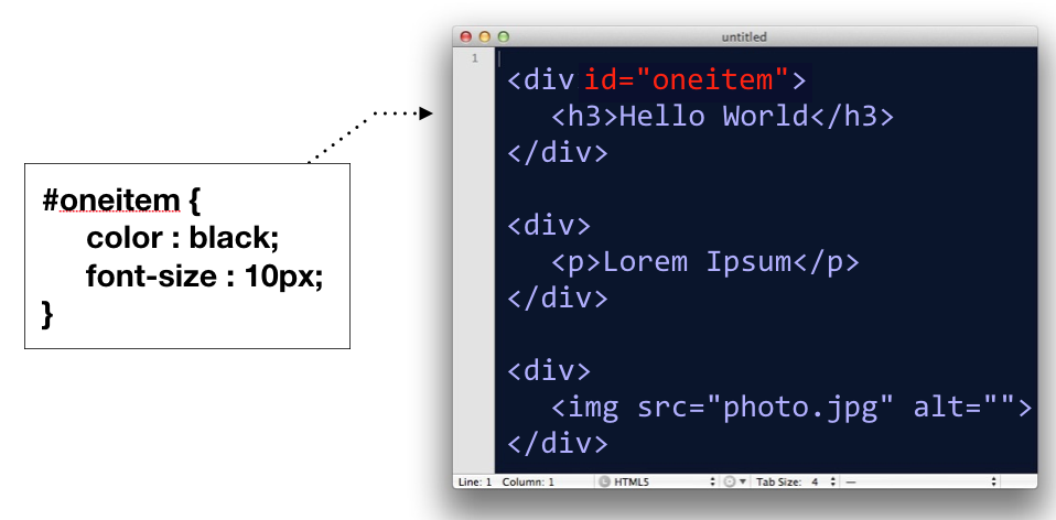
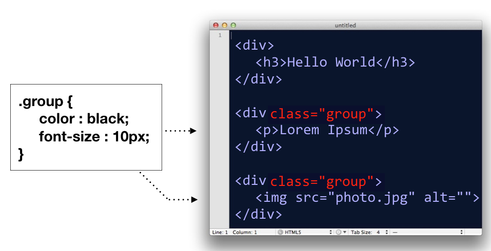
In the above lesson, we went over the three basic types of selectors in CSS:
- Type (or name) selector for selecting an element by its name
div
- ID selector, for selecting an element by it’s id attribute
#oneitem
- Class selector, for selecting groupings of elements by their class attribute
.group
In addition to these, there is actually a whole host of ways you can select elements in a document. We’ll go over two of them.
Comma Separated CSS Selectors
In CSS, you can comma-separate selectors so that a rule will apply to multiple selectors at once.
p, div, h1 {
    color : black;
    font-size : 12px;
}
In the above code block, the CSS rule is being applied to <p> tags, <div> tags, and <h1> tags.
This is equivalent to writing:
p{
    color : black;
    font-size : 12px;
}
div{
    color : black;
    font-size : 12px;
}
h1{
    color : black;
    font-size : 12px;
}
So basically, it’s a shortcut; nothing more.
Space Separated CSS Selectors
When you have several elements in a selector which are separated by spaces, it implies that some elements are nested in other elements.
/* only affects p tags inside container element */
#container p{
  background: orange;
}

/* However, this would affect all p tags */
p{
    background: orange
}
The above code would only target <p> tags which are decedents of a #container element. If there are other p tags in the document elsewhere, those are left alone.
Box Model
Next, let’s go over the box model, which consists of margins, padding and a border. It’s important to note that when you set a width using CSS, it only applies to the content inside the box. Padding, margins and borders are extra. (Note however, there is a CSS rule called box-sizing that can switch this fact around).
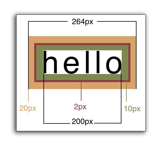
In code, the above would look like this:
<head>
    <style>
    div{
        width: 200px;
        padding: 10px;
        border: 2px;
        margin: 20px;
    }
    </style>
</head>
<body>
    <div>Hello</div>
</body>
Specifying Multiple Margin or Padding Values
When specifying margins or padding, you can set all four values at once.
/* top, right, bottom, left */
div{
    margin: 3px 4px 10px 5px;
}

/* the above is equivalent to */
div{
    margin-top: 3px;
    margin-right: 4px;
    margin-bottom: 10px;
    margin-left: 5px;
}
These for numbers correspond to the top, right, bottom, left, respectively.
Think about a clock starting at 12:00 (top), and then count clockwise: 3:00 (right), 6:00 (bottom), and 9:00 (left).
 Clock designed by Dmitry Baranovskiy from the Noun Project, Attribution (CC BY 3.0)
You will also see instances where only two numbers are specified:
/* 10px refers to the top and bottom, while 15px refers to left and right */
div{
    padding: 10px 15px;
}

/* the above is equivalent to */
div{
    padding-top: 10px;
    padding-bottom: 10px;
    padding-right: 15px;
    padding-left: 15px;
}
The first number refers to both the top and bottom padding, while the second number refers to the left and right measurements.
On a rare occasion, you might see three numbers specified:
/* 10px is top, 15px is both left and right, 20px is bottom */
div{
    margin: 10px 15px 20px;
}
In these situations, the first number is only the top, second number is left and right, and the third number is for the bottom. Think: We’re still going clockwise, but without the fourth number, we simply default to what the right measurement was set at.
Measuring the Box Model Correctly
There is a counter-intuitive issue with the Box Model in CSS. The appearance of a box is determined by the padding, border and width combined. This means if you set the width of a box to 200px, then add a 1px border, then add 10px of padding, the box will actually appear as 222px (200 + 1 + 1 + 10 + 10).
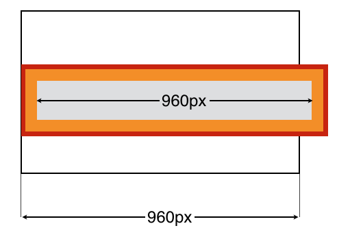
#container{
    width: 960px;
}
#innerbox{
    width: 960px;
    padding: 10px;
    border: 1px solid red;
}
In the example above, the containing box is 960px wide, and the inner box is also 960px wide. But you’ll notice that the inner box doesn’t fit! This is because when you add padding, it widens the box in addition to the width. The inner box has a border (shown in red) and padding (shown in orange).
When you add padding or border, this increases the size of the box beyond the width value you set.
This tutorial was written by Jeremy Rue
Copyright UC Berkeley Graduate School of Journalism . Any code samples in these tutorials are provided under the MIT License
The above copyright notice and this permission notice shall be included in all copies or substantial portions of the Software.
THIS PAGE IS PROVIDED "AS IS", WITHOUT WARRANTY OF ANY KIND, EXPRESS OR IMPLIED, INCLUDING BUT NOT LIMITED TO THE WARRANTIES OF MERCHANTABILITY, FITNESS FOR A PARTICULAR PURPOSE AND NONINFRINGEMENT. IN NO EVENT SHALL THE AUTHORS OR COPYRIGHT HOLDERS BE LIABLE FOR ANY CLAIM, DAMAGES OR OTHER LIABILITY, WHETHER IN AN ACTION OF CONTRACT, TORT OR OTHERWISE, ARISING FROM, OUT OF OR IN CONNECTION WITH THE INFORMATION IN THIS PAGE OR THE USE OR OTHER DEALINGS IN THIS INFORMATION.