Using Bootstrap framework for building websites
What is Bootstrap?
Bootstrap is an HTML/CSS framework for quickly building websites. It also contains several optional JavaScript components for adding various functionality, like a carousel or drop-down menus.
It was created by developers at Twitter as an internal tool, then later was open-sourced to help create a standard design scheme across the web.
Download Boostrap directly from their website. There are options to download the source code, or a pre-compiled developer version called SASS, which allows you to customize some of the Bootstrap options.
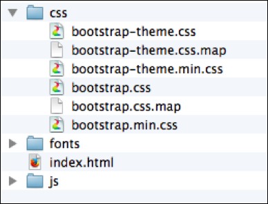
There are six files in the css folder. The bootstrap-theme files are optional theme files which you can load in addition to bootstrap proper. The other three pertain to the actual bootstrap framework.
bootstrap.css— the actual editable Bootstrap library.bootstrap.css.map— a special developer file when debugging code with Chrome’s developer tools.bootstrap.min.css— same as the first, but a compressed version. This is the version we will use.
The files in the JavaScript folder are optional, and will be included only if you intend on using any of the JavaScript components.
Including Bootstrap in your web page
To include Bootstrap CSS in your web page, you need to add a link to the bootstrap.min.css file in the <head> of your document.
<head>
      <link href="css/bootstrap.min.css" rel="stylesheet">
</head>
However, a better way to include Bootstrap in your web page is to use a boilerplate template shown on bootstrap’s website, which also has the above code, but in addition it contains many other meta tags that are useful to enabling responsive design on mobile devices, as well as fallbacks for older browsers.
We’ve listed the HTML template from the Bootstrap site here:
<!DOCTYPE html>
<html lang="en">
  <head>
    <meta charset="utf-8">
    <meta http-equiv="X-UA-Compatible" content="IE=edge">
    <meta name="viewport" content="width=device-width, initial-scale=1">
    <title>Bootstrap 101 Template</title>

    <!-- Bootstrap -->
    <link href="css/bootstrap.min.css" rel="stylesheet">

    <!--[if lt IE 9]>
      <script src="https://oss.maxcdn.com/html5shiv/3.7.2/html5shiv.min.js"></script>
      <script src="https://oss.maxcdn.com/respond/1.4.2/respond.min.js"></script>
    <![endif]-->
  </head>
  <body>
    <h1>Hello, world!</h1>

    <!-- jQuery (necessary for Bootstrap's JavaScript plugins) -->
    <script src="https://ajax.googleapis.com/ajax/libs/jquery/1.11.1/jquery.min.js"></script>
    <!-- Include all compiled plugins (below), or include individual files as needed -->
    <script src="js/bootstrap.min.js"></script>
  </body>
</html>
Copy the above text, then paste it into a blank TextMate or Sublime document. Save it as index.html in the Bootstrap dist folder you download from their website. (The dist folder will be in a .zip file initially.)
Applying Some Basic Styles
The CSS page on the Bootstrap website has some great resources on some of the various classes you can apply to elements to style them in a very attractive way.
Contextual Colors
Try typing some text into the <body> of your index.html file, then apply various classes to see the effect:
<p class="text-muted">   This text will appear gray or muted.</p>
<p class="text-primary"> This text will appear blue, as a primary indicator.</p>
<p class="text-success"> This text will appear green, to indicate a successful action.</p>
<p class="text-info">    This text will appear muted green, to indicate information.</p>
<p class="text-warning"> This text will appear orange, to indicate a warning.</p>
<p class="text-danger">  This text will appear red, to indicate a warning.</p>
Below are examples of how this would look on a web page:
This text will appear gray or muted.
This text will appear blue, as a primary indicator.
This text will appear green, to indicate a successful action.
This text will appear muted green, to indicate information.
This text will appear orange, to indicate a warning.
This text will appear red, to indicate a warning.
Buttons
Bootstrap also has styles built in for giving buttons different looks depending on their context.
Any button can have the btn class to give it basic style, then a number of specialized contextual classes, like btn-default or btn-primary to color it for a specific purpose.
<!-- Standard button -->
<button type="button" class="btn btn-default">Default</button>

<!-- Provides extra visual weight and identifies the primary action in a set of buttons -->
<button type="button" class="btn btn-primary">Primary</button>

<!-- Indicates a successful or positive action -->
<button type="button" class="btn btn-success">Success</button>

<!-- Contextual button for informational alert messages -->
<button type="button" class="btn btn-info">Info</button>

<!-- Indicates caution should be taken with this action -->
<button type="button" class="btn btn-warning">Warning</button>

<!-- Indicates a dangerous or potentially negative action -->
<button type="button" class="btn btn-danger">Danger</button>

<!-- Deemphasize a button by making it look like a link while maintaining button behavior -->
<button type="button" class="btn btn-link">Link</button>
These are example of how the above code would appear on a web page:
Check out the CSS page on the Bootstrap website for additional examples of classes you can add to your document.
The Grid System
Bootstrap uses a 12 column grid system for creating a page layout. When creating <div> box elements, you can specify the size by adding a class name based on the grid.
If you imagine a 12 column grid over your site, you can specify how many columns each box will be.
Structure of the Grid
Bootstrap grids start with a container or container-fluid. The container holds your website as a centered column, and container-fluid extends the site from edge to edge of your page.
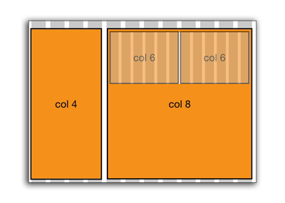
Next, specify a series of stacked rows; each row should have columns which add up to 12 or less.
<div class="container">

    <div class="row">
        <div class="col-sm-6"></div>
        <div class="col-sm-6"></div>
    </div>

    <div class="row">
        <div class="col-sm-4"></div>
        <div class="col-sm-4"></div>
        <div class="col-sm-4"></div>
    </div>

    <div class="row">
        <div class="col-sm-8"></div>
        <div class="col-sm-4"></div>
    </div>

</div>
In the above code snippet, we see three rows with examples of columns, each which add up to 12.
Specifying the Column Breakpoints
In the Bootstrap grid system, columns will break into a stacked mobile-view once they hit a certain width breakpoint of the browser. This is the two-letter designation after the col- part.
col-xs-4The XS never breaks into a stacked form. The grid maintains throughout the various screen sizes.col-sm-4The SM breaks into mobile view at 768px.col-md-4The MD breaks into mobile view at 992px.col-lg-4The LG breaks into mobile view at 1200px.
Nesting Grids
An entire new grid system can be placed inside one column. In this situation, you should only add an additional row <div>, which resets the grid.
In code, the above picture would look like this:
<div class="container">
    <div class="row">
        <div class="col-sm-4">
        </div>
        <div class="col-sm-8">
            <div class="row">
                <div class="col-sm-6">
                </div>
                <div class="col-sm-6">
                </div>
            </div>
       </div>
    </div>
</div>
The part which is highlighted shows an entire new grid within one column of the existing grid. By specifying the row, the count is reset, and the columns inside can add up to 12.
Offsetting Columns
Another feature of the Bootstrap grid system is offsetting columns. While it it technically possible to fill in blank space with empty <div> tags, it’s much cleaner to apply offsets, which essentially push div boxes over a certain number of columns.
Offsets are designated with class names just like columns, but with the word “offset” after the size: col-sm-offset-3 for example.
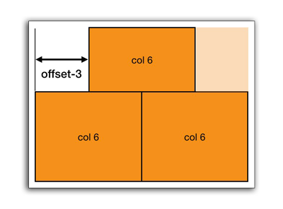
The above image would appear like so in code:
<div class="container">
    <div class="row">
        <div class="col-sm-6 col-sm-offset-3"></div>
    </div>
    <div class="row">
        <div class="col-sm-6"></div>
        <div class="col-sm-6"></div>
    </div>
</div>
Notice the top div is six columns, but is offset three columns from the left. The columns in each row don’t necessarily have to add up to 12.
Setting Up a Basic Portfolio Website
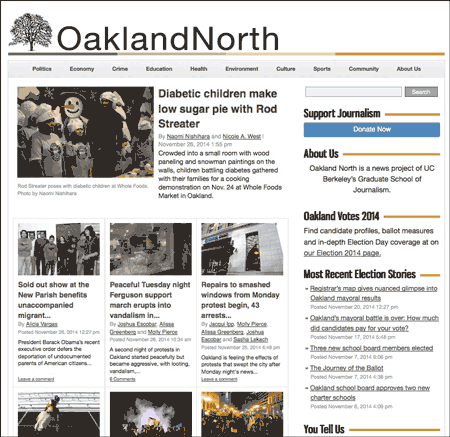
In this section, we will go through the process step-by-step of creating a basic portfolio website. It’s best to download a starting template for setting up your portfolio website. There are many free tutorials at StartBootstrap.com that you can use. This tutorial will go through using a one build by the instructor based on several free portfolio styles.
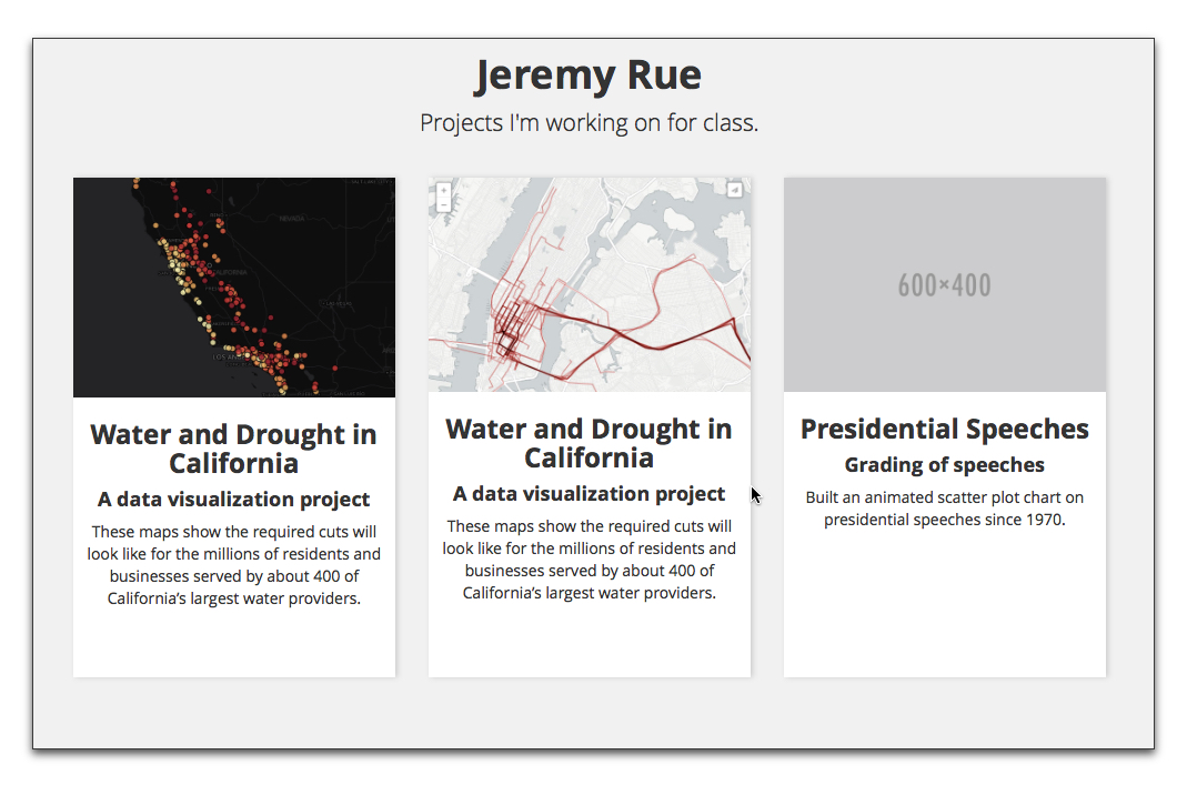
- Click this link to download the template shown above in the picture.
- Move the .zip file to a location where you will be working on your website.
- Unzip the file by double-clicking it.
- Open the
index.htmlin a text editor like Brackets or Sublime Text.
Step 1. Edit the Metadata in the <head>
First step is to personalize the metadata in the document <head>. Right now it’s generic, and it’s best to get this out of the way so that when you upload your website to a server, Google doesn’t index a lot of generic data.
Fill in the “content” values for the description and author attributes (area between the quotes.) Also, change the <title> tag to your own name. This will be the name of your site in Google search results and when people bookmark your site.
<meta name="description" content="">
<meta name="author" content="">
Step 2. Change the Site Branding
Find the line of code which says “Your Name Here” (on or near line 46). Change this to your own name.
<header>
    <h1>Your Name Here</h1>
    <p>A short tagline of what this page is about</p>
</header>
Step 3. Add the basic framework for a portfolio work piece
Following the process we learned in the Bootstrap lesson, we first need to create a <div> container that will house our entire portfolio section.
<div class="container">


</div>
This will go after the <header>, but before our JavaScript <script> tags at the bottom of our page.
Next, we will add a row div and three div boxes for each portfolio story. On a 12 column grid, in order to have three boxes we must make each box 4 columns wide (3 x 4 = 12).
<div class="row">
    <div class="col-sm-4">
    </div>
    <div class="col-sm-4">
    </div>
    <div class="col-sm-4">
    </div>
</div>
Stylistically, we should also add a text-center class to each of these boxes, so that the text will be centered automatically.
<div class="col-sm-4 text-center">
</div>
Step 4: Adding content to each box
Next, let’s add some content to each of our column boxes. We will add an image, and then link that image to the portfolio work clip we want to feature. If the clip you want to feature does not exist online somewhere, you can create a mini bootstrap page for the story yourself as a separate .html file, and link to that file by modifying the a tag like so: <a href="project2/"></a>. This would mean: Link to a separate index.html inside project2 folder.
Notice we also added an additional <div> tag with the class inner-box. This is a stylistic item only so that each box will appear white on a gray background.
<div class="inner-box">
    <a href="#">
        <img class="img-responsive" src="http://placehold.it/700x500" alt="">
    </a>
    <h3>Project One</h3>
    <h4>Subheading</h4>
    <p>Lorem ipsum dolor sit amet, consectetur adipisicing elit. Laudantium veniam exercitationem expedita laborum at voluptate. Labore, voluptates totam at aut nemo deserunt rem magni pariatur quos perspiciatis atque eveniet unde.</p>
</div>
Make sure your images have the class img-responsive so that they will resize automatically. The images will only get as large as their native size, so use a size like 700x500 for best results.
Step 5: Rinse, repeat
When you’re done, you should have the content added from Step 4 in each of the column boxes.
Getting a Hosting Provider and/or Registering your own Domain Name
Below is an overview of registering a domain with a hosting service from the previous class. This is optional, and listed here only for informational reasons.
Options for Hosting Your Website
In order to view your HTML file on the web, you need to host it on a web server. You have multiple options for purchasing a hosting service. There are two parts to getting a website:
- web hosting — this refers to the actual web server where your website is stored. You will need to access this server to upload your files.
- domain name — this is the URL address that people will type in to find your website.
Many companies will offer both services in one package, or you can buy them separately from two different companies even — hosting from one, and domain registration from another. Or, if you have an existing domain name, you can connect it to any other server.
We don’t have any specific recommendations for a hosting provider. Some of the big ones are GoDaddy and Bluehost. Costs vary, and are by monthly or yearly subscriptions, typically with big discounts when buying many years upfront.
Finding a Good Domain Name
A domain name (URL) represents the brand of your website. Finding a good one that hasn’t been taken can be tricky. A good place to check if a domain name has been taken is Instant Domain Search; there are many others as well.
If you have a unique enough name, you might want to try getting yourname.com. If it has already been taken, there are tricks to getting a similar name, like appending qualities of your work to the name, such as yourname-reporter.com, or yourname-media.com.
New Generic Top Level Domains (gTLD)
A number of new generic “Top Level Domains” (gTLD) have been added recently. A top-level domain is the abbreviation that comes after the dot in a URL, such as .com in www.example.com.
This means, even if you can’t get the .com version of your website, you might be able to get the .report or .media version.
List of new generic Top Level Domain names
Connecting You Domain Name to a Hosting Provider
If you are purchasing a domain name and hosting together from the same company as a packaged deal, you can skip this section. They usually automatically connect the two for you with no additional work.
But if you already have a domain name (URL) and you want to connect it to a different host, then you will need to find out the nameservers addresses for your hosting provider. A good way to find this is to look at the hosting provider’s documentation page, sometimes referred to as a “knowledge base.” Another way is to search Google for the name of your hosting provider and the word “nameservers.” For example, if Bluehost was my hosting provider, I would Google Bluehost nameservers and the first several links take me to pages with their name servers.
Name servers addresses typically (but not always) start with ns1, ns2, etc. Here are Bluehost’s nameserver addresses:
ns1.bluehost.com
ns2.bluehost.com
In the settings for your domain registrar (ex. GoDaddy, Bluehost, Namecheap), look for somewhere it says “nameserver” to set the appropriate nameservers for your hosting provider.
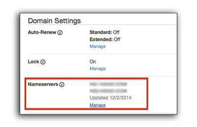
Then, you would log into the site or service where you registered your domain name, and enter in these nameserver addresses.
Connecting to Your Hosting Provider via FTP
Most hosting providers will give you access to your web sever via an online form or through a service called FTP. You should try to get FTP access to your server, as this is an easier way to upload multiple files quickly.
In order to connect to an FTP server, you will need the following information from your hosting provider. They may send this in an e-mail, or you might have to log into the hosting provider’s website and setup a new FTP account. The following information is typically what you will receive:
- Server Address — This a URL that connects to the server. It might look something like
ftp.example.com - Username — This might be your own username, domain name, or in the form of an email address like
user@example.com - Password — They typically choose a password for you. If not, make sure you create a strong password.
- Port — This is typically
21, but in some instance might be different.
Downloading an FTP Client
In order to connect to an FTP server, you need to download a piece of software called a “client.” The two for Mac we recommend are:
- CyberDuck (free) — A quick an easy way to connect to a server and upload files.
- Transmit (~$35) — A more featured FTP client, with some features if you are working with FTP servers often.
This tutorial will show screenshots for CyberDuck, but the setup is similar with other FTP clients.
Setting up a Connection
After downloading CyberDuck, copy it over to your Applications Folder. You may wish to also drag a copy to your Dock for quick access later. Launch CyberDuck.
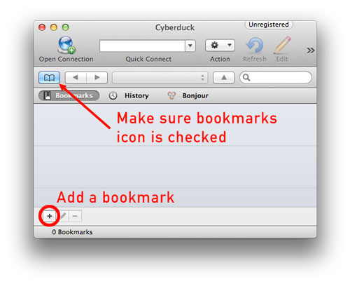
It’s best to add a bookmark so you can connect to your server later without re-entering your information.
Next, enter in the credentials you get from your hosting provider. Note that the “Nickname” field is arbitrary, and only for your own reference.
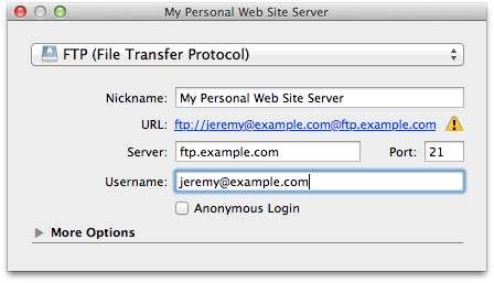
In some rare instances, your server may require only secured connections. In this situation, you want to change the drop-down menu at the top of this window from “FTP (File Transfer Protocol)” to either FTP-SSL or SFTP.
When you first connect, it will ask you for a password. You can check “save to keychain” at that time, so you don’t have to re-enter your password each time.
Uploading Content
Once you’ve established a connection to your webserver, you can begin uploading content. If you see any of the following folders, you should upload content there, as this is the document root of your website:
- public_html
- www
If you don’t see either of these folders, then you can upload files directly to where you logged in. It’s best to upload a sample index.html file with some unique content, then visit your website to see if it shows up to make sure the connection was property established.
Portfolio Examples
Many jobs in the journalism industry require a portfolio, demo reel, or written clips to demonstrate your abilities. The specific requirements of a portfolio depends on the type of job you’re applying for. If you’re just starting out, it’s OK if some clips aren’t published. But as you progress in your career, you’ll want to swap out less polished work with published examples of higher quality. Some, but not all, employers like to see a diversity of media types, such as writing, video, audio, and graphics examples in a single portfolio. In some jobs, this is less important.
A good portfolio has the following qualities:
- Quickly and easily conveys concise information about the person;
- Allows an employer to quickly grasp a sense and range of the work samples of the person;
- Has a simple navigation to different sections, often requiring fewest clicks needed to get to the content;
- Includes contact information, links to social media, and links to resume or other relevant information;
- Has a design that reflects the personality of the journalist.
It’s important to look at examples of other journalist portfolios to get a sense of the types of clips they post. Here are a few we will discuss in class:


Graphics/Data
- Charley Bodkin
- Lam Thuy Vo
- Armand Emamjomeh
- Jacky Myint
- Shan Carter
- Lena Groeger
- Hannah Recht
- Heather Jay Billings
- Evan Wagstaff
- Reuben Fischer-Baum
Video/Photographer Journalists
- J. Clark
- Lauren Frohne
- Andrew Burton
- Kainaz Amaria
- Chris Jordan-Bloch
- Rob Finch
- Tanya Habjouqa
- Dai Sugano
- Henrik Hansen
- Mark Andrew Boyer
- Ryan De Franco
- Ami Vitale
Documentary
Broadcast
Writers
- Ann Friedman
- Nicole Pasulka
- Lesley M. M. Blume
- Ariel Levy
- Amy Krouse Rosenthal
- Brett Murphy
- Alex Cuadros
- Aaron W. Gordon
- Angela Saini