CSS for designing a web page
Review of CSS Selectors
In the last class, we went over the three basic types of selectors in CSS:
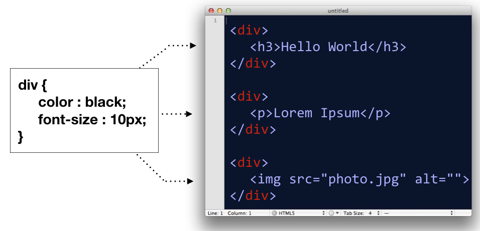
- Type (or name) selector for selecting an element by its name
div
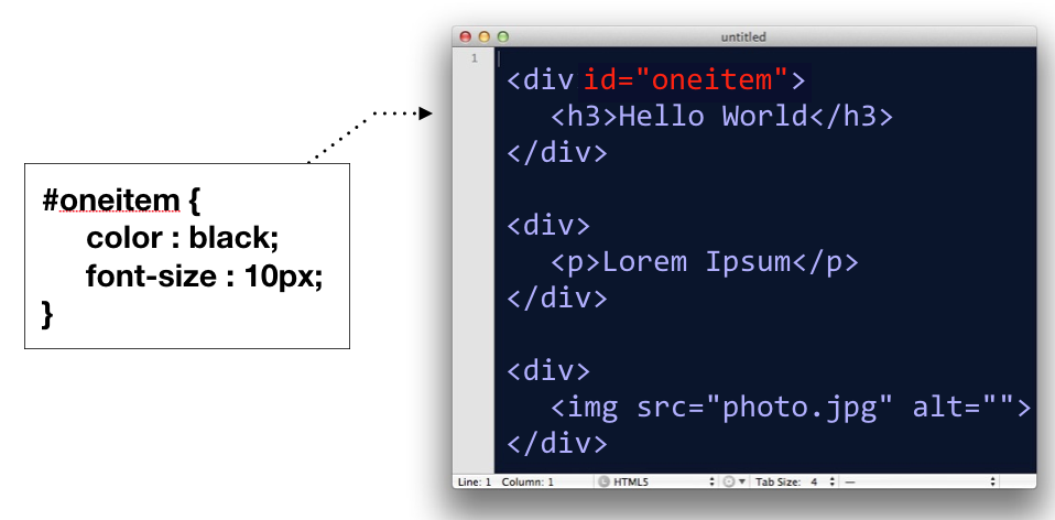
- ID selector, for selecting an element by it’s id attribute
#oneitem
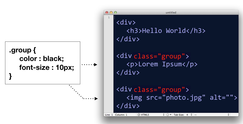
- Class selector, for selecting groupings of elements by their class attribute
.group
In addition to these, there is actually a whole host of ways you can select elements in a document. We’ll go over two of them.
Comma Separated CSS Selectors
In CSS, you can comma-separate selectors so that a rule will apply to multiple selectors at once.
p, div, h1 {
    color : black;
    font-size : 12px;
}
In the above code block, the CSS rule is being applied to <p> tags, <div> tags, and <h1> tags.
This is equivalent to writing:
p{
    color : black;
    font-size : 12px;
}
div{
    color : black;
    font-size : 12px;
}
h1{
    color : black;
    font-size : 12px;
}
So basically, it’s a shortcut; nothing more.
Space Separated CSS Selectors
When you have several elements in a selector which are separated by spaces, it implies that some elements are nested in other elements.
/* only affects p tags inside container element */
#container p{
  background: orange;
}

/* However, this would affect all p tags */
p{
    background: orange
}
The above code would only target <p> tags which are decedents of a #container element. If there are other p tags in the document elsewhere, those are left alone.
Box Model
Next, let’s go over the box model, which consists of margins, padding and a border. It’s important to note that when you set a width using CSS, it only applies to the content inside the box. Padding, margins and borders are extra. (Note however, there is a CSS rule called box-sizing that can switch this fact around).
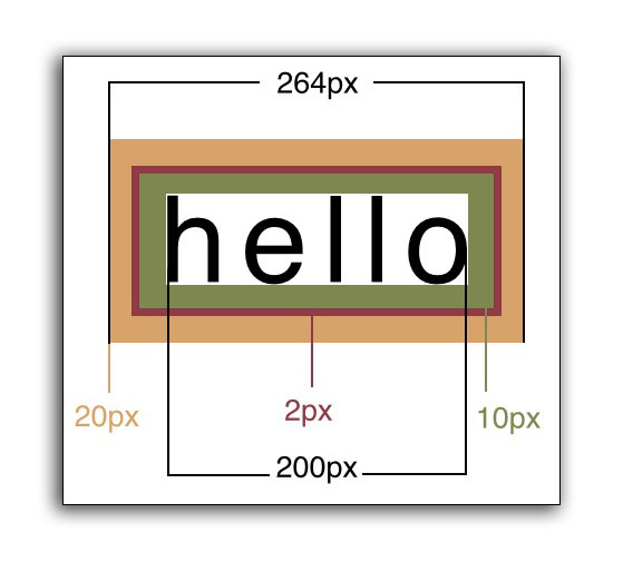
In code, the above would look like this:
<head>
    <style>
    div{
        width: 200px;
        padding: 10px;
        border: 2px;
        margin: 20px;
    }
    </style>
</head>
<body>
    <div>Hello</div>
</body>
Specifying Multiple Margin or Padding Values
When specifying margins or padding, you can set all four values at once.
/* top, right, bottom, left */
div{
    margin: 3px 4px 10px 5px;
}

/* the above is equivalent to */
div{
    margin-top: 3px;
    margin-right: 4px;
    margin-bottom: 10px;
    margin-left: 5px;
}
These for numbers correspond to the top, right, bottom, left, respectively.
Think about a clock starting at 12:00 (top), and then count clockwise: 3:00 (right), 6:00 (bottom), and 9:00 (left).
 Clock designed by Dmitry Baranovskiy from the Noun Project, Attribution (CC BY 3.0)
You will also see instances where only two numbers are specified:
/* 10px refers to the top and bottom, while 15px refers to left and right */
div{
    padding: 10px 15px;
}

/* the above is equivalent to */
div{
    padding-top: 10px;
    padding-bottom: 10px;
    padding-right: 15px;
    padding-left: 15px;
}
The first number refers to both the top and bottom padding, while the second number refers to the left and right measurements.
On a rare occasion, you might see three numbers specified:
/* 10px is top, 15px is both left and right, 20px is bottom */
div{
    margin: 10px 15px 20px;
}
In these situations, the first number is only the top, second number is left and right, and the third number is for the bottom. Think: We’re still going clockwise, but without the fourth number, we simply default to what the right measurement was set at.
Measuring the Box Model Correctly
There is a counter-intuitive issue with the Box Model in CSS. The appearance of a box is determined by the padding, border and width combined. This means if you set the width of a box to 200px, then add a 1px border, then add 10px of padding, the box will actually appear as 222px (200 + 1 + 1 + 10 + 10).
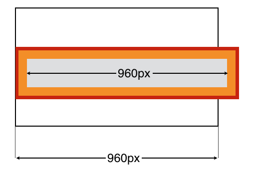
#container{
    width: 960px;
}
#innerbox{
    width: 960px;
    padding: 10px;
    border: 1px solid red;
}
In the example above, the containing box is 960px wide, and the inner box is also 960px wide. But you’ll notice that the inner box doesn’t fit! This is because when you add padding, it widens the box in addition to the width. The inner box has a border (shown in red) and padding (shown in orange).
When you add padding or border, this increases the size of the box beyond the width value you set.