Using Bootstrap framework for building websites
What is Bootstrap?
Bootstrap is an HTML/CSS framework for quickly building websites. It also contains several optional JavaScript components for adding various functionality, like a carousel or drop-down menus.
It was created by developers at Twitter as an internal tool, then later was open-sourced to help create a standard design scheme across the web.
Download Boostrap directly from their website. There are options to download the source code, or a pre-compiled developer version called SASS, which allows you to customize some of the Bootstrap options.
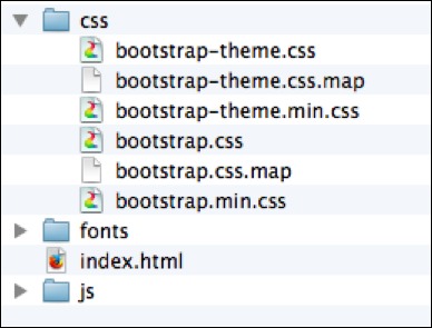
There are six files in the css folder. The bootstrap-theme files are optional theme files which you can load in addition to bootstrap proper. The other three pertain to the actual bootstrap framework.
bootstrap.css— the actual editable Bootstrap library.bootstrap.css.map— a special developer file when debugging code with Chrome’s developer tools.bootstrap.min.css— same as the first, but a compressed version. This is the version we will use.
The files in the JavaScript folder are optional, and will be included only if you intend on using any of the JavaScript components.
Including Bootstrap in your web page
To include Bootstrap CSS in your web page, you need to add a link to the bootstrap.min.css file in the <head> of your document.
<head>
      <link href="css/bootstrap.min.css" rel="stylesheet">
</head>
However, a better way to include Bootstrap in your web page is to use a boilerplate template shown on bootstrap’s website, which also has the above code, but in addition it contains many other meta tags that are useful to enabling responsive design on mobile devices, as well as fallbacks for older browsers.
We’ve listed the HTML template from the Bootstrap site here:
<!DOCTYPE html>
<html lang="en">
  <head>
    <meta charset="utf-8">
    <meta http-equiv="X-UA-Compatible" content="IE=edge">
    <meta name="viewport" content="width=device-width, initial-scale=1">
    <title>Bootstrap 101 Template</title>

    <!-- Bootstrap -->
    <link href="css/bootstrap.min.css" rel="stylesheet">

    <!--[if lt IE 9]>
      <script src="https://oss.maxcdn.com/html5shiv/3.7.2/html5shiv.min.js"></script>
      <script src="https://oss.maxcdn.com/respond/1.4.2/respond.min.js"></script>
    <![endif]-->
  </head>
  <body>
    <h1>Hello, world!</h1>

    <!-- jQuery (necessary for Bootstrap's JavaScript plugins) -->
    <script src="https://ajax.googleapis.com/ajax/libs/jquery/1.11.1/jquery.min.js"></script>
    <!-- Include all compiled plugins (below), or include individual files as needed -->
    <script src="js/bootstrap.min.js"></script>
  </body>
</html>
Copy the above text, then paste it into a blank TextMate or Sublime document. Save it as index.html in the Bootstrap dist folder you download from their website. (The dist folder will be in a .zip file initially.)
Applying Some Basic Styles
The CSS page on the Bootstrap website has some great resources on some of the various classes you can apply to elements to style them in a very attractive way.
Contextual Colors
Try typing some text into the <body> of your index.html file, then apply various classes to see the effect:
<p class="text-muted">   This text will appear gray or muted.</p>
<p class="text-primary"> This text will appear blue, as a primary indicator.</p>
<p class="text-success"> This text will appear green, to indicate a successful action.</p>
<p class="text-info">    This text will appear muted green, to indicate information.</p>
<p class="text-warning"> This text will appear orange, to indicate a warning.</p>
<p class="text-danger">  This text will appear red, to indicate a warning.</p>
Below are examples of how this would look on a web page:
This text will appear gray or muted.
This text will appear blue, as a primary indicator.
This text will appear green, to indicate a successful action.
This text will appear muted green, to indicate information.
This text will appear orange, to indicate a warning.
This text will appear red, to indicate a warning.
Buttons
Bootstrap also has styles built in for giving buttons different looks depending on their context.
Any button can have the btn class to give it basic style, then a number of specialized contextual classes, like btn-default or btn-primary to color it for a specific purpose.
<!-- Standard button -->
<button type="button" class="btn btn-default">Default</button>

<!-- Provides extra visual weight and identifies the primary action in a set of buttons -->
<button type="button" class="btn btn-primary">Primary</button>

<!-- Indicates a successful or positive action -->
<button type="button" class="btn btn-success">Success</button>

<!-- Contextual button for informational alert messages -->
<button type="button" class="btn btn-info">Info</button>

<!-- Indicates caution should be taken with this action -->
<button type="button" class="btn btn-warning">Warning</button>

<!-- Indicates a dangerous or potentially negative action -->
<button type="button" class="btn btn-danger">Danger</button>

<!-- Deemphasize a button by making it look like a link while maintaining button behavior -->
<button type="button" class="btn btn-link">Link</button>
These are example of how the above code would appear on a web page:
Check out the CSS page on the Bootstrap website for additional examples of classes you can add to your document.
The Grid System
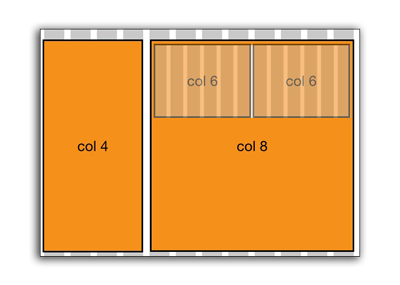
Bootstrap uses a 12 column grid system for creating a page layout. When creating <div> box elements, you can specify the size by adding a class name based on the grid.
If you imagine a 12 column grid over your site, you can specify how many columns each box will be.
Structure of the Grid
Bootstrap grids start with a container or container-fluid. The container holds your website as a centered column, and container-fluid extends the site from edge to edge of your page.
Next, specify a series of stacked rows; each row should have columns which add up to 12 or less.
<div class="container">

    <div class="row">
        <div class="col-sm-6"></div>
        <div class="col-sm-6"></div>
    </div>

    <div class="row">
        <div class="col-sm-4"></div>
        <div class="col-sm-4"></div>
        <div class="col-sm-4"></div>
    </div>

    <div class="row">
        <div class="col-sm-8"></div>
        <div class="col-sm-4"></div>
    </div>

</div>
In the above code snippet, we see three rows with examples of columns, each which add up to 12.
Specifying the Column Breakpoints
In the Bootstrap grid system, columns will break into a stacked mobile-view once they hit a certain width breakpoint of the browser. This is the two-letter designation after the col- part.
col-xs-4The XS never breaks into a stacked form. The grid maintains throughout the various screen sizes.col-sm-4The SM breaks into mobile view at 768px.col-md-4The MD breaks into mobile view at 992px.col-lg-4The LG breaks into mobile view at 1200px.
Nesting Grids
An entire new grid system can be placed inside one column. In this situation, you should only add an additional row <div>, which resets the grid.
In code, the above picture would look like this:
<div class="container">
    <div class="row">
        <div class="col-sm-4">
        </div>
        <div class="col-sm-8">
            <div class="row">
                <div class="col-sm-6">
                </div>
                <div class="col-sm-6">
                </div>
            </div>
       </div>
    </div>
</div>
The part which is highlighted shows an entire new grid within one column of the existing grid. By specifying the row, the count is reset, and the columns inside can add up to 12.
##Offsetting Columns
Another feature of the Bootstrap grid system is offsetting columns. While it it technically possible to fill in blank space with empty <div> tags, it’s much cleaner to apply offsets, which essentially push div boxes over a certain number of columns.
Offsets are designated with class names just like columns, but with the word “offset” after the size: col-sm-offset-3 for example.
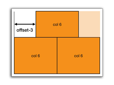
The above image would appear like so in code:
<div class="container">
    <div class="row">
        <div class="col-sm-6 col-sm-offset-3"></div>
    </div>
    <div class="row">
        <div class="col-sm-6"></div>
        <div class="col-sm-6"></div>
    </div>
</div>
Notice the top div is six columns, but is offset three columns from the left. The columns in each row don’t necessarily have to add up to 12.
Setting Up a Basic Portfolio Website
In this section, we will go through the process step-by-step of creating a basic portfolio website. It’s best to download a starting template for setting up your portfolio website. We will start with one of the templates on StartBootstrap.com.
Let’s use the 1 Col Portfoilo Theme as a starting point for a portfolio of work.
- Download the theme above, or click this link.
- Move the .zip file to a location where you will be working on your website.
- Unzip the file by double-clicking it.
- Open the
index.htmlin a editor like TextMate or Sublime Text.
Step 1. Edit the Metadata in the <head>
First step is to personalize the metadata in the document <head>. Right now it’s generic, and it’s best to get this out of the way so that when you upload your website to a server, Google doesn’t index a lot of generic data.
Fill in the “content” values for the description and author attributes (area between the quotes.) Also, change the <title> tag to your own name. This will be the name of your site in Google search results and when people bookmark your site.
<meta name="description" content="">
<meta name="author" content="">

<title>1 Col Portfolio - Start Bootstrap Template</title>
Step 2. Change the Site Branding
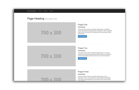
Find the line of code which says “Start Bootstrap” (on or near line 42). This is the small site brand in the upper left-hand corner. You can remove or change this to your own name.
<a class="navbar-brand" href="#">Start Bootstrap</a>
Step 3. Change the Navigational Links to Include Your Own Pages
The template comes with several nav links to other pages at top (e.g. About, Service and Contact). You may not have these pages, or may want to add them later. For now, let’s remove them.
Instead of completely deleting them, we can comment them out which means putting some special tags around them so that the browser doesn’t “see” the code, and ignores it. HTML comment tags can be written like this:
<!-- This content ignored by browser -->
Don’t forget the exclamation point and two dashes. You also need to close your comment. Failing to do so will keep the commented portion going, and possible comment out the rest of your page.
BEFORE:
<!-- Collect the nav links, forms, and other content for toggling -->
<div class="collapse navbar-collapse" id="bs-example-navbar-collapse-1">
    <ul class="nav navbar-nav">
        <li>
            <a href="#">About</a>
        </li>
        <li>
            <a href="#">Services</a>
        </li>
        <li>
            <a href="#">Contact</a>
        </li>
    </ul>
</div>
<!-- /.navbar-collapse -->
AFTER:
<!-- Collect the nav links, forms, and other content for toggling -->
<div class="collapse navbar-collapse" id="bs-example-navbar-collapse-1">
    <ul class="nav navbar-nav">
    <!--
        <li>
            <a href="#">About</a>
        </li>
        <li>
            <a href="#">Services</a>
        </li>
        <li>
            <a href="#">Contact</a>
        </li>
    -->
    </ul>
</div>
<!-- /.navbar-collapse -->
Notice we put a comment around the <li> tags. This allows us to see them and add them back later if we need to.
Step 4: Editing Project 1 of the Template
Scroll down in your code to the first project, around line 75. You can edit the text to reflect on your first project you’ve done.
<!-- Project One -->
<div class="row">
    <div class="col-md-7">
        <a href="#">
            <img class="img-responsive" src="http://placehold.it/700x300" alt="">
        </a>
    </div>
    <div class="col-md-5">
        <h3>Project One</h3>
        <h4>Subheading</h4>
        <p>Lorem ipsum dolor sit amet, consectetur adipisicing elit.</p>
        <a class="btn btn-primary" href="#">View Project <span class="glyphicon glyphicon-chevron-right"></span></a>
    </div>
</div>
<!-- /.row -->
In particular, you should edit the pound symbol # for the href attributes. A pound is like a placeholder in a link. Instead, you should put the full url to your first portfolio project out on the web.
<a href="http://example.com/my-totally-awesome-portfolio-item">
    <img class="img-responsive" src="http://placehold.it/700x300" alt="">
</a>
There are two places where you will need to edit the link code: In the <a> tags around the image (what we just did above), and the <a> tags that surround the button (example below). Edit the href attribute, replacing the pound symbol with the URL of your project. Both hrefs can be the same.
<a class="btn btn-primary" href="#"> ...
Step 5: Replacing Images With Your Own
Create a new folder called “images” in your template folder where you’re working. This is where we will save the image files for each project.
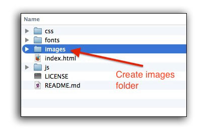
As we can see from the example image when we first downloaded the template, images are 700x300 pixels. It’s best to open your images in Photoshop and resize them to this size exactly. This will ensure they have the proper ratio to fit in the spot.
Find the <img … > tag, and replace the contents of the src attribute with the filename of your own image.
<img class="img-responsive" src="http://placehold.it/700x300"" alt="">
<img class="img-responsive" src="images/my_own_image.jpg"" alt="">
The value of the src attribute can be a local image, or an image somewhere on the web. It depends on whether you include an http:// protocol at the beginning. If you include the http protocol, then it will search for an image on that specific website (i.e. http://example.com/someimage.jpg). If you start without a protocol, then it looks at folders relative to the index.html file.
<!-- Including an image that is hosted on the web -->
<img src="http://example.com/someimage.jpg">

<!-- Including a local image that is in a folder "images" relative to the index.html file -->
<img src="images/someimage.jpg">
Step 6: Removing the Pagination and Editing Footer
The final step is to remove the pagination. The “pager” is the mechanism used to navigate between pages.
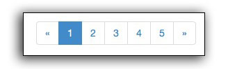
To remove, we just comment out the whole block of code near the bottom.
<!-- Pagination -->
<div class="row text-center">
<div class="col-lg-12">
<!-- COMMENTING OUT PAGINATION
<ul class="pagination">
<li>
<a href="#">«</a>
</li>
<li class="active">
<a href="#">1</a>
</li>
<li>
<a href="#">2</a>
</li>
<li>
<a href="#">3</a>
</li>
<li>
<a href="#">4</a>
</li>
<li>
<a href="#">5</a>
</li>
<li>
<a href="#">»</a>
</li>
-->
</ul>
</div>
</div>
<!-- /.row -->
Make sure your comment tags properly match!
Lastly, you can customize the content of the footer to include your own website name:
<p>Copyright © Your Website 2014</p>
Next section is how to publish your portfolio website to the web. When you upload your website, you will need to upload the index.html as well as the entire contents of this folder! (The license and readme are the only two files that you can safely delete).