CSS for designing a webpage
Recipe assignments from last class.
New Type of CSS Selectors
In the last class, we went over the three basic types of selectors in CSS:
- Type (or name) selector for selecting an element by its name
div - ID selector, for selecting an element by it’s id attribute
#mainheading - Class selector, for selecting groupings of elements by their class attribute
.quotes
In addition to these, there is actually a whole host of ways you can select elements in a document. We’ll go over two of them.
Comma Separated CSS Selectors
In CSS, you can comma-separate selectors so that a rule will apply to multiple selectors at once.
p, div, h1 {
    color : black;
    font-size : 12px;
}
In the above code block, the CSS rule is being applied to <p> tags, <div> tags, and <h1> tags.
This is equivalent to writing:
p{
    color : black;
    font-size : 12px;
}
div{
    color : black;
    font-size : 12px;
}
h1{
    color : black;
    font-size : 12px;
}
So basically, it’s a shortcut; nothing more.
Space Separated CSS Selectors
When you have several elements in a selector which are separated by spaces, it implies that some elements are nested in other elements.
/* only affects p tags inside container element */
#container p{
  background: orange;
}

/* However, this would affect all p tags */
p{
    background: orange
}
The above code would only target <p> tags which are decedents of a #container element. If there are other p tags in the document elsewhere, those are left alone.
Box Model
Next, let’s go over the box model, which consists of margins, padding and a border. It’s important to note that when you set a width using CSS, it only applies to the content inside the box. Padding, margins and borders are extra. (Note however, there is a CSS rule called box-sizing that can switch this fact around).
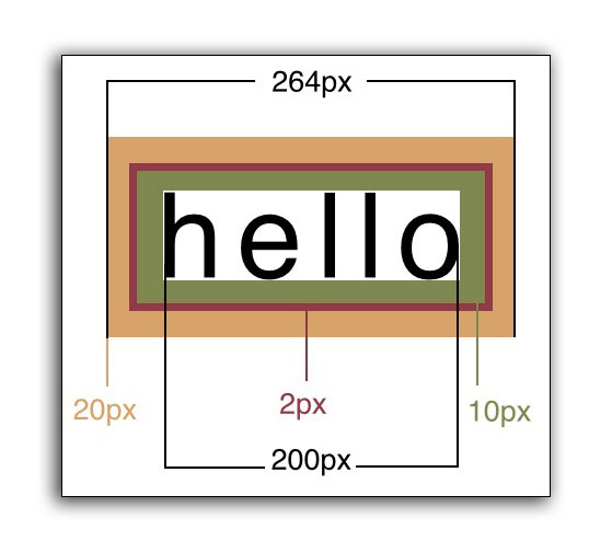
In code, the above would look like this:
<head>
    <style>
    div{
        width: 200px;
        padding: 10px;
        border: 2px;
        margin: 20px;
    }
    </style>
</head>
<body>
    <div>Hello</div>
</body>
Specifying Multiple Margin or Padding Values
When specifying margins or padding, you can set all four values at once.
/* top, right, bottom, left */
div{
    margin: 3px 4px 10px 5px;
}

/* the above is equivalent to */
div{
    margin-top: 3px;
    margin-right: 4px;
    margin-bottom: 10px;
    margin-left: 5px;
}
These for numbers correspond to the top, right, bottom, left, respectively.
Think about a clock starting at 12:00 (top), and then count clockwise: 3:00 (right), 6:00 (bottom), and 9:00 (left).
 Clock designed by Dmitry Baranovskiy from the Noun Project, Attribution (CC BY 3.0)
You will also see instances where only two numbers are specified:
/* 10px refers to the top and bottom, while 15px refers to left and right */
div{
    padding: 10px 15px;
}

/* the above is equivalent to */
div{
    padding-top: 10px;
    padding-bottom: 10px;
    padding-right: 15px;
    padding-left: 15px;
}
The first number refers to both the top and bottom padding, while the second number refers to the left and right measurements.
On a rare occasion, you might see three numbers specified:
/* 10px is top, 15px is both left and right, 20px is bottom */
div{
    margin: 10px 15px 20px;
}
In these situations, the first number is only the top, second number is left and right, and the third number is for the bottom. Think: We’re still going clockwise, but without the fourth number, we simply default to what the right measurement was set at.