Class overview and anatomy of a multimedia story
Buy HTML & CSS book
This class will recommend you to follow closely with the following HTML & CSS book. This book will be a good investment in your learning of web development, and will serve as a good reference guide for many years to come.
Purchase options on the HTML & CSS Website
This book is also sold as a bundle with a JavaScript and jQuery book. This is also a recommended purchase for those who want to further their knowledge of jQuery.
Making sure your text editor is up to date

In this course we will be using Sublime Text 3 for all of the coding and previewing of documents. Please make sure your program is up to date.
Note: Sublime Text is dontationware, which means it’s free to use indefinitely, but will occasionally notify you to purchase the software. A license costs $80.
Review previous projects from this class
Here are links to a few of the projects from previous years from this class. Some are password protected based on the student’s request (embargoed for publication or other reason). Contact the instructor for access.
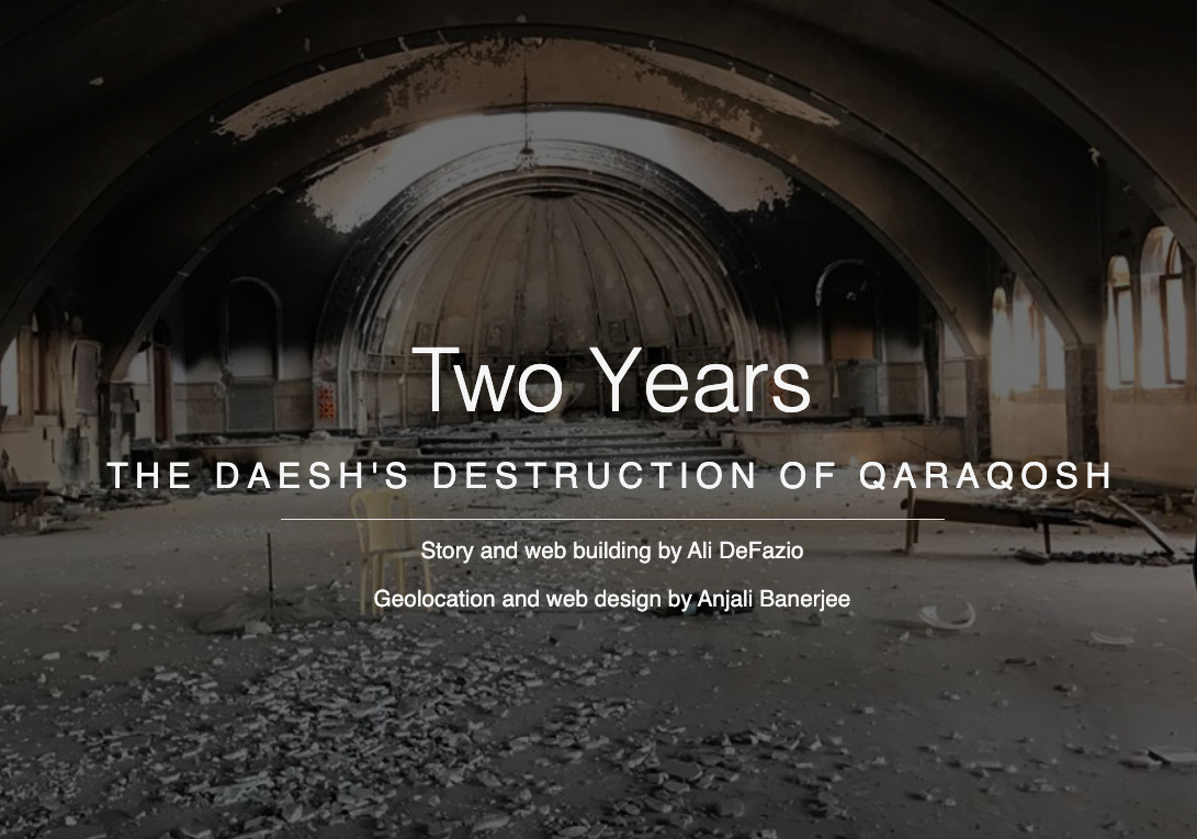 Daesh’s destruction of Churches in Iraq.
 Labor trafficking in Alameda County.
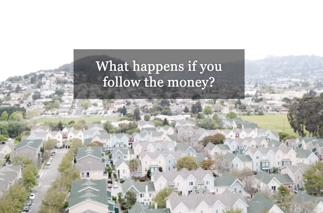 How remittances sent abroad affect the broader economy.
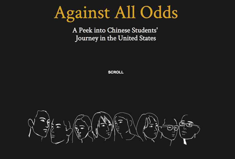 Chinese students studying in America grapple with isolation and depression.
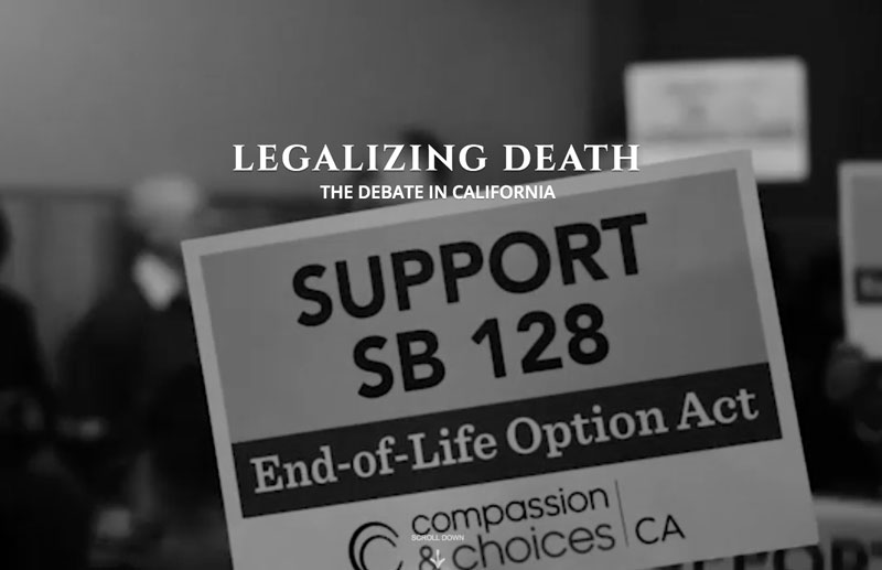 A look at California legislation to legalize drug-assisted death for the terminally ill.
 The closing of a community hospital in San Pablo, and the ripple effect it will cause.
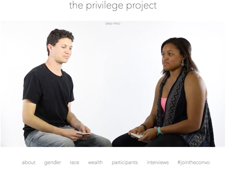 An experimental conversation-format interactive piece that places two strangers across from each other to discuss the concept of privilege.
 Port workers in Oakland are bound to lease agreements for little pay, and have few options to switch jobs.
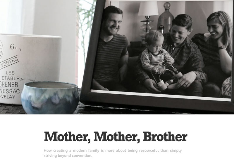 A lesbian couple, who wishes to have a child that has genetic makeup from both parents, looks to the brother of one pair to serve as a sperm donor.
Looking at examples of News Packages
On this site, I’ve created a page amassing a large number of online news packages for students to analyze. There are over 1000 news packages listed on this site. As we go through the different approaches to displaying multimedia stories, it’s important to spend a significant amount of time looking at these examples to dissect and understand their nature. Most importantly, you should consider the following:
- What is the first immediate impression of the overall design?
- How effective is the information hierarchy, understanding what the story is about immediately, and does it engage you to dive in deeper?
- does the story design aid in pulling you further into the story, or does it exist for its own sake?
- do the media forms (i.e. video, photo, graphics, text) fit the various story components and tell those parts of the story well?
- are the various story components the appropriate length given the medium used to consume the story?
Techniques for telling digital longform stories
Telling a longform story requires careful attention to the reader’s train of thought and how they are consuming the story. Given that the medium of the Web (the devices that are used to consume stories) are distracting, it becomes important to use multimedia in a way that keeps the attention span of the reader.
In general, the goals are:
- Use multimedia in a way that is cohesive to the overall narrative. Videos, photos, and graphics shouldn’t be redundant to text.
- Understand how multimedia connects with the content around it. Does it distract from the narrative? What is the cognitive load of a piece of multimedia? Does it interrupt the flow? If so, is that OK?
- Don’t create flashy design effects for their own sake. Every design decision should have a purpose. It’s OK for design to be “cool,” but use the cool factor in a way that better communicates the story. (e.g. Autoplaying background videos, scrolling curtain effects, or animation.)
- Ledes and introductory text of the package becomes crucial, because most continuous stories require a commitment from the user. Tease users with good explanatory introductions so they know what they are going to get.
“Chunkifying” content
A technique used in lots of continuous pieces is to break text apart into smaller chunks that grasp the user’s attention. It’s a bit like holding a user’s hand and leading them through the story.
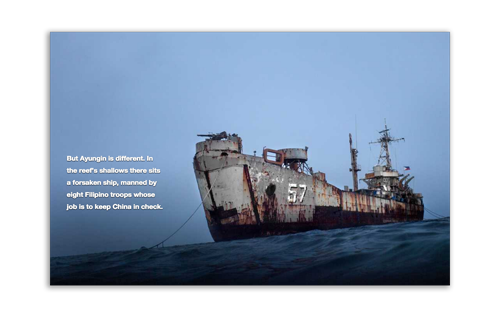
In this South China Sea Piece by the New York Times, content is broken into smaller chunks at various points in the narrative. These pieces of content help reinforce the multimedia with descriptions of what’s happening.
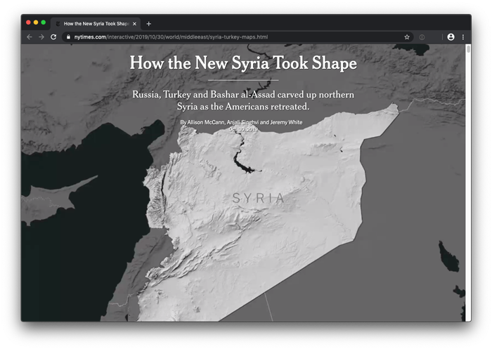
In the piece How the New Syria Took Shape by The New York Times, short chunks of text seem to annotate the background video that steps forward with the scroll mechanism. This gives the user agency to control the flow of the narrative.
Multimedia “Interrupters”
Another term has been adopted in the multimedia storytelling industry to describe when a piece of multimedia “interrupts” the narrative flow of a piece. While this sounds like a bad thing, it’s often done intentionally.
Careful consideration should be made as to when a piece of multimedia breaks the text apart, or when it’s placed off to the side of the text, where it becomes a more optional element.
The factors to consider in making this decision:
- Is the multimedia critical the story, and at that point in the narrative?
- What is the learning curve of an informational graphic? If it takes too long to decipher beyond a glance, perhaps it should be considered more of a sidebar.
- Multimedia often makes good chapter breaks or segues for introducing the next section of a story.
- Breaking up a narrative with a video is often a forceful indication that the viewer needs to watch it. You shouldn’t break the text if you think it’s optional, because the viewer will be left thinking they missed something.
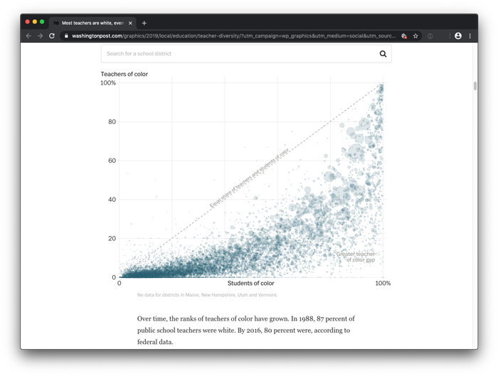
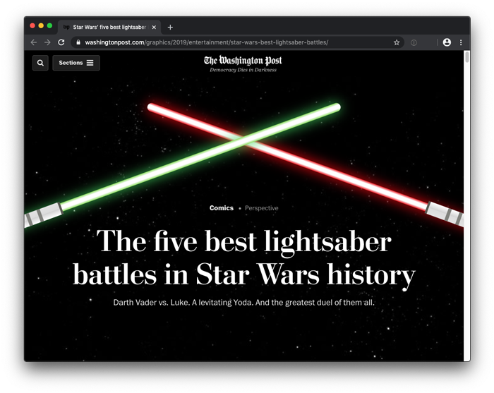
Some multimedia elements essentially become the story, as in data-driven stories that are based on charts. In this Washington Post piece about the race gap in schools, the chart of every school district in the United States becomes an essential part of the story.
https://www.washingtonpost.com/graphics/2019/local/education/teacher-diversity/
Design techniques
Web producers employ several design techniques when building these packages. Most have usefulness, but some are often gratuitous or exist for their own sake.
Scrollytelling
Scrollytelling is a term that relates to animations that play as the user scrolls. This is often an effective method for engaging readers, because it offers simulation as they interact with the piece and makes the process of scrolling enjoyable. But the caveat is that most scrollytelling pieces require movement, and are often antithetical to longer text stories which are read at a much slower pace.
- Good for: scannable content, chunkified content.
- Bad for: longer text stories.
Curtain Effect
A curtain effect is when part of the page seems to reveal another section of the page. This effect is often useful for indicating breaks in a piece, or a transition to another section of the copy. It should be considered a hard interruption, and give the sense of unveiling a piece of content.
Many times it’s used as purely an aesthetic device, perhaps gratuitously and unnecessarily.
- Good for: creating very strong interruptions for transition, unveiling new content.
- Bad for: times when it doesn’t serve a purpose, or it’s used gratuitously and unnecessarily.
Auto-playing Background videos
Another element seen in many continuous stories are silent auto-playing background videos. These can really make static images come alive and add some dynamism to the piece.
They usually come in two forms:
- Aesthetic: Simple repeating imagery that sets a scene or offers a piece of movement.
- Illustrative: A situation when it shows something happening. In this case it’s similar to an animated GIF. This is a quick way to show an action without the user having to commit to a video.
In the first case, the types of background videos that work best are ones that are short and have some type of subtle movement. They generally work create a scene setters, and help create a more dynamic feel that differs from the frozen moment of a still photo.
In the second case, the action should be quick or users might get confused about whether the video should be watched or just glanced at.
- Good for: setting scenes, creating dynamism to a piece aesthetically.
- Bad for: when it’s distracting, overused, too long, or should be a playable video instead.
Auto trigger elements, like videos
When autoplaying multimedia content, like video, it’s important to make sure sound doesn’t autoplay. In fact, this is a restriction being employed by most browsers these days. There is also rumors that Google will lower your seach index if you autoplay content without the user’s consent.
But pausing videos when scrolling away is an effective way to keep one’s place in the story. This interaction also creates a subtle sense of responsiveness to the page. It knows you’re no longer looking at a video, and it will automatically pause it when you scroll away.
Slideshow Models
In reponse to the popularity of Instagram stories, many website news packages have started employing slideshow-like experiences. These create a great sense of continuity with a visual story, and allow you to effectively mix still photos and video together in a seamless experience.
It’s important to draw on user interface techniques users are already familiar with, such as the bar navigation along the top of the page (as seen in mobile slideshow storytelling).
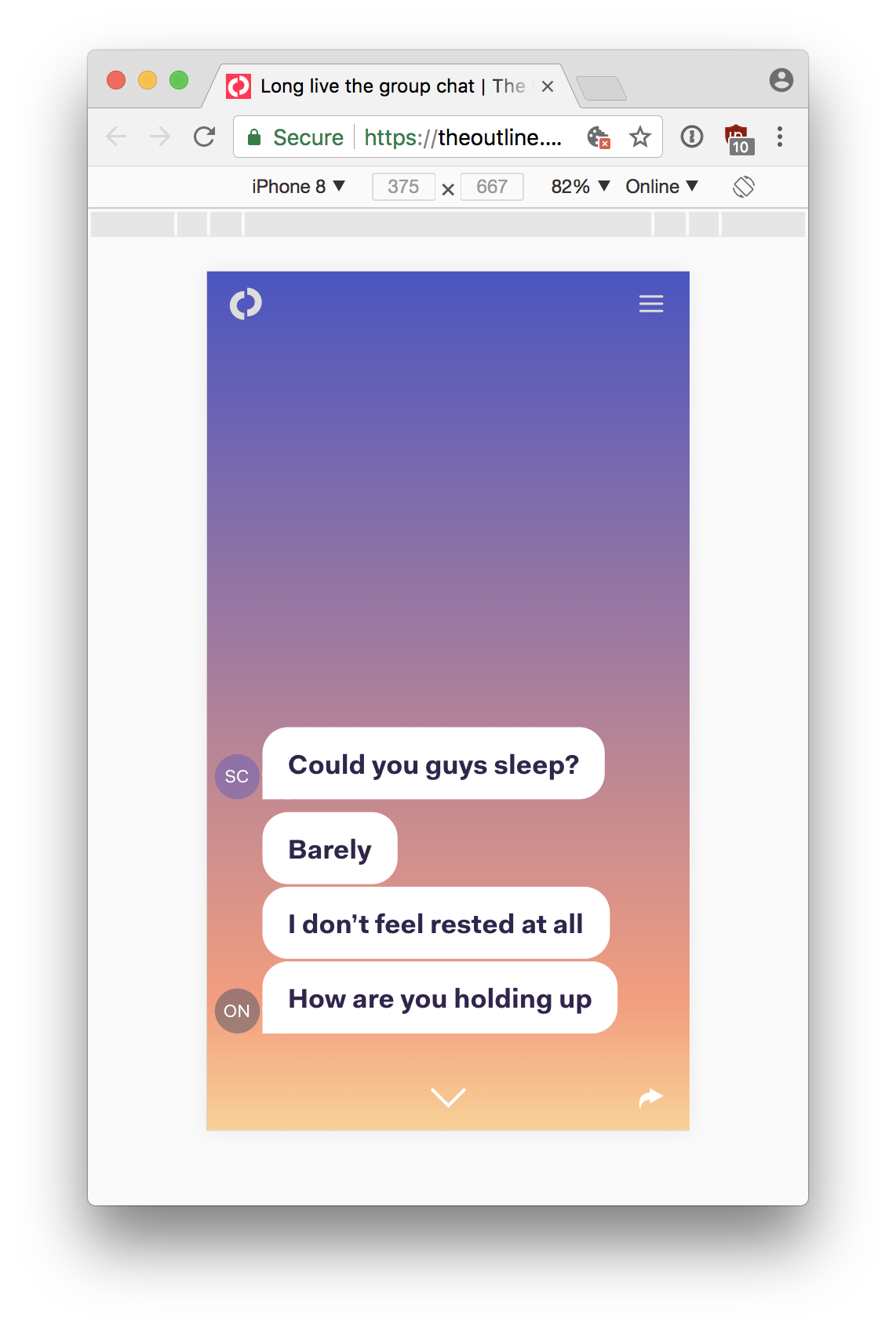
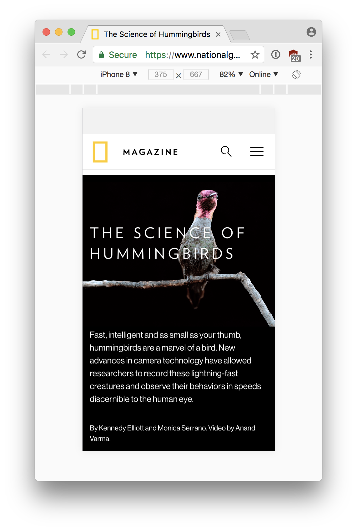
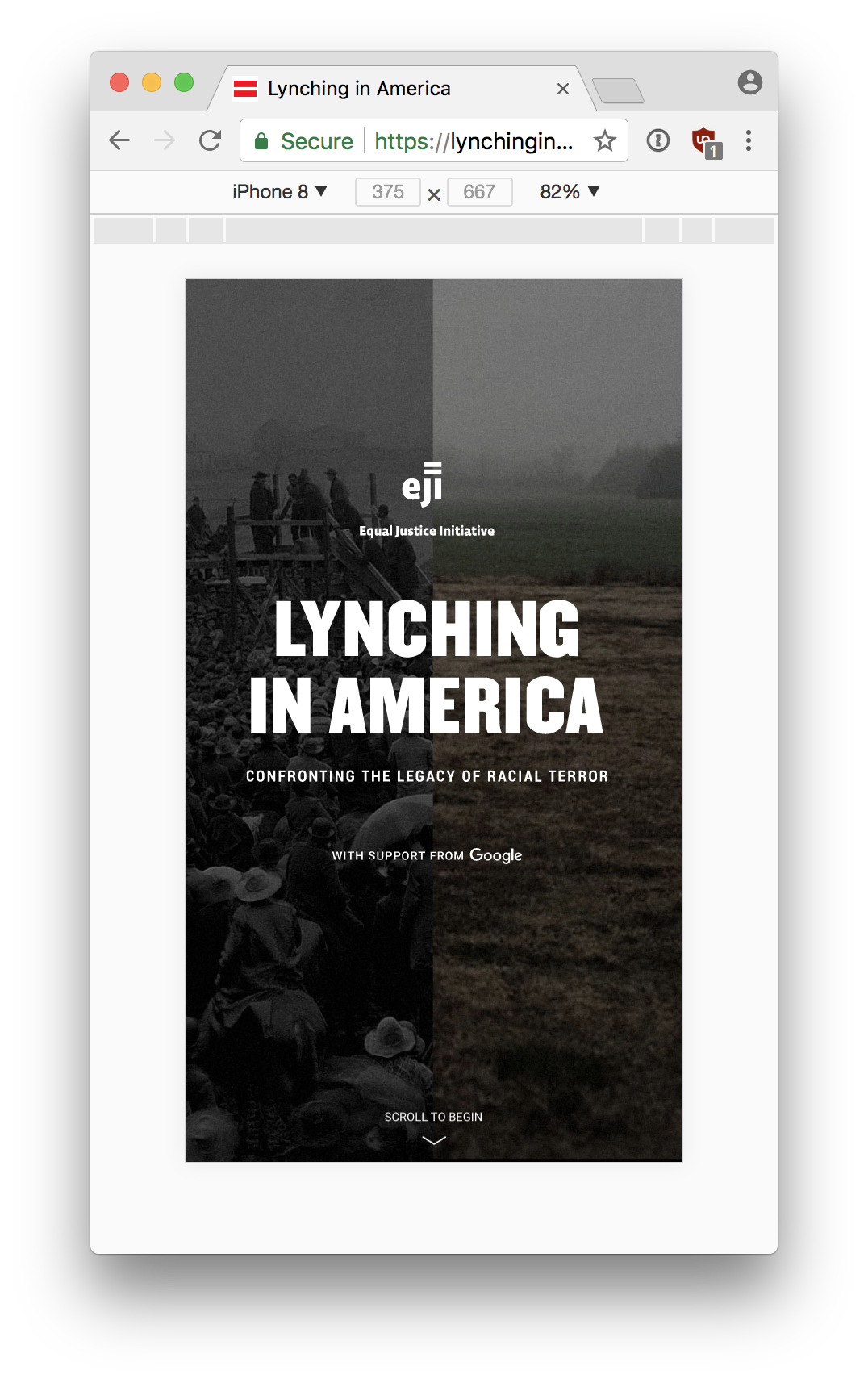
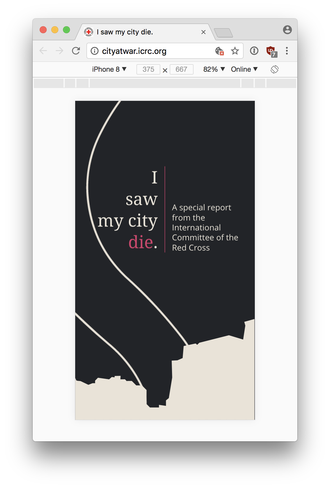
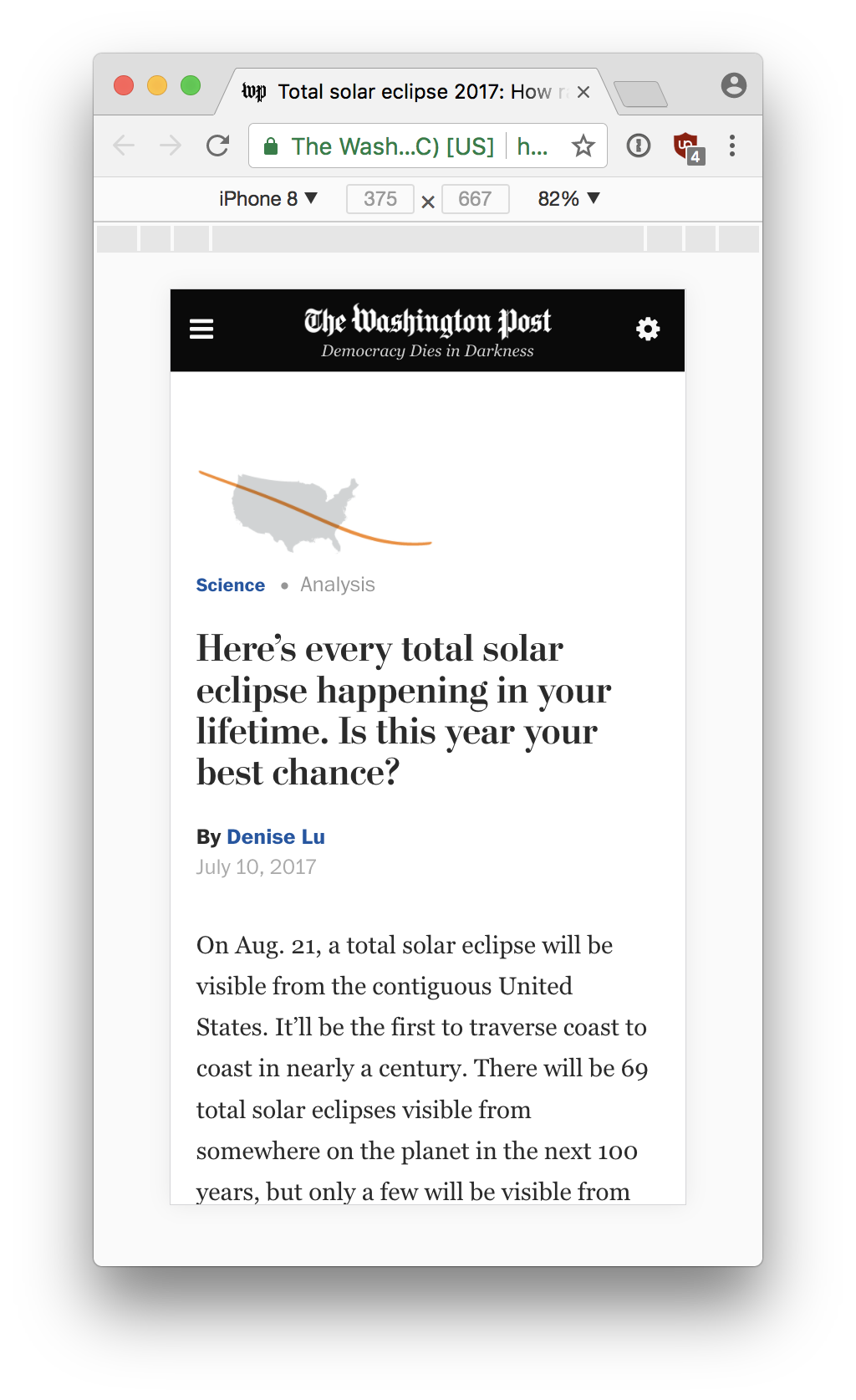
Mobile Formatted Stories
Consumers are more likely to consume stories on their mobile device before anything else. When designing a news package, it is essential to make sure it functions on mobile.
But going further, many producers are designing packages specifically for mobile first, adding features and design considerations that don’t show up or work on desktop web. Some of these conventions are:
- swiping to switch content
- revealing content on scroll
- slide-out “drawer” menus that appear when a button is pressed
- large buttons that are easily pressed with a finger
Here are some examples of mobile-formatted news packages: