CSS Part 2
Review of CSS Selectors
In the last class, we went over the three basic types of selectors in CSS:
- Type (or name) selector for selecting an element by its name
div
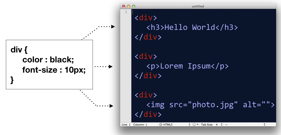
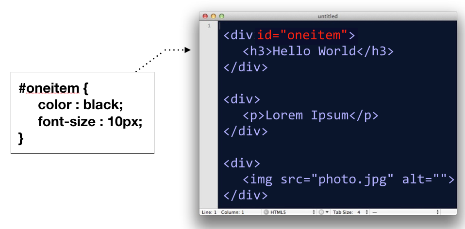
- ID selector, for selecting an element by it’s id attribute
#oneitem
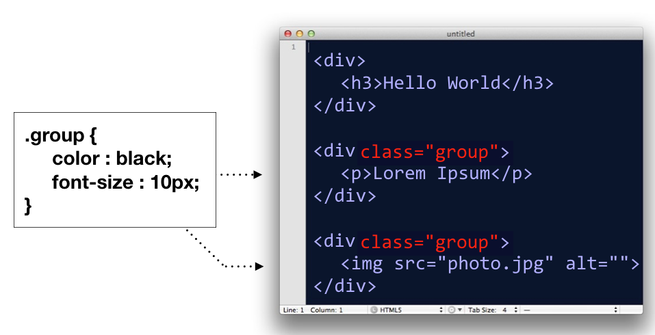
- Class selector, for selecting groupings of elements by their class attribute
.group
In addition to these, there is actually a whole host of ways you can select elements in a document. We’ll go over two of them.
Comma Separated CSS Selectors
In CSS, you can comma-separate selectors so that a rule will apply to multiple selectors at once.
p, div, h1 {
    color : black;
    font-size : 12px;
}
In the above code block, the CSS rule is being applied to <p> tags, <div> tags, and <h1> tags.
This is equivalent to writing:
p{
    color : black;
    font-size : 12px;
}
div{
    color : black;
    font-size : 12px;
}
h1{
    color : black;
    font-size : 12px;
}
So basically, it’s a shortcut; nothing more.
Space Separated CSS Selectors
When you have several elements in a selector which are separated by spaces, it implies that some elements are nested in other elements.
/* only affects p tags inside container element */
#container p{
  background: orange;
}

/* However, this would affect all p tags */
p{
    background: orange
}
The above code would only target <p> tags which are decedents of a #container element. If there are other p tags in the document elsewhere, those are left alone.
Box Model
Next, let’s go over the box model, which consists of margins, padding and a border. It’s important to note that when you set a width using CSS, it only applies to the content inside the box. Padding, margins and borders are extra. (Note however, there is a CSS rule called box-sizing that can switch this fact around).
In code, the above would look like this:
<head>
    <style>
    div{
        width: 200px;
        padding: 10px;
        border: 2px;
        margin: 20px;
    }
    </style>
</head>
<body>
    <div>Hello</div>
</body>
Specifying Multiple Margin or Padding Values
When specifying margins or padding, you can set all four values at once.
/* top, right, bottom, left */
div{
    margin: 3px 4px 10px 5px;
}

/* the above is equivalent to */
div{
    margin-top: 3px;
    margin-right: 4px;
    margin-bottom: 10px;
    margin-left: 5px;
}
These for numbers correspond to the top, right, bottom, left, respectively.
Think about a clock starting at 12:00 (top), and then count clockwise: 3:00 (right), 6:00 (bottom), and 9:00 (left).
 Clock designed by Dmitry Baranovskiy from the Noun Project, Attribution (CC BY 3.0)
You will also see instances where only two numbers are specified:
/* 10px refers to the top and bottom, while 15px refers to left and right */
div{
    padding: 10px 15px;
}

/* the above is equivalent to */
div{
    padding-top: 10px;
    padding-bottom: 10px;
    padding-right: 15px;
    padding-left: 15px;
}
The first number refers to both the top and bottom padding, while the second number refers to the left and right measurements.
On a rare occasion, you might see three numbers specified:
/* 10px is top, 15px is both left and right, 20px is bottom */
div{
    margin: 10px 15px 20px;
}
In these situations, the first number is only the top, second number is left and right, and the third number is for the bottom. Think: We’re still going clockwise, but without the fourth number, we simply default to what the right measurement was set at.
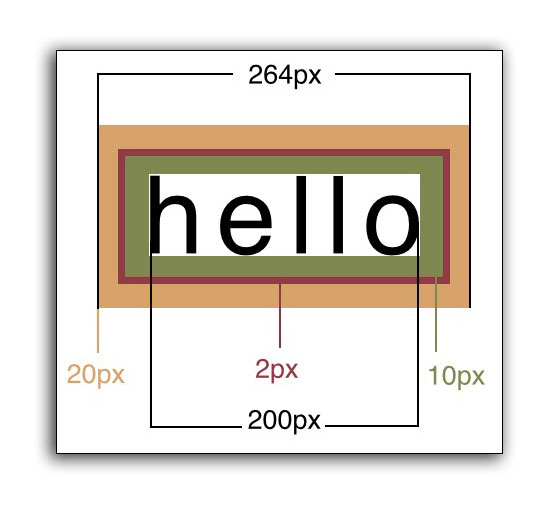
Measuring the Box Model Correctly
There is a counter-intuitive issue with the Box Model in CSS. The appearance of a box is determined by the padding, border and width combined. This means if you set the width of a box to 200px, then add a 1px border, then add 10px of padding, the box will actually appear as 222px (200 + 1 + 1 + 10 + 10).
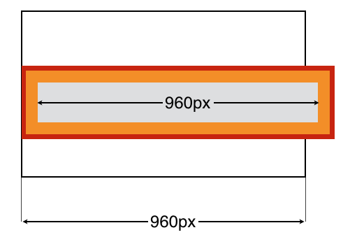
#container{
    width: 960px;
}
#innerbox{
    width: 960px;
    padding: 10px;
    border: 1px solid red;
}
In the example above, the containing box is 960px wide, and the inner box is also 960px wide. But you’ll notice that the inner box doesn’t fit! This is because when you add padding, it widens the box in addition to the width. The inner box has a border (shown in red) and padding (shown in orange).
When you add padding or border, this increases the size of the box beyond the width value you set.
Backgrounds
Backgrounds can be set with colors or images. (It is generally a good idea to do both, so if the image fails to load, you still see the background color).
Here are some background properties:
background-color |
Sets the color of the background of an element |
background-image |
Specify an image with notation url(img.jpg) |
background-repeat |
Should the image repeat. Values are repeat-x repeat-y no-repeat. |
background-position |
Where should the image be positioned? This property takes two values space separated, for the x and y position. Words like top center can be used, or percentages or pixel values (i.e. 45px 30%) |
background-attachment |
Determines if the background image should move as the user scrolls. fixed and scroll are the two primary values. |
background-size |
Determines how large the background image should be. Using a size value of cover, contain, or a percentage 100% are all potential value. Cover means to cover the entire area, even if the image is clipped. And contain means that the entire image will show, even if there is empty space in the box. |
In particular, the background-size property comes in handy, particularly when you want to place text over the background.
In-Class Exercise
This is a sample boilerplate HTML file we will use for the in-class exercise:
<!DOCTYPE html>
<html>
<head>
    <meta charset="utf-8">
    <title>Intro to Coding Interactives</title>
    <style>


    </style>
</head>
<body>


</body>
</html>
And we will be using this CSS Reset:
html, body, div, span, applet, object, iframe, h1, h2, h3, h4, h5, h6, p, blockquote, pre, a, abbr, acronym, address, big, cite, code, del, dfn, em, font, img, ins, kbd, q, s, samp, small, strike, strong, sub, sup, tt, var, b, u, i, center, dl, dt, dd, ol, ul, li, fieldset, form, label, legend, caption {
    margin: 0;
    padding: 0;
    border: 0;
    outline: 0;
    font-size: 100%;
    vertical-align: baseline;
    background: transparent;
}
Recreate the opening two sections of this example using the assets provided below.
Direct link to the background image for the above screenshot
The final code from the in-class exercise will look like this:
<!DOCTYPE html>
<html>
<head>
<meta charset="utf-8">
<title>Intro to Coding Interactives</title>
<style>
html, body, div, span, applet, object, iframe, h1, h2, h3, h4, h5, h6, p, blockquote, pre, a, abbr, acronym, address, big, cite, code, del, dfn, em, font, img, ins, kbd, q, s, samp, small, strike, strong, sub, sup, tt, var, b, u, i, center, dl, dt, dd, ol, ul, li, fieldset, form, label, legend, caption {
margin: 0;
padding: 0;
border: 0;
outline: 0;
font-size: 100%;
vertical-align: baseline;
background: transparent;
}
header{
background-image:url(https://multimedia.report/images/classes/intro-to-interactives/background.png);
height: 100vh;
color: #ffffff;
text-align: center;
overflow: hidden;
background-size: cover;
background-position: center;
}
header h1{
font-size: 5em;
font-weight: 100;
margin-top: 40vh;
}
header h2{
text-transform: uppercase;
font-weight: 100;
letter-spacing: 0.2em;
font-size: 1.4em;
}
header p{
margin-top: 10vh;
font-family: sans-serif;
font-weight: 100;
color: #aaaaaa;
}
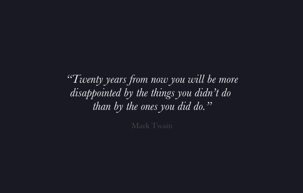
section{
height: 100vh;
background-color: #111111;
color: #ffffff;
text-align: center;
overflow: hidden;
}
section q{
font-style: italic;
font-size: 2em;
font-weight: 100;
max-width: 600px;
display: block;
margin:40vh auto 0;
}
section cite{
margin-top: 20px;
display: block;
font-style: normal;
font-size: 1.5em;
color: #555;
}
</style>
</head>
<body>
<header>
<h1>The Wild Path</h1>
<h2>— An Icelandic Adventure —</h2>
<p>An interactive storytelling experience.</p>
</header>
<section>
<q>Twenty years from now you will be more disappointed by the things you didn't do than by the ones you did do.</q>
<cite>Mark Twain</cite>
</section>
</body>
</html>
Recipe Assignment:
The assignment is to create a recipe for a delicious meal (it must be delicious).
The recipe requires the following elements:
- A title or
<header>describing the recipe. This means using both<header>and<h1>tags. Clever titles are allowed. - A photograph depicting the finished meal (copyrighted images on the web are OK). If you are taking your own images, you can upload them to our media server upload hosting service.
- A list of ingredients
- A description of the process on how to make the meal, and optionally any background info about the meal.
Design a web page for the recipe using HTML and CSS.
The following elements are required:
- An unordered/ordered list of ingredients.
- An image tag for the photograph with alt attribute.
- Some changes in the background color of the page or recipe.
- A border of some sort.
- Gold stars if it looks good (figuratively speaking, we’re not going to actually give you anything.)
Save your recipe as yourname.html and upload it using the provided form on bCourses.
Log into bCourses to submit the assignment.
CSS Recipe Assignment FAQ
Q. How do I add an image to my recipe website?
A. You should upload your image to our media server upload service and then copy the Direct Link URL to your clipboard. Then write out an HTML img tag, and paste your PostImage link in the src="" attribute. Don’t forget the alt attribute!
<img src="https://media.journalism.berkeley.edu/.../example.png" alt="example">
Q. How do I add a background image?
A. You should either find a background image online, or upload your own to our media server upload service. You have to set the image to serve as the background of an element. You can do this to the body if you want the image to be the background of the whole page.
body{
    background-image: url(https://example.com/example.png);
}
By default, background images repeat. Sometimes you want this to happen, such as when you use background patterns. But you avoid this, or optionally add some additional CSS properties for controlling the way the background image appears.
body{
    background-image: url(https://example.com/example.png);
    background-repeat: no-repeat;
    background-position: center top; /* horizontal and vertical position */
    background-size: cover; /* also use "contain" to not crop */
}
Q. What’s the difference between a <ul> and <ol>?
A. The <ul> tag stands for “unordered list” and is a list where the order isn’t as important. Think: a bulleted list. The <ol> tag is a numbered list where the order is important, (such as following steps in a recipe). Here are examples of both:
<ul>
    <li>Butter</li>
    <li>Sugar</li>
    <li>Egg</li>
    <li>Flour</li>
</ul>

<ol>
    <li>Mix all together in a bowl.</li>
    <li>Put in oven.</li>
    <li>Eat.</li>
</ol>
Q. How do I include Google Fonts?
A. You can visit the Google Fonts website and pick out the font you want to include. Click on the + button, and then when you’re ready, click on the bottom tab and it will give you a link to some code you can put in the <head> of your document to embed the font. You should put this before your <style> tag for the rest of your CSS.
<head>
    <meta charset="utf-8">
    <title>My Recipe</title>


    <link href="https://fonts.googleapis.com/css?family=Roboto" rel="stylesheet">
    <style>
        body{
            font-family: 'Roboto', sans-serif;
        }
    </style>

</head>
You will need to add the font-family property to any areas you want to use that font. It’s not advised to use a display font on body text.
Q. What are some other cool CSS tricks I can do?
A. Check out CoDrops for some ideas and tutorials. There is also CodePen which is much more technical, but sometimes students find interesting things they can incorporate into their site. Lastly, Google is your friend.
There is no extra credit for whiz-bang features… but they look fun.