CSS Part 3
Attributes
It’s important that we understand attributes which are pieces of information that can go into tags.

Attributes like href="" go inside the <a> tag to specify where a user will go when they click a link.
Some common attributes
- src — Specify the image location inside a <img /> tag.
- alt — Specify some alternate text to describe the image in an <img /> tag.
- href — Specify the URL an <a> tag will visit when clicked.
- title — Specify some text that will appear when the user hovers their mouse over this tag.
There are three attributes that can go in all HTML tags that pertains to CSS:
- id attibute — This is a unique term that gives this tag an identifier we can reference in our CSS.
- class attribute — This is a grouping term that allows us to reference multiple tags in our CSS.
- style attribute — This is a special way to include inline CSS, basically putting CSS code directly into an HTML tag.
Multiple Attribute Values for Classes
A single HTML tag can have have multiple distinct classes, but you must put them in the same class attribute. You just space separate them.
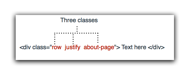
Attempting to have multiple class attributes in the same tag won’t work.

The Box Model
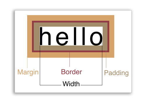
The CSS box model is a series of rules governing how boxes should work on the web. This includes four central properties:
- width/height — The dimensions of the inside of a box.
- padding — The space between the content and the box’s edges.
- margin — The space between the box and other elements around it.
- border — An area surrounding the box, usually visible as a line of a certain thickness.
It’s important to note that the width and height properties are counter-intuitive. They only determine the size of the area inside the box. This can be confusing when you have borders around the box, because the size of a box from border to border is determined by the width/height in addition to the padding.
Box Rules
There are a few rules governing how boxes react by default. Some of these can be counter-intuitive and really confuse people who are trying to imagine web page layout as a free-form process. It takes careful consideration of how to create designs as you conceive them in your head or from a mock-up. It’s a bit like putting together a puzzle.
- By default a box will have a width of “auto”, or the full width of its container. This means any block-level element you create will automatically stretch the full width of the browser, or its containing element.
- By default a box will have a height that conforms to the content of that box. So when you create a box with nothing in it, it won’t have any height. You have to set a height property in order to open the box up.
- If you set a height in CSS, that overrides the content. This means if you set a box to be shorter than its content, the content (like text or photos) will protrude from the box.
- By default a box will stack from the top down. If you create additional block-level elements, they stack from the top of the browser down.
div{
    width: 100px;
    height: 100px;
    border: 1px solid black;
    overflow: visible;
}
The above code would produce the following:
We will cover the overflow property later.
Box Properties
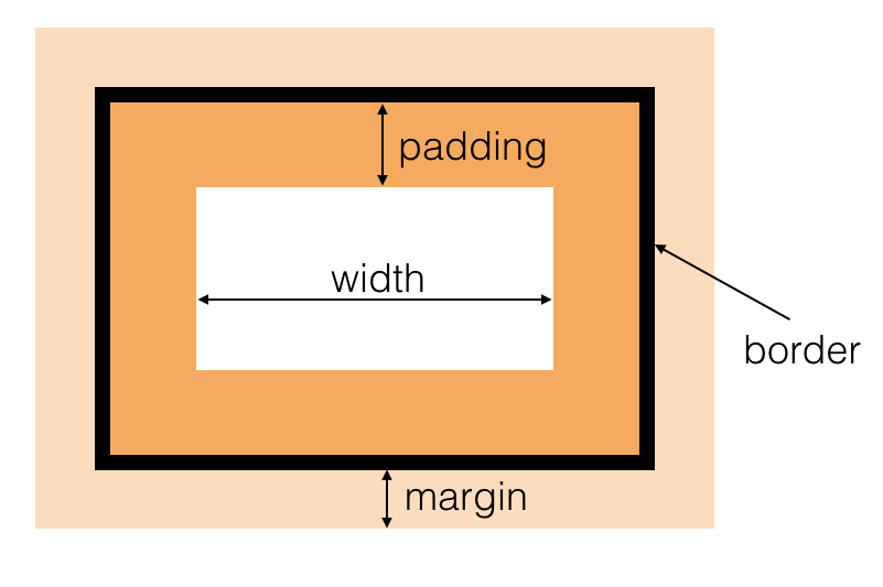
Let’s go over a few box properties and discuss how they work in relation to your design.
Width, Height
It’s important to remember that width and height properties only affect a specific portion of a box, the inside part between the padding.
These values can be set as px which is a static, unchanging value. Or you can use a percentage %, which is a percentage of the containing element.
Note: Using percentage values for height will only affect an element if it has a containing element. If you try to use a percentage for height on an element in the <body> element, nothing will happen (unless a height value is set on the body tag).
div{
    height: 50%; /* won't work unless parent element has a height */
}
Min-width, Max-width
These properties are important when doing responsive design. They allow you to setup restrictions about how large or small an element can get. They work particularly well in conjunction with the width and height properties when they are set to percentages.
div{
    width: 50%; /* 50% of containing element */
    max-width: 400px; /* don't go more than 400px */
}
Overflow
The overflow property determines how to deal with content that might protrude from a box. When you manually set the width or height values of a box, there is always a chance that the text will protrude from the box (especially in responsive design). You can choose to cut off the text, have it scroll, or just show it sticking out of the box.
| visible | This is the default setting. The content will be visible even if it protrudes from the box. |
| hidden | This will allow you to hide any content that doesn’t fit in the box. |
| scroll | Allows the user to scroll any content that wouldn’t fit in the box otherwise. |
Border
The border has three distinct properties.
border-widthSpecifies the thickness of the border in pixels.border-styleSpecifies the style of the line (i.e. solid, dashed, dotted)border-colorSpecifies the color of the border.
You can also specify all three of these properties as a shorthand notation. This is the most common way to do this. The order is border-width border-style border-color with one or more spaces spearating the values.
div{
    border: 1px dotted #ddffff; /* width style color */
}
Padding
Padding is the space between the content and the border. It can be specified as individual sides, or as a shorthand property. When done with the shorthand property, the first value refers to the top and goes clockwise. When only two values are specified, the first value refers to top and bottom, and second value to the left and right.
div{
    padding-top: 10px;
    padding-right: 10px;
    padding-bottom: 10px;
    padding-left: 10px;
    padding: 10px 10px 10px 10px; /* shorthand, clockwise from the top */
}
Important note about percentages: When using percentage values for padding, they will always refer to a percentage of the width of the containing element, even when doing padding-height.
div{
    padding-top: 30%; /* padding top will be 30% of width of containing box */
}
Margin
Margins work the same exact way as padding in terms of notation. There is a caveat when a bottom margin interacts with the top margin of an element below it. This effect is called collapsed margins where only the larger of the two margins will be used, and the smaller is disregarded.
Just like the padding quirk, using a percentage of margin refers to a percentage of the width of the containing element.
How to Center Elements In CSS
There are many ways to center an element in CSS depending on what you’re trying to do. Here are a few different methods.
Inline Elements
Inline elements are simple. You should just text-align them to the center. Since inline elements don’t have height properties, there is no such thing as centering something vertically.
span{
    text-align: center;
}
Block Elements
To center a block element, the most standard way is to set the left-margin and right-margin to auto. This has the effect of pushing on both sides until the block element is in the center. It should note that this only works when the width of the element has a value other than the default auto.
p{
    width: 50%; /* must have some width value */
    margin-left: auto;
    margin-right: auto;
}
Vertical Centering When the Height is Unknown
Sometimes you want an item centered on the page vertically when the height is unknown. There is a trick you can do that we haven’t learned just yet. The properties will be listed here, but absolute positioning will be covered in a future class.
div{
             position : absolute;
                  top : 50%;
                 left : 50%;
    -webkit-transform : translate(-50%,-50%);
            transform : translate(-50%,-50%);
}
There is also a newer way to do this that doesn’t work on older version of Internet Explorer 9 and earlier. If that doesn’t matter, then you can use a new property called flexbox.
.parent{
    display: flex;
    justify-content: center;
    align-items: center;
}
Display Property (Inline vs Block)
You can actually change an element that is natively block to inline and vice versa. The property is called display. In this method, you could actually make divs act like spans, or strong tags take up their own line.
| block | Elements act like boxes, taking up a whole line in the browser |
| inline | Elements act like text and words, going side-by-side |
| inline-block | Elements can be stacked like inline elements, but have qualities (like heights and margins) as inline elements do. |
| none | Hide elements completely from the browser |
The most common scenario is to make li elements, which are natively block elements, run as inline elements, so they are side-by-side. This is often done for making navigational menus.
li{
    display: inline;
}
Hiding Elements
Another interesting value of the display property is the ability to assign it none. This essentially hides the element from the document flow completely, so that it doesn’t affect anything.
Using the visibility:hidden rule is another way to do this, but with this method the element is still a part of the document flow and will affect other elements around it (it’s just invisible).
display: none |
Will completely remove element as if it doesn’t exist. |
visibility: hidden |
Just makes element invisible, but can still affect elements around it |
New Units of Measurement
There are some new units of measurement that can be done that are in relation to the viewport. So, instead of using a percentage of the containing element, you can actually use a unit of percentage based on the viewport (browser window).
vw— Means “viewport width” This is a percentage of the viewport’s width.vh— Means “viewport height” This is a percentage of the viewport’s height.
Both values take a unit of measure that is 1/100th. So 1vw means 1% of the viewport width, and 50vw means 50% of the viewport width.
Note: You have to be careful when using viewport units of measure because as the browser window grows, content can often get too big and extend out of the viewport itself. There are also situations when scrollbars will appears due to an overflow property bug in IE. The best way to handle this is with media queries and using max-width type constrains. More info on ways to handle the bugs.
Embedding Multimedia
There are two ways of embeding rich media into your web page. The first is using <iframe> tags to embed another page. The second is using media specific tags <audio> or <video>.
When to use <iframe> or Vimeo/YouTube embeds?
You want to use the <iframe> tag (Vimeo/YouTube/other) with video hosting services whenever you are embedding a video that is designed to be watched by the user. These are the kinds of video where the user will click play, sit back, and view the whole thing. Using a streaming service will generally result it far better quality than hosting the video yourself.
When to use <video> tags?
You want to use <video> tags whenever you are displaying a video as a decrative element to your page. This includes looping background videos, and longer gifs (which often aren’t actually gifs, but short videos that we now refer to as gifs). You don’t want to use a streaming service, because it will create a player with a play button, and these will distract from the decorative intent of the video. It also becomes difficult to place graphics on top of the video.
The <video> tag
The <video> tag is used for directly embedding a video file on your webpage. This means, you have to have a direct link to the actual file itself, like a .mp4, a .ogv or a .webm file. You cannot use services like YouTube to use the <video> tag.
Yes, the <video> tag can be used with:
- .mp4 video files encoded in H.264
- .ogv video files encoded with Ogg theora format
- .webm video files encoded with vorbis
No, the <video> tag CANNOT be used with:
- YouTube media
- Vimeo media
- .mov quicktime video files
- .flv or flash video files
- Some types of video files like .mp4 that uses a different encoder
Here is the format for the video tag including all optional attributes:
<video controls loop muted autoplay playsinline preload poster="photo.jpg">
    <source src="my-awesome-video.mp4" type="video/mp4">
    <source src="my-awesome-video.ogv" type="video/ogg">
    <source src="my-awesome-video.webm" type="video/webm">
    <img src="sorry-cant-play-videos.jpg">
</video>
Here are what the different attributes do:
| controls | Show controls, like volume and a scrubber. |
| loop | Repeat playing the video after it ends. |
| muted | Silence the video, even if it has sound. |
| autoplay | Automatically play the video. |
| preload | Load the video into memory, so it plays immediately. |
| poster | Show an image in the opening frame. |
| playsinline | For mobile devices, play the video without going full screen. |
The <source> tag is a method to creat a fallback system. If the browser is unable to play the first video file format, it defaults to the second <source> tag. And if the browser is still unable to play the second file, then it defaults to the third and so on.
Much of this is moot, since all major browsers nowadays support .mp4 files encoded with H.264. Few browsers create a fallback system.
Exporting H.264 from Premiere
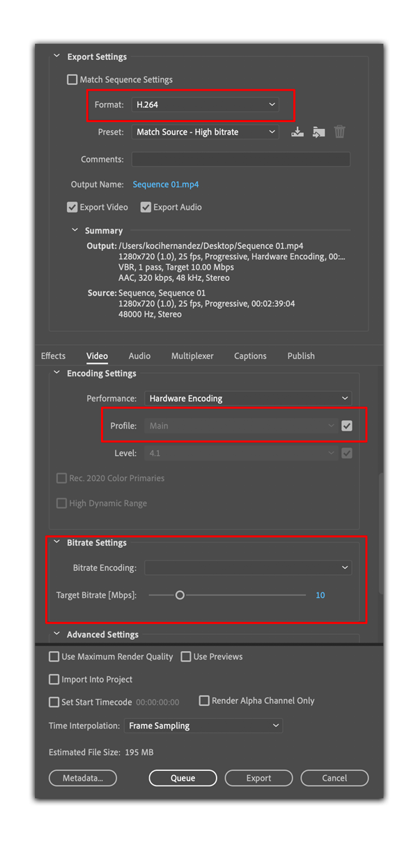
If you want to export a video file from Premiere, go to File –> Export and use the following settings:
- Format: H.264
- Check both Explort Video and Export Audio (even if there is no audio).
- Under Video tab, make sure the Profile is set to “Main” at least level 4.1.
- Under Bitrate settings, you should VBR, either 1 pass or 2 pass (2 pass is high quality but takes longer to export).
- Optionally you can check Maximum Render Quality, but this will increase export time.
The <iframe> tag
The iframe tag is a special tag that allows you to embed another website within your website. For example:
<iframe src="https://wikipedia.org" width="400" height="600"></iframe>
You will see Wikipedia page embeded within your own website!
The iframe tag is now exclusively used to embed rich media, like videos or audio players, inside your own website. This way, the hosting service that is running the media is responsible for the content, and you’re just providing a window to their website.
Note: There are some security concerns with embedding media from other sites using the iframe tag. You’re essentially giving them full power to place a window of content on your own site. They could change the content at any point (or remove it) and this will appear on your site.
The iframe attributes are as follows
| width | Set the width value of the box. You can set to 100% to go full width of its container. |
| height | Set the height value of the box. You can set to 100% to go full height of its container. |
| scrolling=”no” | Determine whether or not scrolling is allowed within the box. Set to “yes” or “no” |
| frameboder=”0” | Determine the size of the border. Can also be set in CSS. |
| sandbox | Create security restrictions.. |
| allowfullscreen | Include if you want the user to be able to click a fullscreen button and go fullscreen. |
Responsive Web
The leading philosophy in designing for mobile today is creating responsive websites. These are websites that automatically adjust their layout to adapt to various screen sizes.
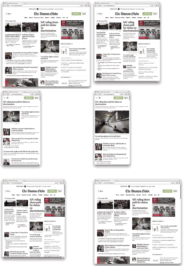
The importance of responsive web is due in large by the proliferation of so many different screen sizes. Smartphones now come in many different screen sizes, as do tablets. Smart watches, and other portable devices also create more potential ways that people can see content online.
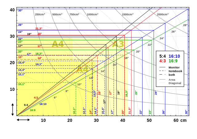
Using Break Points for Responsive Websites
The solution to this dilemma is to use CSS Media Queries to create multiple styles for your design. The way it works is simple:
1) Start with your basic default styles. The current trend in the industry it to start with mobile first styles and work your way up. Since mobile proliferation is slated to over take desktop web usage (it already has in most industries) you should put your primary emphasis on that. 2) Decide on a series of breakpoints based on your content rather than on screen sizes. Keep the screen size agnostic to your layout. 3) Include CSS media query blocks for various viewport dimensions when the design gets too wide.
Tips:
- Create breakpoints based on content rather than devices.
- Design small and work your way up, enhancing the design the larger it gets.
- Lines of text should be 70 to 80 characters (roughly eight to 10 words).
CSS Media Queries
CSS Media Queries are blocks of CSS code that specify conditions when the code will be in effect. The following code means the h2 and h3 rules will only take effect if the screen size is below 800px:
@media (max-width:800px){

    h2{
        font-size: 36px;
    }
    h3{
        font-size: 28px;
    }

}
Remember, the max-width portion is inverse. Max means below, and Min means above (because the condition needs to be true).
You can also use queries to restrict to certain devices like screen, print, or tv. (Screen is any device with a screen, print are the styles when you print on a printer, and tv are styles with internet connected tv devices).
Beyond width and height, there are a whole host of “media features” or aspects that you can affect, such as whether or not the user is using a color monitor, or is using a specific aspect ratio.
/* printers */
@media print {

}

@media screen (min-aspect-ration: 1/1){

}

@media screen (orientation: landscape){

}
You can also create multiple condition using logical operators and and not.
@media screen (min-width:600px) and (max-width:800px){

}

@media not screen{

}
In the above example, only when the viewport is between 600 and 800 pixels will the styles in the code block take effect.
What takes precedence?
Just because a media query code block takes effect doesn’t mean those styles will alter the content on the page. The normal cascade rules still apply. It’s important to be specific in your media queries of the exact styles you want to alter.
Responsive Images using srcset
Newer browsers have the ability to load in different images depending on the screen size of the device you’re on. They do this by analyzing the device pixel ratio. A device pixel ratio is determined by the following formula:
num of device pixels / CSS width of an image
In order to create a series of fallbacks, you would save multiple copies of your image on the server, each with a unique name. Most people append the size to the filename. So if the full-size of your image is example.jpg, you might make a smaller copy called example-2000w.jpg, example-1600w.jpg, and finally example-750w.jpg.
In your HTML, you could include the following image tag:
<img src="example.jpg"

     srcset="example-2000w.jpg 2000w,
             example-1600w.jpg 1600w,
             example-750w.jpg 750w"

    alt="Description of image"
>
This way, older browsers will only see the original src attribute and load in the full size. But newer browser—in particular, mobile browsers—will save bandwidth and time loading by loading in a smaller version that’s needed for a smaller device.
The srcset attribute requires a space after the image name, and a specification of the size of the image. Sometimes you’ll see an x dimension used. This refers to the device-pixel ratio. This is helpful, because it will help you target higher density screens (sometimes called retina screens).
Mobile Design Patterns
There are a host of websites that collect and curate mobile design patterns to get a sense of the different approaches to designing for mobile devices. Most are geared toward native applications, which tend to be more free form in their approach in web design since the designs often don’t have to adapt to larger screens.
For Mobile Websites
Blue Fountain Media article on inspiring responsive design
For Apps
Cocoa Controls (Cocoa is a reference to the coding framework many iOS apps are built with.)
Apple Human Interface Guidelines (HIG)
For years Apple has been publishing it’s own Human Interface Guidelines with tips about how to design for its various products. Their mobile interface guidelines include tips like how big to make various buttons so they can be tapped with a finger or thumb, and to ensure text doesn’t get so small that it becomes illegible.
CoDrops Tutorials
The website Tympanus has a page dedicated to UI elements and tutorials on how to build them. Most of them are highly animated, but can be useful in trying to come up with new methods of interfacing with a design.
Exploring the Google Web Inspector (Dev Tools)
Right now, as you read this tutorial, press Option Command i.
This will pop up a web inspector at the bottom of your screen.
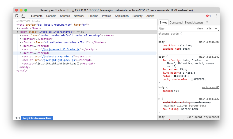
This box shows you the “DOM” or Document Object Model. It’s displaying the underlying live realtime HTML code for the web page, which is different than the static HTML document you’ve written.
Right click to inspect
You can also right-click an element on the page, and select “Inspect” (or “inspect element” with older browser versions) from the contextual menu to pull open the inspector.
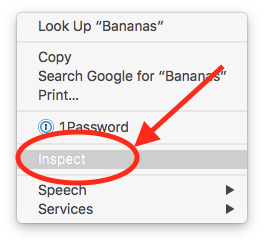
Do this now on the blue boxes below:
You will notice that the boxes above, called “pills” in Bootstrap parlance, are really <li>, or list, elements inside a <ul>. And they each have an <a> tag in them.
Click and drag to re-order the elements in the DOM. You can also double-click certain regions to edit them, or you can control-click to modify/copy content.