Web Design Concepts
Design
“Design is not just what it looks like and feels like. Design is how it works..”
- Steve Jobs
Visual design on the web covers multiple facets of not just how things look, but how they work. This tutorial will cover the following areas:
- Composition
- Function
- Visual Thinking
- Typography and color
The key books we suggest to read for understanding the foundations of web design are:
- Designing Web Usability by Jakob Nielsen
- Don’t Make Me Think by Steve Krug
- Various titles by A Book Apart
We don’t read pages. We scan them.
In his 1997 seminal study, Jakob Nielsen found that web users don’t read web pages word for word. Instead, they scan pages they come across picking out piece of content that most interest them.
Below is an eyetracking video of a user visiting TheRation.com. The red dot is the location where they are looking, done with special cameras that look at the pupil of the eye. The larger the dot becomes, the longer they stare at a particular part of the page.
Why do we scan?
- We’re in a hurry — Web use is often motivated by the desire to accomplish a task. Web users tend to act like sharks: They have to keep moving or they’ll die. They don’t read more than is necessary.
- We don’t need to read everything — On most pages, we’re only interested in a fraction of what’s presented.
- We’re good at it — We scan newspapers, magazines, e-mails, fliers to find the parts we’re most interested in.
We don’t figure out how things work. We muddle through.
- True of all technology — Web sites, software, household appliances. We use things all the time without understanding how they work. Few people read the instructions.
- If we find something that works, we stick with it — Once we find something that works, no matter how badly, we tend to not look for a better way. (We might stumble upon a better way, but seldom look for one.)
- Not much penalty for wrong guesses — Unlike firefighting, penalty is usually only a click or two to go back.

Tips for Effective Design
- Create a clear visual hierarchy
- The more important something is, the more prominent it should appear on the page.
- This can be done with size, boldness, color, or groupings
- CRAP (Contrast, Repetition, Alignment, Proximity)
Which piece of text in the above image is easier to read? Contrast is an effective way of creating hierarchy.
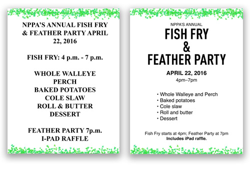
In the flier design below, we apply rules of contrast (varying type size), repetition (bullet points), alignment (lining up the text), and proximity (grouping items into logical areas).
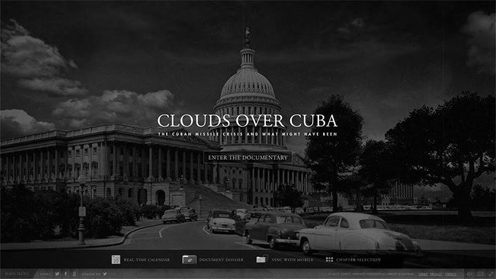
We can see contrast being employed on Clouds Over Cuba project.
Get rid of “Happy Text”
Just like E.B. White and William Strunk, keeping text concise is often the best way to present material on the web. Short and to the point.
Omit Needless Words
Vigorous writing is concise. A sentence should contain no unnecessary words, a paragraph no unnecessary sentences, for the same reason that a drawing should have no unnecessary lines and a machines no unnecessary parts.
- William Strunk Jr, E.B. White, Elements of Style
The following is a paragraph the introduces a company survey:
Thank you for agreeing to take this brief survey. The following questionnaire is designed to provide us with information that will help us improve the site and make it more relevant to your needs. Please select your answers from the drop-down menus and radio buttons below. The questionnaire should only take you 2-3 minutes to complete.
At the bottom, you can choose to leave your name and phone number. You may be contacted in the future to participate in a survey to help us improve the site.
Using the roles of concision, removing needless platitudes, we can reduce this to just a couple of important sentences.
Don’t Make Me Think
In Steve Krug’s book, he advocates for simple user interfaces that require little cognitive load. The web interface should be self-evident and completely obvious, and more importantly, not detract from people finding the content of a project.
- Nothing should be more than two clicks away.
- People should “get it” instantly.
- Every page should be self-evident, self-explanatory, and intuitive.
In his book, he puts forth a couple of examples about the “mental chatter” which goes through a person’s head (even subliminally) when they are faced with an equivocal user-interface element on the Web.
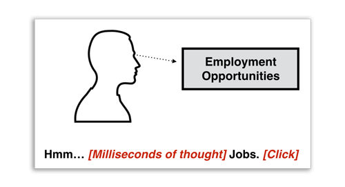
Below is an even more ambiguous name for someone who hypothetically might be looking for a jobs page.
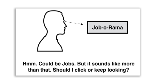
A better solution, advocates Krug, would be to simply call the section “jobs.”
Beyond Functional Design
It’s important foremost to have a functional and reliable website. But once we achieve those goals, the next step is to create content that is pleasurable or enticing. People should enjoy the site, and feel something. Aaron Walters compares this type of thinking to Maslow’s famous hierarchy of needs triangle.
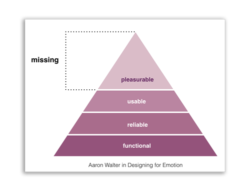
The best ways to achieve these goals is to design for emotion, that is, use typefaces, colors, and design patterns that create a mood or imply a feeling that is conducive to the experience you’re trying to generate.
Typography
There are two central types of fonts: Serif and sans-serif. Sans- which means “without,” are fonts without the small feet at the edges of the letters.
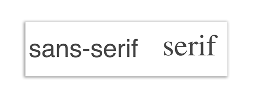
- Serifs are easier to read long text, like in books or long articles. Serifs are a authoritative, serious font.
- Sans-serifs are easier to see at a glance. San-serifs are generally more modern, minimalistic.
Never use display fonts for blocks of text
Display fonts are specialty designed fonts like handwriting fonts, Old English, or ghoulish fonts. Only use display fonts for logos and very special use cases. They may look fun, but always stick to serifs and sans-serifs for body copy.
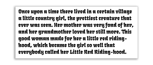
Display fonts are difficult to read as body copy.
Font Pairings
Like wine, certain fonts go well together. There are lots of links that aim to teach you about common font pairings.
- JustMyType.co
- FontPair.co
- TypeGenius.com
- TypeConnection.com A font dating game!
Steal Like an Artist
It’s important to scrapbook and collect examples of things that inspire you. One of the best ways to become a better designer is to look at how others solved common design problems before you did.
- Envato Marketplace - Marketplace for reasonably priced graphics, videos, audio loops, and stock images.
- Veer.com - Stock photos and graphics.
- CoDrops - Tutorials on user-interface experiments.
- Code Pen - Examples of coding experiements, mostly UI related.
- SideBar.io - Five best links of the day, also as a newsletter.
- Dribbble - A social network of designer who share things they develop.
- The Noun Project - Open source (with attribution) icons, or purchase for royalty-free licensing.