CSS for mobile
Responsive Web
The leading philosophy in designing for mobile today is creating responsive websites. These are websites that automatically adjust their layout to adapt to various screen sizes.
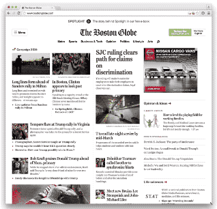
The importance of responsive web is due in large by the proliferation of so many different screen sizes. Smartphones now come in many different screen sizes, as do tablets. Smart watches, and other portable devices also create more potential ways that people can see content online.
Using Break Points for Responsive Websites
The solution to this dilemma is to use CSS Media Queries to create multiple styles for your design. The way it works is simple:
1) Start with your basic default styles. The current trend in the industry it to start with mobile first styles and work your way up. Since mobile proliferation is slated to over take desktop web usage (it already has in most industries) you should put your primary emphasis on that. 2) Decide on a series of breakpoints based on your content rather than on screen sizes. Keep the screen size agnostic to your layout. 3) Include CSS media query blocks for various viewport dimensions when the design gets too wide.
Tips:
- Create breakpoints based on content rather than devices.
- Design small and work your way up, enhancing the design the larger it gets.
- Lines of text should be 70 to 80 characters (roughly eight to 10 words).
CSS Media Queries
CSS Media Queries are blocks of CSS code that specify conditions when the code will be in effect. The following code means the h2 and h3 rules will only take effect if the screen size is below 800px:
@media (max-width:800px){

    h2{
        font-size: 36px;
    }
    h3{
        font-size: 28px;
    }

}
Remember, the max-width portion is inverse. Max means below, and Min means above (because the condition needs to be true).
You can also use queries to restrict to certain devices like screen, print, or tv. (Screen is any device with a screen, print are the styles when you print on a printer, and tv are styles with internet connected tv devices).
Beyond width and height, there are a whole host of “media features” or aspects that you can affect, such as whether or not the user is using a color monitor, or is using a specific aspect ratio.
/* printers */
@media print {

}

@media screen (min-aspect-ration: 1/1){

}

@media screen (orientation: landscape){

}
You can also create multiple condition using logical operators and and not.
@media screen (min-width:600px) and (max-width:800px){

}

@media not screen{

}
In the above example, only when the viewport is between 600 and 800 pixels will the styles in the code block take effect.
What takes precedence?
Just because a media query code block takes effect doesn’t mean those styles will alter the content on the page. The normal cascade rules still apply. It’s important to be specific in your media queries of the exact styles you want to alter.
Responsive Images using srcset
Newer browsers have the ability to load in different images depending on the screen size of the device you’re on. They do this by analyzing the device pixel ratio. A device pixel ratio is determined by the following formula:
num of device pixels / CSS width of an image
In order to create a series of fallbacks, you would save multiple copies of your image on the server, each with a unique name. Most people append the size to the filename. So if the full-size of your image is example.jpg, you might make a smaller copy called example-2000w.jpg, example-1600w.jpg, and finally example-750w.jpg.
In your HTML, you could include the following image tag:
<img src="example.jpg"

     srcset="example-2000w.jpg 2000w,
             example-1600w.jpg 1600w,
             example-750w.jpg 750w"

    alt="Description of image"
>
This way, older browsers will only see the original src attribute and load in the full size. But newer browser—in particular, mobile browsers—will save bandwidth and time loading by loading in a smaller version that’s needed for a smaller device.
The srcset attribute requires a space after the image name, and a specification of the size of the image. Sometimes you’ll see an x dimension used. This refers to the device-pixel ratio. This is helpful, because it will help you target higher density screens (sometimes called retina screens).
Mobile Design Patterns
There are a host of websites that collect and curate mobile design patterns to get a sense of the different approaches to designing for mobile devices. Most are geared toward native applications, which tend to be more free form in their approach in web design since the designs often don’t have to adapt to larger screens.
For Mobile Websites
Blue Fountain Media article on inspiring responsive design
For Apps
Cocoa Controls (Cocoa is a reference to the coding framework many iOS apps are built with.)
Apple Human Interface Guidelines (HIG)
For years Apple has been publishing it’s own Human Interface Guidelines with tips about how to design for its various products. Their mobile interface guidelines include tips like how big to make various buttons so they can be tapped with a finger or thumb, and to ensure text doesn’t get so small that it becomes illegible.
CoDrops Tutorials
The website Tympanus has a page dedicated to UI elements and tutorials on how to build them. Most of them are highly animated, but can be useful in trying to come up with new methods of interfacing with a design.
Exercise
Here is an html boilerplate template for the in-class exercise:
<!DOCTYPE html>
<html>
<head>
    <meta charset="utf-8">
    <title>Intro to Coding Interactives</title>
    <link href='https://fonts.googleapis.com/css?family=Lato:100,400,700' rel='stylesheet' type='text/css'>
    <meta name="viewport" content="width=device-width">
    <style>
        html, body, div, span, h1, h2, h3, h4, h5, h6, p, a, em, img, strong, b, u, i, ol, ul, li, form, label, legend, caption {margin: 0;padding: 0;border: 0;outline: 0;font-size: 100%;vertical-align: baseline;background: transparent;}

        body{
            font-family: Lato, sans-serif;

        }

        .container{
          background-image: url(http://newmedia.report/images/classes/intro-to-interactives/background.jpg);
          background-color: #000;
          background-size: 150%;
          background-position: left top;
          height: 70vw;
          color:#ffffff;
          position: relative;
          overflow: hidden;
        }

        .content{
            width:60%;
            margin: 30px auto;
            line-height: 35px;
            font-size: 18px;
        }

        .content p{
            margin-bottom: 20px;
        }

        h1{
            font-size:55px;
            margin-top:15%;
            text-align: right;
            margin-right: 50%;
            margin-left: 5%;
            padding: 2% 5%;
            border-right: 8px solid white;
            box-sizing: border-box;

        }
        h2{
            border-right: 8px solid white;
            padding: 2% 5%;
            font-size: 30px;
            font-weight: 100;
            margin-right: 50%;
            color: #f7ac53;
            text-align: right;
            vertical-align: middle;
        }
    </style>
</head>
<body>
    <div class="container">
        <div class="hgroup">
          <h1>Passion Changes Everything</h1>
          <h2>Designers as Storytellers</h2>
        </div>
    </div>

    <div class="content">
        <p>Lorem ipsum dolor sit amet, consectetur adipiscing elit. Nullam feugiat, magna ut aliquet porttitor, eros metus facilisis mauris, pretium consequat nisi lectus sit amet mauris. Nullam eget elit a elit pharetra tincidunt a ut mi. Curabitur malesuada, tortor eget interdum efficitur, tortor nulla pulvinar enim, ut blandit urna dolor et elit. Vestibulum ante ipsum primis in faucibus orci luctus et ultrices posuere cubilia Curae; Sed erat sapien, ultrices quis congue id, mollis vulputate lacus. Nam tincidunt malesuada rhoncus. Curabitur placerat eros non nibh tempus eleifend sed tincidunt quam. In hac habitasse platea dictumst. Donec eu dignissim neque. Quisque mollis enim lectus, cursus pharetra turpis porttitor vel. Maecenas vulputate sapien quam, quis bibendum augue efficitur id. Cum sociis natoque penatibus et magnis dis parturient montes, nascetur ridiculus mus.</p>

        <p>Nunc et metus eget sem tempus auctor. Nam augue nisi, elementum quis tellus vitae, imperdiet blandit nulla. Curabitur hendrerit mollis lectus, et viverra ex luctus a. Vestibulum nec vehicula lorem, a venenatis quam. In ipsum lectus, pretium et dui elementum, sagittis faucibus elit. Vestibulum at quam dolor. Vestibulum faucibus, lacus ut venenatis congue, nulla leo finibus purus, id interdum quam neque eget quam. In justo arcu, ultrices eu facilisis eu, venenatis a sapien. Praesent volutpat bibendum velit vestibulum elementum.</p>

        <p>Vivamus condimentum augue eget elit sagittis, vel blandit lorem ornare. Nam dui quam, ultricies ut purus eget, semper ultrices nulla. Morbi malesuada quis erat vitae dapibus. Nulla nunc nisi, cursus in neque eu, dictum feugiat urna. Aliquam accumsan diam mauris, eu ultrices augue malesuada a. Vestibulum vel massa velit. Cras tincidunt mauris id orci porta, ut volutpat neque luctus.</p>

        <p>Nunc imperdiet tellus velit, eu cursus tortor dignissim a. Maecenas volutpat risus in libero consequat pellentesque. Cras accumsan cursus augue, in faucibus ipsum molestie vel. Vivamus hendrerit scelerisque tortor, a cursus neque accumsan eu. Quisque nec facilisis purus. Cum sociis natoque penatibus et magnis dis parturient montes, nascetur ridiculus mus. Integer a accumsan sapien. Quisque accumsan luctus nisi ac tincidunt. Duis non nunc id enim ultricies vestibulum ut non dui. Cras non libero at velit sollicitudin consequat. Mauris ac sapien facilisis justo bibendum interdum. Nunc neque ex, luctus ac velit vitae, ornare pulvinar odio. Proin dignissim urna a diam varius pulvinar. Vestibulum egestas convallis tortor non egestas. Nunc eget libero laoreet, imperdiet nisl a, accumsan nunc.</p>

        <p>Donec venenatis massa nec maximus tincidunt. Donec fermentum aliquam egestas. Maecenas auctor viverra egestas. Cras a eros at ex malesuada euismod quis non risus. Pellentesque habitant morbi tristique senectus et netus et malesuada fames ac turpis egestas. Proin interdum ante eget turpis aliquet, quis dictum lorem efficitur. Morbi blandit nisl sit amet lacus dictum, id convallis sem vulputate. Proin sed urna at arcu venenatis finibus. Integer sollicitudin, nulla nec vehicula pellentesque, mi nulla maximus magna, in vehicula velit nisi vitae mauris. Mauris condimentum, dolor non faucibus viverra, turpis metus eleifend sem, vitae tincidunt dolor eros eget nisl. Mauris nulla leo, sodales vel aliquam eu, malesuada non nibh. Suspendisse suscipit elit in mauris dignissim, nec aliquet arcu scelerisque.</p>
    </div>
</body>
</html>