CSS3 Animation, video, and audio
New features in design, CSS3
The latest version of CSS3 brings some exciting new features. This article will cover a few of these. Among them are:
- Ability to do transparencies with
rgba()values - A host of new selectors like
E[attribute^="value"] - New pseudo-elements like
:nth-childand::before - New background properties like
background-size,background-clip, and multiple background images - transitions and animations
It is important to note that not all version of browsers are compatible with the latest CSS3 features. If your goal is to ensure the best cross-browser compatibility, particularly in developing nations where older browsers are prominent, then you should check the new features at CanIuse.com
RBGA(0,0,0, 0.0);
The rgb(0,0,0) value has been around in CSS for a long time. It allows you to specify three numbers from 0–255; the first is red, then green and the third number is blue. With CSS3, a fourth number has been added, which is a value from 0 to 1, a percentage of opacity. For example, 0.5 would be 50% opacity.
.somebox{
    background-color: rgba(100, 201, 56, 0.5);
}
This would create a background color with 50 percent opacity.
New Selectors in CSS
There are several new ways to select HTML elements in CSS which could be helpful.
Targeting by attribute
You can target HTML elements by their attributes. This is helpful when designing CSS on an existing platform like WordPress and in some other unique situations.
<style>
    nav[role="navigation"]{
        color: red;
    }
</style>
<nav role="navigation"></nav>
New pseudo classes
There are a number of additional pseudo classes for targeting elements based on how the user interacts with them.
:target which affects elements when the user has linked to them using a URL Fragment. A URL Fragment is when the url is appended by a pound symbol and a word: http://example.com/#some-id Typically, this would link to an element with “some-id” set as an id attribute, but you can also style this element using the :target pseudo-selector.
<style>
    #about:target{
        color: red;
    }
</style>
<div id="about"></div>
:nth-child(num)
:nth-child is another pseudo-selector that can target any particular number of elements of its parent and skip based on a special list of rules. Here are some examples:
/* target odd paragraph tags of its parent */
p:nth-child(odd){ }

/* target even paragraph tags */
p:nth-child(even){ }

/* target every fifth paragraph tag of its parent */
p:nth-child(5){ }

/* starting with forth element, targets every third, i.e. 4, 7, 10, 13 */
p:nth-child(3n+4){ }
::before and ::after
::before and ::after are two pseudo-elements that allow you to actually insert content using CSS. These can be powerful for hacks when you want to insert content into your page that is non-existent in the HTML. These pseduo-selectors are used in conjunction with the content: property, to inject new content into the page. It’s important to note that this isn’t real content, and won’t be seen by Google. So you shouldn’t use this for any type of semantic content, only for visual aids and aesthetics.
li::before{
    content: " >> ";
}
The above code will insert a >> symbol before every li. This could have also been text.
The Mozilla Developer Network has an online list of additional pseudo-classes that you can use to select different elements based on how the user interacts with them.
Background properties
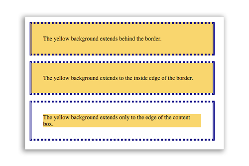
There are some new background properties, namely background-size and background-clip. The background-clip property allows you to decide whether the background image should extend under the padding or the border of the box:
border-box |
Extend the background underneath the border. |
padding-box |
Extend the background underneath the padding. |
content-box |
Only display the background under the content. |
The above would generate the following:
Background-size
background-size is another important property that really helps when doing large jumbotron-style displays.
300px 200px |
You can set two space-separated measurements starting with a width then height for the background image. |
50% 100% |
You can set one or two percentages, starting with the width then height. If only one percentage is given, it’s repeated for the other dimension. |
contain |
The content is letter-boxed so that every piece of the background is shown, and won’t get clipped. |
cover |
The box is filled with the background image, even if it means clipping a portion of it. Set the background-position to determine which area of the image shows predominantly. |
div{
    background-image: url(http://example.com/some-image.jpg);
    background-size: cover;
    background-position: center top;
}
The background-position is two values, starting with the horizontal. They can be pixel values, percentages or shorthand words like left, top, bottom or center.
Transitions and Animation in CSS3
It is possible to animate using only CSS! There are two methods for doing this. The first is using a transition property. The second is using an animation property. The difference is the transition is quick and dirty, just one line of code without much control. The animation property allows you to adjust every step of the animation, and give additional features for how the animation occurs.
Transition Method
The transition method is performed by specifying a particular property that you want to animate. Anytime this property is change, the browser will automatically attempt to animate the transition. There is a shorthand for applying the transition property. It is:
transition: property [duration] [ease-function] [delay];
(The parts in brackets are optional.) It is advised to include a duration as the second value. It’s a number followed by a unit of measurement, (s for seconds).
div{
    width: 100px;
    height: 100px;
    background-color: red;
    border: 1px solid black;
    transition: margin-left 1s;
}
The CSS above would cause the following to occur (click red box to view):
(Note that I added some JavaScript to change the margin-left on click.) Transitions generally work in concert with JavaScript. The CSS just says, ‘whenever you change this property, do it in an animated way.’
More information on CSS transitions can be found on the Mozilla Developer Network page on transitions.
Animation method
In CSS, it is also possible to animate using a special animate property. This property also has a shorthand form:
animation: [duration] [ease-function] [delay] [iteration-count] [direction] [fill-mode] [play-state] [name];
Here are definitions for each value of the animation property:
| duration | A number followed by “s” for seconds. |
| ease-function | Linear, ease-in, ease-out, ease-in-out. |
| delay | Delay before animation begins, followed by “s” for seconds. |
| iteration-count | Number of times to repeat, or “infinite” for looping |
| direction | If you want to repeat in “reverse” or “normal” or “alternate” back-and-forth. |
| fill-mode | Should it apply styles before or after animation. “none”, “forwards”, “backwards”. |
| play-state | “paused” or “running”. |
| name | An arbitrary name you give this animation to reference it with keyframes. |
A few examples. First, a simple example of changing the margin-left property from 0% to 50% over 3 seconds, just one time, in a linear fashion.
#mybox{
    animation: 3s linear 0s 1 normal myCoolAnimation;
}

@keyframes myCoolAnimation{
    from{
        margin-left: 0%;
    }
    to{
        margin-left: 50%;
    }
}
Note the @keyframes portion, which defines the actual animation. You can apply this definition to multiple elements using the name provided.
Below, this example will animate the margin-left back-and-forth forever.
#mybox{
    animation: 3s linear 0s infinite alternate myCoolAnimation;
}

@keyframes myCoolAnimation{
    from{
        margin-left: 0%;
    }
    to{
        margin-left: 50%;
    }
}
We can also adjust the keyframes so that we specify every part of the animation using percentages instead of the from and to keywords.
#mybox{
    position: absolute;
    animation: 3s linear 0s infinite alternate myCoolAnimation;
}

@keyframes myCoolAnimation{
    0%{
        top: 0%;
        left: 0%;
    }
    25%{
        top: 100%;
        left: 0%;
    }
    50%{
        top: 100%;
        left: 100%
    }
    75%{
        top: 0%;
        left: 100%;
    }
    100%{
        top: 0%;
        left: 0%;
    }
}