Continuous News Stories (Case Studies)
What is a Continuous Story?
A continuous news package is one that is told linearly with a beginning, middle, and end. It is not designed to be consumed out of order, or if it is, the experience is very directed.
Given the nature of continuous stories, they tend to be narrative in nature, meaning they have a more traditional story arc.
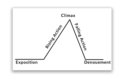
A narrative arc isn’t a prerequisite for the continuous category. But if the story lacks a narrative, then it usually still follows a single train of thought through the piece.
Continuous stories are generally lead by one central media form that drives the package. This could be text, video, or graphics.
Einstein’s Camera (Example of a text-driven piece)
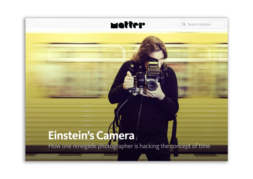
This Matter story titled Eintein’s Camera covers a story of a photographer who composites multiple images together into these motion mosaics. His photo projects are a key element to the story. It’s hard to argue that not seeing his videos would be detrimental to the story, and Matter did a good job of integrating video snippets of his projects as parts of the text.
The story works through elements about how Magyar manufactures his own devices to capture on medium format gear to generate super high-resolution imagery, showing both
Officer Involved (Example of data-driven piece)
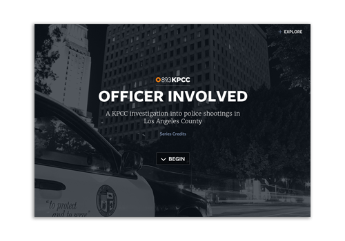
Southern California Public Radio called Officer Involved The piece tells a story with graphics, but leads you through a single narrative, told mostly with text and data graphics.
The piece is a companion to a collection of stories on the topic, and was designed to engage readers with shorter, concise story elements.
Hopes of a Generation Ride on Indian Vote (Example of a photo-driven piece)
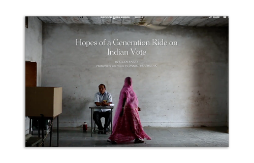
In this New York Times piece about the run-up to the Indian election was very photo driven, interpolated with text snippets about the reporter’s experience speaking to people about their hopes and dreams.
The intention of the piece wasn’t to have a text narrative, but rather to explore the “scenes” just before the Indian election. The text becomes secondary, with short anecdotes and quotes from sources.
America Elect (Example of a graphics-driven piece)
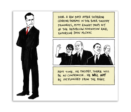
America Elect was done by The Guardian as a way to perform a story in the style of a graphic novel, and giving the same feel as one would reading a comic book. It tells the story of the 2012 U.S. Presidential Election. The movement of the pieces are tied to the scrolling of the page, so different elements pop in-and-out of view at various points in time, and help direct the eye in the same fashion as a graphic novel would.
Alma: A Tale of Violence (Example of a video-driven piece)
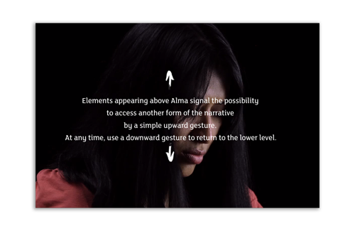
In Alma: Tale of Violence, the production company Arte Americas wanted to create a more interactive element to what would normally be a lean-back experience. The piece is a gripping video interview with Alma, a former Guatemalan gang member, as she describes how she killed another woman with a screwdriver as part of her initiation. The story goes on to describe how she tried to leave the gang when she learned she was pregnant, and was shot and paralyzed as a result.
The entire 40-minute interview is captivating, which presents the challenge of how to show it? Would viewers want to stare at someone talking for that long? The producers chose to make the b-roll (background video) as an optional element for the viewer, rather than force it over the subject. Giving the user the choice allows them to simply sit and watch Alma, or explore and see scenes of Guatemala as she describes her story.
Techniques for telling continuous Stories
Telling a continuous story requires careful attention to the reader’s train of thought and how they are consuming the story. Given that the medium of the Web (the the devices that are used to consume stories) are very distracting, it becomes important to use multimedia in a way that keeps the attention span of the reader.
In general, the goals are:
- Use multimedia in a way that is cohesive to the overall narrative. Videos, photos, and graphics shouldn’t be redundant to text.
- Understand how multimedia connects with the content around it. Does it distract from the narrative? What is the cognitive load of a piece of multimedia? Does it interrupt the flow? If so, is that OK?
- Don’t create flashy design effects for their own sake. Every design decision should have a purpose. It’s OK for design to be “cool,” but use the cool factor in a way that better communicates the story. (e.g. Autoplaying background videos, scrolling curtain effects, or animation.)
- Ledes and introductory text of the package becomes crucial, because most continuous stories require a commitment from the user. Tease users with good explanatory introductions so they know what they are going to get.
“Chunkifying” content
A technique used in lots of continuous pieces is to break text apart into smaller chunks that grasp the user’s attention. It’s a bit like holding a user’s hand and leading them through the story.
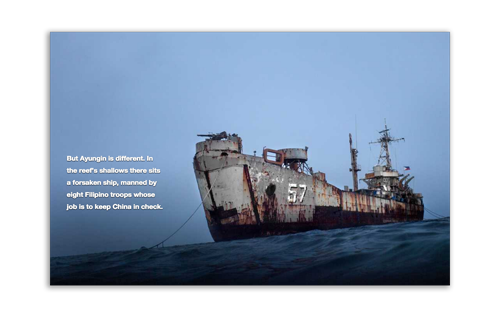
In this South China Sea Piece by the New York Times, content is broken into smaller chunks at various points in the narrative. These pieces of content help reinforce the multimedia with descriptions of what’s happening.
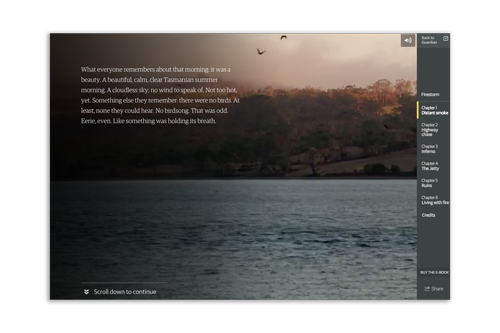
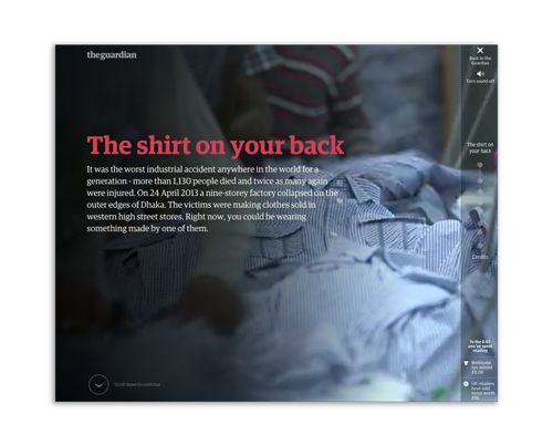
In this piece Firestorm by The Guardian, a documentary filmmaker, longform magazine writer, and multimedia producer teamed up to tell the story of a family’s harrowing escape from a bushfire in Tasmania. Much of the piece is separated into smaller chunks.
Multimedia “Interrupters”
Another term has been adopted in the multimedia storytelling industry to describe when a piece of multimedia “interrupts” the narrative flow of a piece. While this sounds like a bad thing, it’s often done intentionally.
Careful consideration should be made as to when a piece of multimedia breaks the text apart, or when it’s placed off to the side of the text, where it becomes a more optional element.
The factors to consider in making this decision:
- Is the multimedia critical the story, and at that point in the narrative?
- What is the learning curve of an informational graphic? If it takes too long to decipher beyond a glance, perhaps it should be considered more of a sidebar.
- Multimedia often makes good chapter breaks or segues for introducing the next section of a story.
- Breaking up a narrative with a video is often a forceful indication that the viewer needs to watch it. You shouldn’t break the text if you think it’s optional, because the viewer will be left thinking they missed something.
Design techniques
Web producers employ several design techniques when building these packages. Most have usefulness, but some are often gratuitous or exist for their own sake.
Scrollytelling
Scrollytelling is a term that relates to animations that play as the user scrolls. This is often an effective method for engaging readers, because it offers simulation as they interact with the piece and makes the process of scrolling enjoyable. But the caveat is that most scrollytelling pieces require movement, and are often antithetical to longer text stories which are read at a much slower pace.
- Good for: scannable content, chunkified content.
- Bad for: longer text stories.
Curtain Effect
A curtain effect is when part of the page seems to reveal another section of the page. This effect is often useful for indicating breaks in a piece, or a transition to another section of the copy. It should be considered a hard interruption, and give the sense of unveiling a piece of content.
Many times it’s used as purely an aesthetic device, perhaps gratuitously and unnecessarily.
- Good for: creating very strong interruptions for transition, unveiling new content.
- Bad for: times when it doesn’t serve a purpose, or it’s used gratuitously and unnecessarily.
Auto-playing Background videos
Another element seen in many continuous stories are silent auto-playing background videos. These can really make static images come alive and add some dynamism to the piece.
They usually come in two forms:
- Aesthetic: Simple repeating imagery that sets a scene or offers a piece of movement.
- Illustrative: A situation when it shows something happening. In this case it’s similar to an animated GIF. This is a quick way to show an action without the user having to commit to a video.
In the first case, the types of background videos that work best are ones that are short and have some type of subtle movement. They generally work create a scene setters, and help create a more dynamic feel that differs from the frozen moment of a still photo.
In the second case, the action should be quick or users might get confused about whether the video should be watched or just glanced at.
- Good for: setting scenes, creating dynamism to a piece aesthetically.
- Bad for: when it’s distracting, overused, too long, or should be a playable video instead.