Python Data Wrangling
Pandas Assignment.
Below is a step-by-step guide for analyzing a dataset in Pandas.
Import your .csv into DataHub
For this lesson, we will use UC Berkeley DataHub. Visit the following URL and log in with your CalNet Credentials.
You should then create a folder.
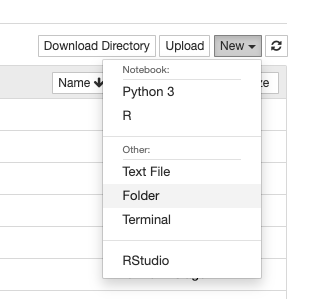
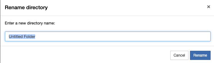
When you create a new folder, it will automatically give it the name “Untitled.” You will need to select this folder and rename it.
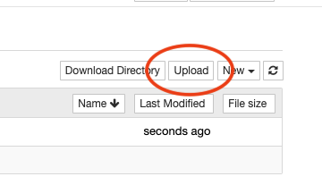
Then press the upload button to upload a .csv
Setting up the Python Libraries
The next step is to import the necessary Python libraries you will be using. For this lesson, you ale only expected to use Pandas, Numpy (pronounced num-pie) and Seaborn. Seaborn also requires MatplotLib, which is a similar data visualization library.
import pandas as pd
import numpy as np
import seaborn as sns
import matplotlib.pyplot as plt
%matplotlib inline
Next, let’s set some parameters in case our dataset is large, so we can see everything.
pd.set_option('display.max_rows', 500)
pd.set_option('display.max_columns', 500)
pd.set_option('display.width', 1000)
Import your data
To import your data, you’ll need to use the pd variable created when you imported the Pandas library. Create your own variable to assign this data.
my_variable = pd.read_csv("name_of_your_data.csv", encoding="utf-8")
To see the first few rows of your data, use the .head() function, which also takes a numerical argument for the number of rows you want to display.
my_variable.head()
How to select portions of your data
The first lesson in using the Pandas library is learning how to select various rows and cells. If you need to manipulate your data, or assign a portion of it to a temporary variable, you’ll need to know how to select a specific set of the data.
Note: In all of the following examples, the angle brackets <> represent placeholders. Don’t type the angle brackets in your own code.
Filtering based on a cell
To select rows based on a value within a certain column, use the following format:
my_variable[my_variable["<column name>"] == "<search value>"]
We will cover two functions in the next portion of this lesson:
- .iloc - Index based selection
- .loc - Name or label based selection
This tutorial will start with the .iloc function.
To get a specific row
To select a specific row, use it’s index number. (Note the double square brackets.)
my_variable.iloc[[21]]
To select multiple individual rows
If you want to select multiple rows, comma-separate each index number.
my_variable.iloc[[21, 22, 35]]
To select range (slice) of rows or columns
To select a range of numbers, use the [start:stop:step] notation.
- start - means the index which to start counting
- stop - is a count (not index) of when to stop
- step - is optional, and it means skip count by this number
You can also leave off any number, and it will count to the end.
Note: When using slice notation (ranges) you don’t need a double square bracket.
my_variable.iloc[0:5] # count from 0 index to the 5th item
my_variable.iloc[8:]  # count from 8 index to the last row
my_variable.iloc[:50] # count from the beginning to the 50th item
my_variable.iloc[:]   # returns the entire list, all rows
my_variable.iloc[5:100:5] # count from index 5 to 100th item, counting by 5s
To select multiple/portion of columns
If you want to select specific columns by index, add a second argument to the .iloc function.
my_variable.iloc[:, [3, 7, 8]] # select all rows (:) and columns 3, 7 and 8
my_variable.iloc[[0,5], [2]]   # select rows 0 and 5, but only second column
my_variable.iloc[0:5, 0:3]     # select row index 0 to 5th row, and column 0 index to 3rd
Note that using slice notation doesn’t require an extra set of square brackets
Continuous vs Categorical Data vs Neither
How you analyze the data will depend of whether your data is numerical, or if it’s made up of categories (labels). The data type is really determined by column, so many spreadsheets can be a mix of both types. There is a third type of data that is neither, which would be like descriptions
| id | Categorical | Continuous | Neither |
|---|---|---|---|
| 01 | blue | 5345.34 | https://example.com |
| 02 | blue | 6456.23 | Note on this row |
| 03 | blue | 1231.45 | |
| 04 | green | 6543.34 | |
| 05 | red | 4322.52 | re-check this one |
| 06 | green | 1141.41 | |
| 07 | blue | 1119.11 | |
| 08 | red | 9563.34 | The deal with this |
| 09 | blue | 2362.24 | Another note |
| 10 | green | 4532.46 |
Some things you can do with continuous data
With continuous data, you can plot your data using charts. To use most of these plots, you’ll need at least two columns of continuous data.
To make these charts work, you will also need to specify your dataframe variable — we used my_variable in our example here — and the column names for the x and y axes. This also means you might need to resort or transpose your data so that the numerical data goes down each column rather than across multiple columns.
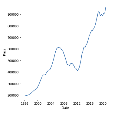
Line Plot
Line plots are best for showing data across a time axis, which is typically the X axis.
sns.lineplot(data=<your data variable>, x='<column name>', y='<column name>')
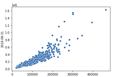
Scatter Plot
Scatter plots are best for comparing two columns of numerical data to see their relationship.
sns.relplot(data=<your data variable>, x='<column name>', y='<column name>')
Histogram Plot
Histograms are best when you want to graph only one column of numerical data to see its distribution. The last argument “bins” represents how many buckets it puts the numbers into. This gives a great way to see the shape of a single column of numbers.
sns.histplot(data=<your data variable>, x='<column name>', bins=50)
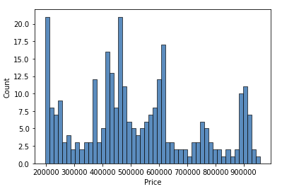
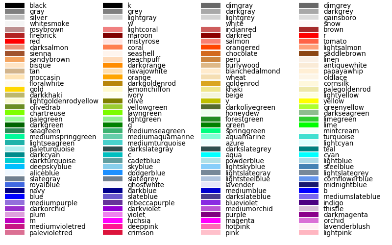
Chart colors
In most cases, you can specify a color='<color name>' argument to chart to specify the colors within your chart from the default blue. Here is a full list of color names supported:
An example using dimgray with the histogram would be:
sns.histplot(data=<your data variable>, x='<column name>', bins=50, color='dimgray')
Sorting your data
If you need to sort your data, especially so it appears in order on a chart, you can use the sort_values function.
my_variable = my_variable.sort_values('<column name>', ascending=False)
Converting Data Types
In some cases, you might need to convert your data types for each column. This is especially true with dates. If you have a column of dates, you can create a new column called “Date” and assign it a date data type.
my_variable['Date'] = pd.to_datetime(my_variable['<column with dates>'])
This will create a new column called “Date” which might look duplicative to your existing column, but it will be date data type. This is helpful when making charts where the x axis is a series of dates or times.
You can also convert a column to numbers:
my_variable['Number'] = pd.to_numeric(my_variable['<column with numbers>'])
Some things you can do with categorical data
Categorical data deals with columns that have discrete labels, or categories.
Count unique values
Sometimes you want to see how many occurrences there are for unique values in your data.
my_variable.groupby('<column name>', as_index=False).size()
You can also group by multiple columns, which will specify the first column, then pair it up with the second. (Make sure these are categorical labels)
my_variable.groupby(['<column name 1>','<column name 2>'], as_index=False).size()
You can also filter your data first, then run the groupby function.
my_variable[my_variable['<column>'] == '<searched value>'].groupby('<column name>', as_index=False).size()
If you have a mix of both categorical and continuous columns, you can also run a function other than size which just counts the number of occurrences. Instead, you can run sum() or mean() which will either add up the values of the second column, or give you the average.
my_variable.groupby(['<categorical column>', '<continuous column>'], as_index=False).sum()
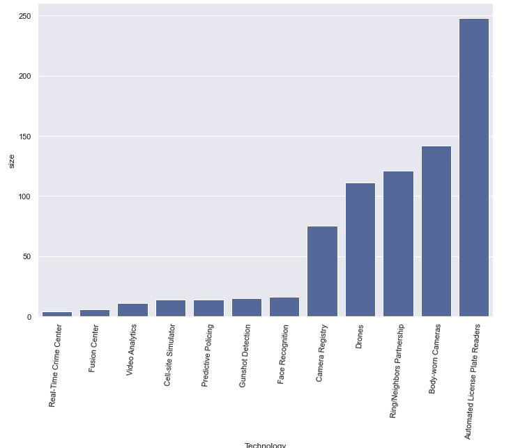
Bar Plot Chart
With categorical data, we often make bar charts. A bar chart typically requires two columns, one with categorical data, and another with numerical data. An easy way to get numerical data is to run a groupby first witch counts unique values.
sns.barplot(data=my_variable.sort_values('<column to sort>'), x="<column name>", y="<column name>", color='b')
h = plt.xticks(rotation=85)
The second line will rotate the labels, which is often needed on bar charts.
More chart example
More chart examples can be found on the Seaborn charting page.
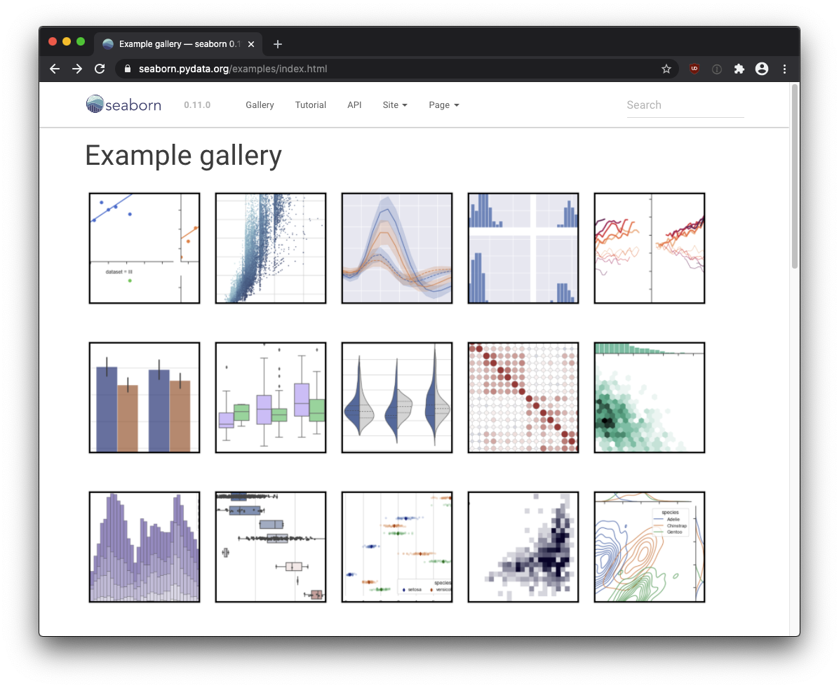
https://seaborn.pydata.org/examples/
Merging two data sets
To merge two data sets, you’ll need a common column between them to match each row. This shouldn’t be a categorical column that repeats, but rather a column of truly unique values (like an index, or key column, where every value is unique).
Table 1 - “people”
| Id | Name | Amount |
|---|---|---|
| 01 | Joe | 5345.34 |
| 02 | Dave | 6456.23 |
| 03 | Lilliana | 9231.45 |
| 04 | Jacquline | 6543.34 |
| 05 | Sarah | 4322.52 |
| 06 | Grace | 1141.41 |
| 07 | Roberto | 1119.11 |
| 08 | Carol | 9563.34 |
| 09 | Daniel | 2362.24 |
Table 2 - “jobs”
| Id | Classification | Years |
|---|---|---|
| 01 | Truck driver | 17 |
| 02 | Dentist | 8 |
| 03 | Lawyer | 23 |
| 04 | Journalist | 5 |
Note the common column between them (Id). Without a common column (called a “key”) you can’t join the two datasets.
merged = people.merge(jobs, how='outer', left_on="Id", right_on="Id")
Here are what the arguments mean:
- jobs - This is the name of the dataset you’re merging with. For this example, we pretended our second table was stored in a “jobs” variable, but your variable will likely be different.
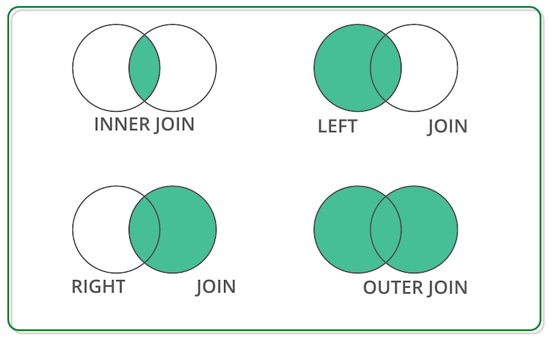
- how - This describes what to do with unmatched items. Choices are “left”, “right”, “inner” or “outer”. Inner join only keeps matched items. Left keeps all items in the original dataset, even if it didn’t find a match. Right keeps unmatched data in the merged dataset but not in the original. And “outer” keeps all data, even if it didn’t find a match.
- left_on - The column name in the original dataset that has the key column to match.
- right_on - The column name in the merged dataset that has the key column to match.
Merged Dataset
| Id | Name | Amount | Classification | Years |
|---|---|---|---|---|
| 01 | Joe | 5345.34 | Truck driver | 17 |
| 02 | Dave | 6456.23 | Dentist | 8 |
| 03 | Lilliana | 9231.45 | Lawyer | 23 |
| 04 | Jacquline | 6543.34 | Journalist | 5 |
| 05 | Sarah | 4322.52 | ||
| 06 | Grace | 1141.41 | ||
| 07 | Roberto | 1119.11 | ||
| 08 | Carol | 9563.34 | ||
| 09 | Daniel | 2362.24 |