How to make a scatter chart in D3
Basic Scatter Chart

Step 1: Prepare your data as a CSV file
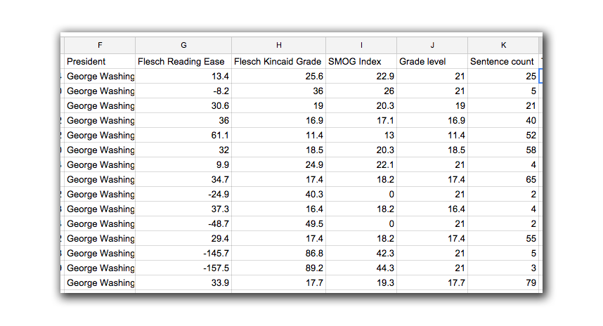
In this example, we will use a provided dataset on the complexity of presidential speeches over the years based on various metrics, including the Flesch Reading score. This included data file has multiple columns to choose from, so it’s important to determine what metrics you want to show to get the general point across. You don’t want to over complicate your chart or include too many dimensions of information unnecessarily. A chart is designed to simply only pieces of the information, not give a comprehensive display of every part.
Download the Presidential-Speeches.csv file

Note: That in the dataset given above, there are numerous columns we could display. In this lesson, we will choose to use the Grade Level column for our Y axis, and the date of the speech for our X axis.
Step 2: Setup our document
As usual, we will setup our chart as we normally do, setting up the width and height attributes and assigning them to variables. (At this point we will assume you’ve setup your HTML document and included the D3 library).
var margin = {top:20, right:10, bottom:20, left:20},
    width  = 1000 - margin.right - margin.left,
    height = 500 - margin.top - margin.bottom;

var svg = d3.select("body")
    .append("svg")
    .attr("width", width + margin.left + margin.right)
    .attr("height", height + margin.top + margin.bottom);
Step 3: Setup our scales
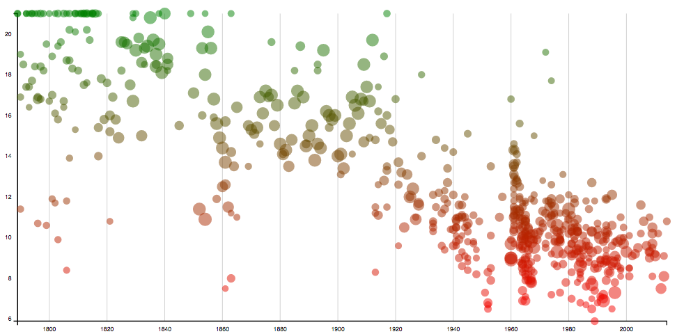
The nice thing about scatter charts is that we can display multiple dimensions of data on the same chart. Not only can we use the X and Y axes to determine the location of the dot, but we can also use the size of the circle to include another column of data, and even use a color scale to show a fourth piece of data. However, most times you want the size and color to correspond to the same data you used for the X and Y axes, as this just reinforces the original intention of the graph.
Below we setup basic X and Y scale ranges based on the chart dimensions. Since our X scale is a date, we are going to use the d3.time.scale() function this time. This requires the data to be in a JavaScript Date format. This is done by specifying a date string using new Date("January 1, 1970") anyplace where you want the date object to appear (with your own date of course).
Notice we haven’t included a domain yet, because we need to do that after we load in the data.
var xScale = d3.time.scale()
    .range([0, width]);

var yScale = d3.scale.linear()
    .range([height, 0]);
Next we add scales for the dot size and color. We can manually enter values depending on how large we want the bubbles to appear in our chart. In the code below we use a dot size from 5 to 10 pixels, and a color scale from red to green.
//bubble size scale
var bScale = d3.scale.linear()
    .range([5, 10]);

//color scale
var cScale = d3.scale.linear()
    .range(["red", "green"]);
Step 4: Setup the Axes
Pretty simple stuff at this point. We prepare the code to display our axes later. We will use the typical orientation of left and bottom.
In a chart like this it’s nice to have a minor grid in the char to help the reader determine where each dot is located. This is done the same way as setting up an additional axis, but without displaying any content by using tickformat("") and setting the tickSize to the full width of the chart.
var xAxis = d3.svg.axis()
    .scale(xScale)
    .orient("bottom")
    .tickFormat(d3.time.format('%Y'));

var yAxis = d3.svg.axis()
    .scale(yScale)
    .orient("left");

var xGrid = d3.svg.axis()
    .scale(xScale)
    .orient("bottom")
    .tickSize(height, 0, 0)
    .tickFormat("");
Step 5: Add CSS and D3 code to make a tooltip
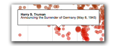
In this chart we will have a tooltip pop up whenever the user moves their mouse over one of the dots. Since the text inside the tool tip can vary, it’s easier to do this outside the SVG using a simple HTML div box. While it might be possible to code an SVG box using <text> tags, this will scale with the chart and wouldn’t look very good in many situations.
This is the CSS for our tooltip. Feel free to customize the h3 and p tags with varying font sizes.
#tooltip{
    font:0.7em/1em "Helvetica Neue", Helvetica, Arial, sans-serif;
    opacity: 0;
    position: fixed;
    top:0;
    left:0;
    -webkit-transform: translate(-50%,0);
            transform: translate(-50%,0);
    z-index: 9999;
    border: 1px solid black;
    box-shadow: 0px 0px 5px 0px #ccc;
    padding: 10px;
    background-color:white;
    pointer-events:none;
}
/* Build the arrow at bottom of tooltip box */
#tooltip:after{
    top:100%;
    left:50%;
    border:solid transparent;
    content: " ";
    height: 0;
    width: 0;
    position: absolute;
    border-top-color:black;
    pointer-events:none;
    border-width: 10px;
    margin-left:-10px;
}
#tooltip:before{
    top:100%;
    left:50%;
    border:solid transparent;
    content: " ";
    height: 0;
    width: 0;
    position: absolute;
    z-index: 99999;
    border-top-color:white;
    pointer-events:none;
    border-width: 9px;
    margin-left:-9px;
}
Then using some D3, we just add an empty div tag. This will be invisible initially.
var tooltip = d3.select("body")
    .append("div")
    .attr("id", "tooltip");
Step 6: Build the chart
We load in our csv file, and then set the scales. In the example below, we used Word Count for the size of each bubble, and the “Grade Level” column in our data file for the Y axis as well as the color.
d3.csv("presidential-speeches.csv", function(data){

    //set xScale of the first and last dates in our dataset,
    //converting each to a date object using "new Date()"
    xScale.domain([
        new Date(data[0]["Date"]),
        new Date(data[data.length - 1]["Date"])
    ]);

    //set the domain for Y scale based on grade level
    yScale.domain([
        d3.min(data.map(function(d){ return +d["Grade level"]; })),
        d3.max(data.map(function(d){ return +d["Grade level"]; }))
    ]);

    //set the bubble size based on word count
    bScale.domain([
        d3.min(data.map(function(d){ return +d["Word count"]; })),
        d3.max(data.map(function(d){ return +d["Word count"]; }))
    ]);

    //set the color scale (from red to green) based on grade level
    cScale.domain([
        d3.min(data.map(function(d){ return +d["Grade level"]; })),
        d3.max(data.map(function(d){ return +d["Grade level"]; }))
    ]);

    //append the grid mark axis first, so it's in back
    svg.append("g")
        .attr("transform", "translate(" + margin.left + "," + margin.top + ")")
        .attr("class", "grid")
        .call(xGrid);

    //append the y axis
    svg.append("g")
        .attr("transform", "translate(" + margin.left + ", " + margin.top + ")")
        .attr("class", "y axis")
        .call(yAxis);

    //append the x axis
    svg.append("g")
        .attr("transform", "translate(" + margin.left + "," + (margin.top + height) + ")")
        .attr("class", "x axis")
        .call(xAxis);

    svg.append("g")
        .attr("transform", "translate(" + margin.left + "," + margin.top + ")")
        .selectAll(".bubbles")
        .data(data)
        .enter()
        .append("circle")
        .attr("cx", function(d){ return xScale(new Date(d["Date"])); })
        .attr("cy", function(d){ return yScale(+d["Grade level"]); })
        .attr("r", function(d){ return bScale(+d["Word count"]); })
        .style("fill", function(d){ return cScale(+d["Grade level"]); })
        .attr("class", "bubbles");

})
Step 7: Add the tool tip
Next, we can add the JavaScript for the tool tip. You would add this right after the above code (make sure you remove the semi-colon) to keep chaining it.

Adding HTML tool tips can be tricky because we need to make sure the tool tip aligns right on top of our chart in the correct location. In the code below, we extract the cx and cy attributes from the circle we hovered over, and use those to calculate the “left” and “top” CSS values of our fixed positioned tool tip.
We also need to figure how tall the tool tip box is, so we can align the bottom arrow with the circle. Since the text in the tool tip box can vary from item to item, we use tooltip.node().getBoundingClientRect().height which will return the height of the box after we’ve set the text content.
.on("mouseover", function(d, i){

    //create variable reference to dot we hovered over
    var dot = d3.select(this)
        .style("opacity", 1);

    //set the tool tip text, and make it visible with display "block" CSS.
    var tooltip = d3.select("#tooltip")
        .html("<strong>" + data[i]["President"] + "</strong><br>" + data[i]["Headline"] + "</p>")
        .style({"display":"block", "opacity": 1});

    //get the height of the tool tip box and save it in a variable
    var tooltipHeight = tooltip.node().getBoundingClientRect().height;

    //set the CSS of our tool tip to position it based on dot attributes
    tooltip.style({
        "left" : (+dot.attr("cx") + (+dot.attr("r")) + margin.left) + "px",
        "top"  : (+dot.attr("cy") + margin.top - tooltipHeight - (+dot.attr("r"))) + "px"
    });
})
.on("mouseout", function(e){

    d3.select(this)
        .style("opacity", .5);

    d3.select("#tooltip")
        .style({"display":"none"})
        .html("");
})